Back in 2021 (That feels like a lifetime ago in crypto btw…) I wrote an article on Medium called DEX UX: a competitive analysis of crypto exchanges.
After spending months reviewing (and working on) dozens of dexes, I decided to write up some of my notes. I went through five in excruciating detail, highlighting all the little differences from each other.
I’m not going to redo that article because as Web3 has got bigger:
- There are a lot more Dexes
- DeFi protocols update their designs more often, so this would immediately be out of date
- I stand by a lot of my conclusions from back then
- I want this handbook to focus on actionable tips, not background theory.
So check out the above Medium article for some history, and read the below for some practical advice.
Users spend most of their time on other sites. This means that users prefer your site to work the same way as all the other sites they already know.
– Jakob’s Law
Essentially, your dex should look like the other dexes. You don’t need to reinvent the wheel, instead you need to follow best practice.
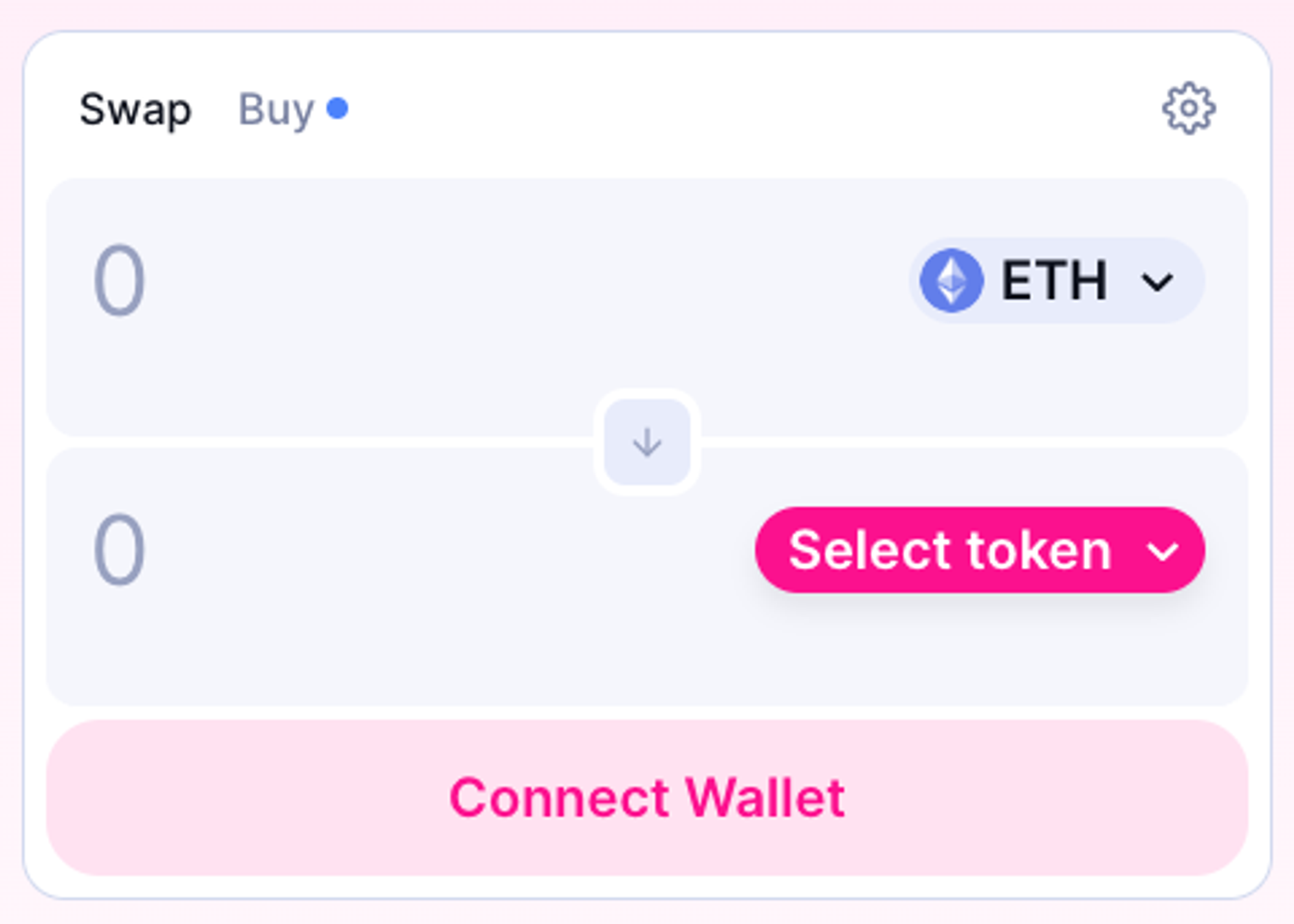
Key features
- The font size for amounts should be at least 20px
- The button should show dynamic messages
- USD equivalent should always be shown
- Contrast ratios should meet AA accessibility standards
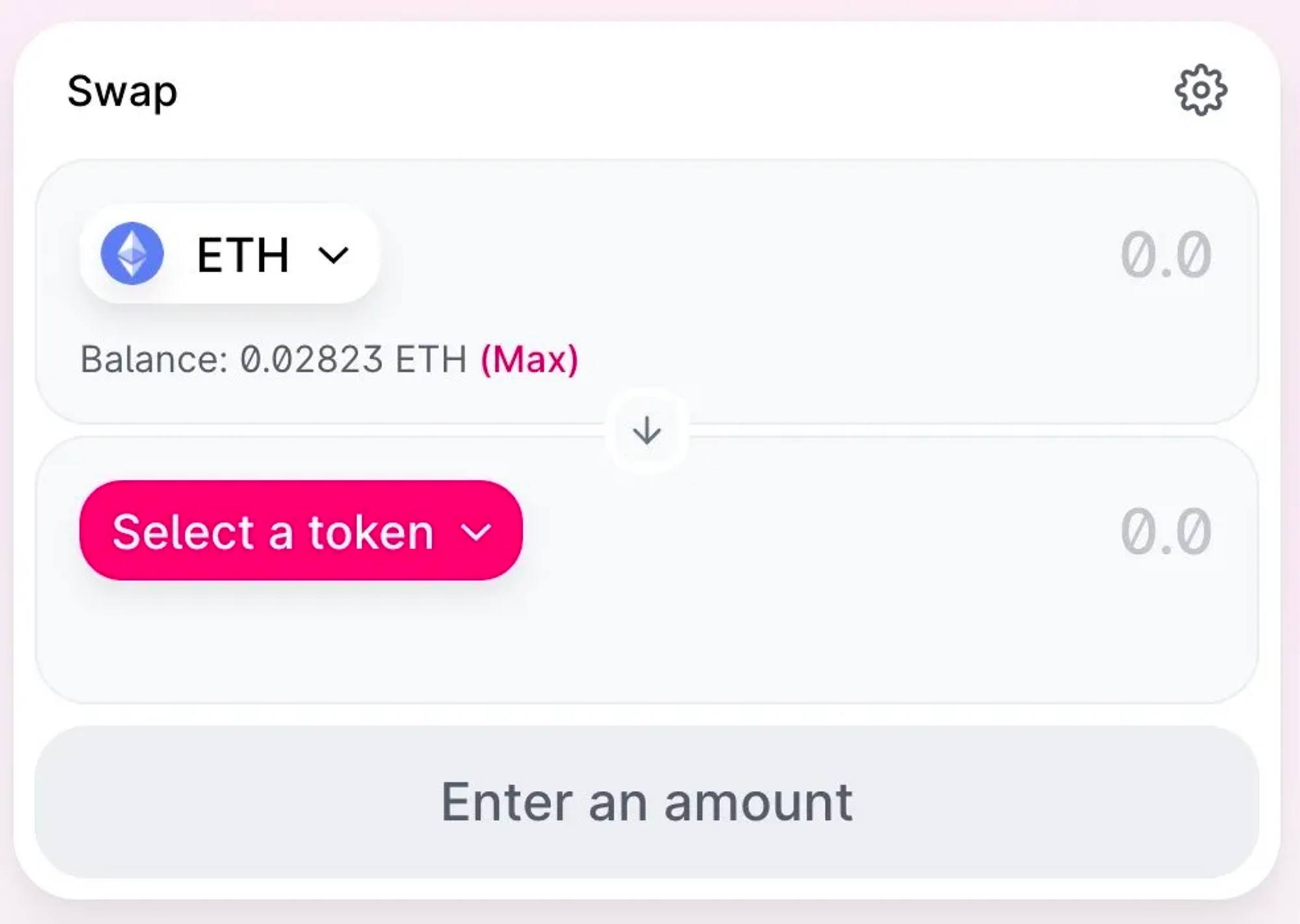
- The token dropdown should probably be on the right
- A 50% button is useful
- White space
- Price chart
- Max button
- Warning to leave amount to pay for gas
- Clear affordances
- Clear confirm
Some further detail
The font size for token amounts should be at least 20px, and probably bigger.
Bear in mind some of the best use significantly larger.
As of time of writing, Sushi use 30px, Uniswap uses 36, and Velodrome use 40.
The token and the amount are the most important pieces of info in the screen. They should be very clear and very readable.
The button should show dynamic messages
The button should never simply say “confirm” - it should say exactly what the user is going to do, eg “swap”. In other sections of the app, it should say things like ”add liquidity” or “stake”.
dApps also use the main CTA to show some contextual help. This means things like “connect” when unconnected and “switch network” and connected to the wrong one. Or “enter an amount” when the fields are blank. In this case, even when the button is disabled, it is still useful.
At times when the button is proposing an action, such as “switch network”, it should actually do that action and start the switching process. Rather than being a message, it should allow the user to do what they need to do. The user should not have to go to their wallet to do this.
For the UX nerds out there, these would be types of “explicit affordances”.
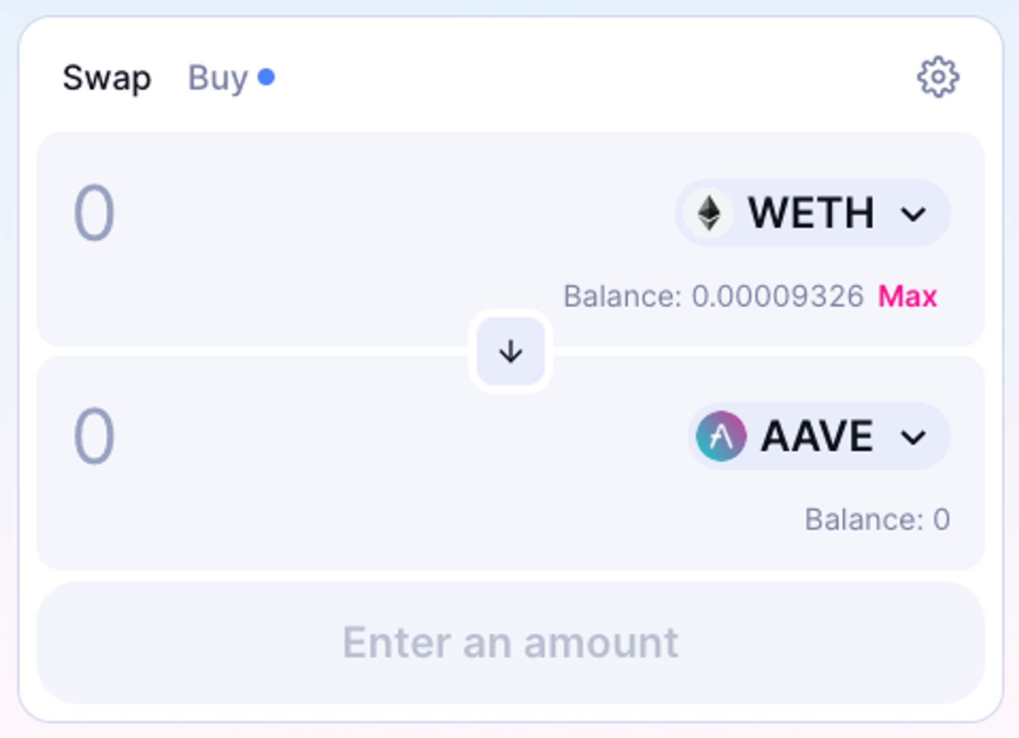
USD equivalent should always be shown
Fairly obvious, but a surprising number of apps don’t do this.
Contrast ratios should meet AA accessibility standards
Because accessibility is important and makes things better for everyone.
The token dropdown should probably be on the right
Both have their advantages, but I’m leaning towards the right side because:
- Most users read left to right and top to bottom, so we terminate our scanning at that point.
- People also tend to expect the most important text on the left.
- Right-handed mobile users won’t have to reach their thumb so far to control the token dropdown.
I could be persuaded of the opposite, except that after writing my initial article in 2021, at some point Uniswap swapped them over. See old vs new below. Honestly, if I hadn’t written a whole article analysing dex UI in minute detail, with many screenshots saved for posterity, I’d have assumed this was a Mandela effect and I was going crazy… “the tokens were on the left, I’m telling you, I remember them! We’re in a different timeline!”
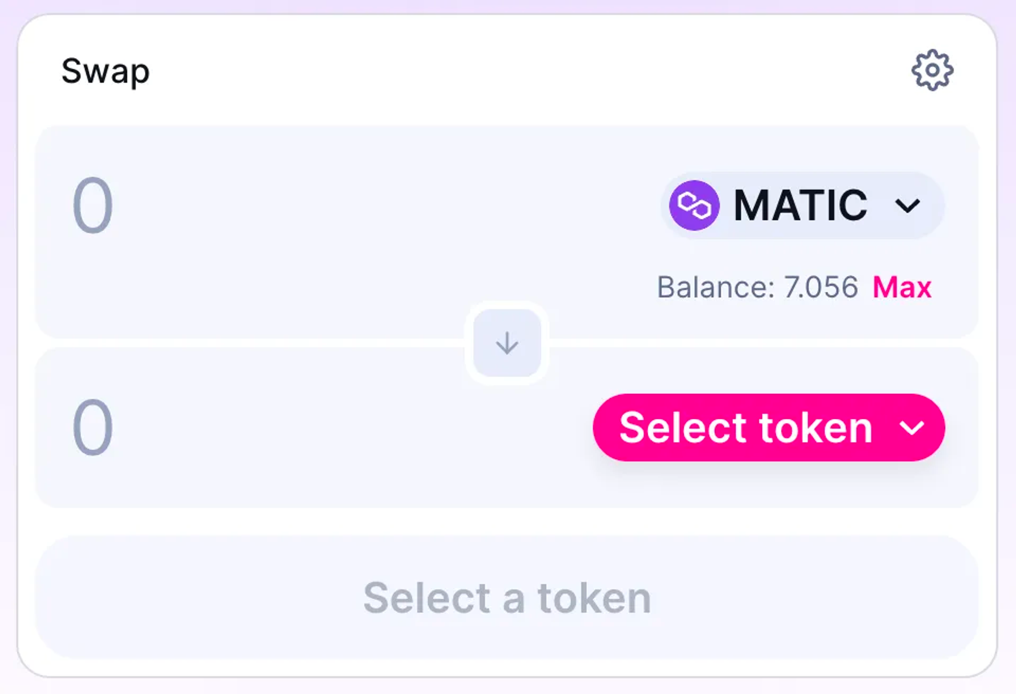
A 50% button is useful in DeFi
This is because you need TWO tokens for a liquidity pool in a 1:1 ratio. I’ve watched people add liquidity before and it’s a fairly common action to take one token, swap 50% of it for a different token, then add both to the pool. That 50% button is an accelerator and much appreciated by advanced users. For this reason I don’t think there’s much need for a 25% and 75% button, because they’re not used as much. But the 50% swap button is uniquely useful for LPs.
White space is appreciated
No need to make things super tight. An easy way to get this right is to actually design mobile-first. Make it as spacious and comfortable as you can. Then flip back to desktop screen.
Price chart
Useful, but not essential. Have the option to hide it. Many beginners prefer the layout of Uniswap to the advanced trading layouts of Binance or other CEXes. Keeping it simple is appreciated.
Max button
Definitely have one
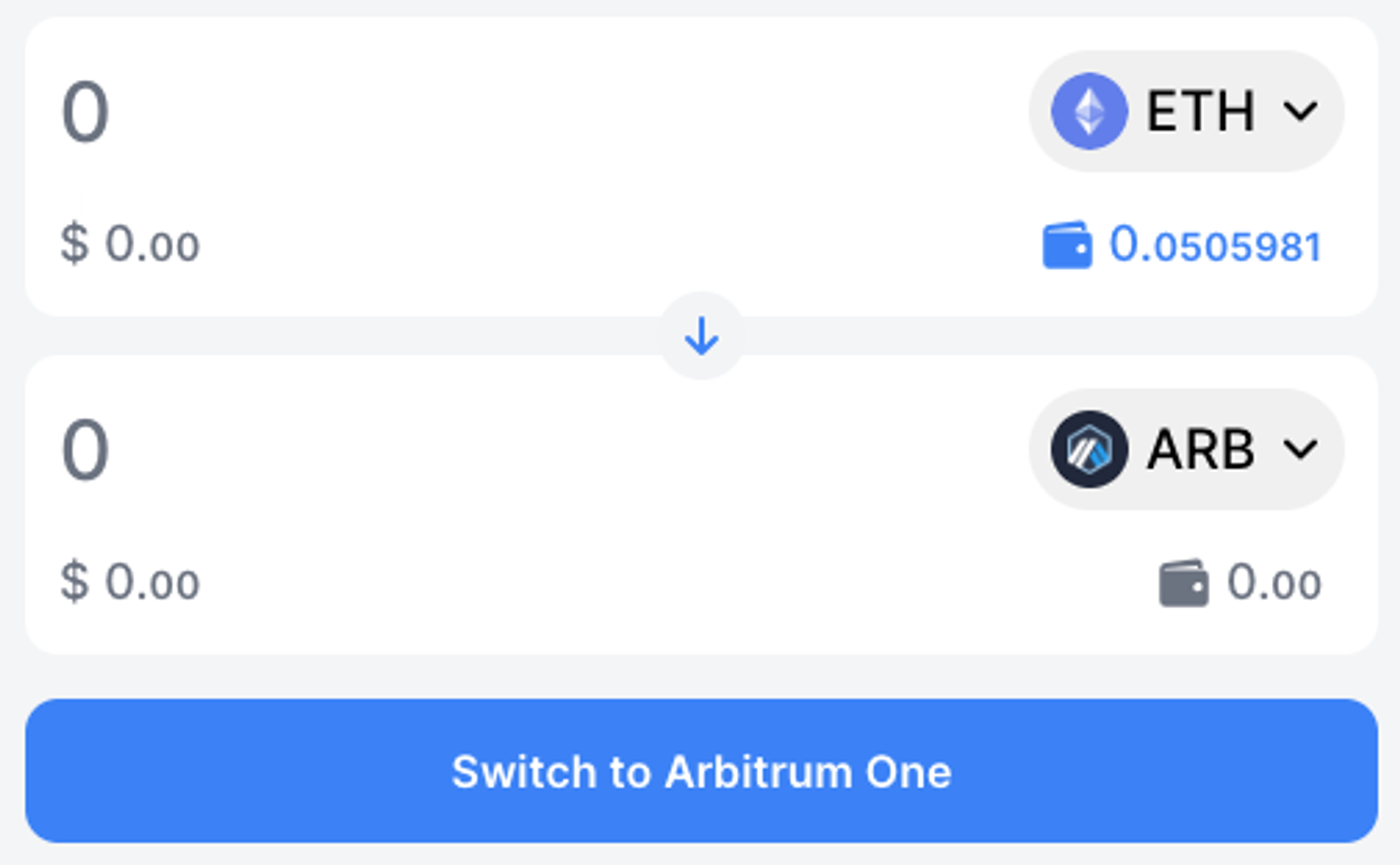
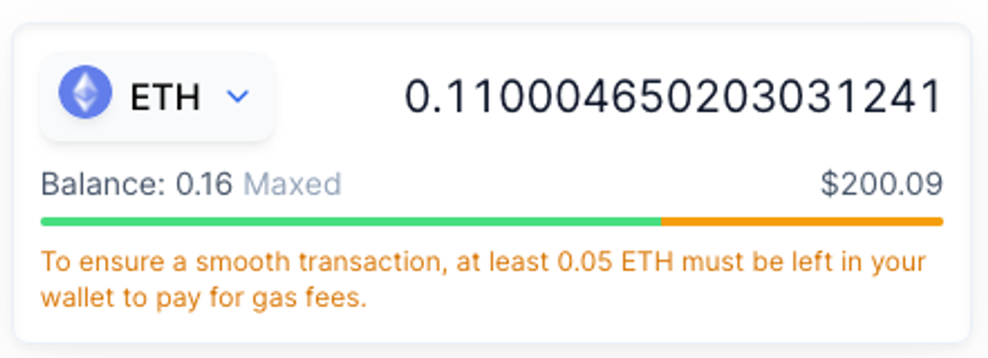
Warning to leave amount to pay for gas
Balancer pioneered this feature and it is one of the best UX improvements I’ve ever sen in DeFi. When swapping a native token, you need some of that token to pay for gas. Therefore, you should not allow the user to swap 100% of that token else it will, or worse yet, go through but leave them no tokens left to pay for further transactions.
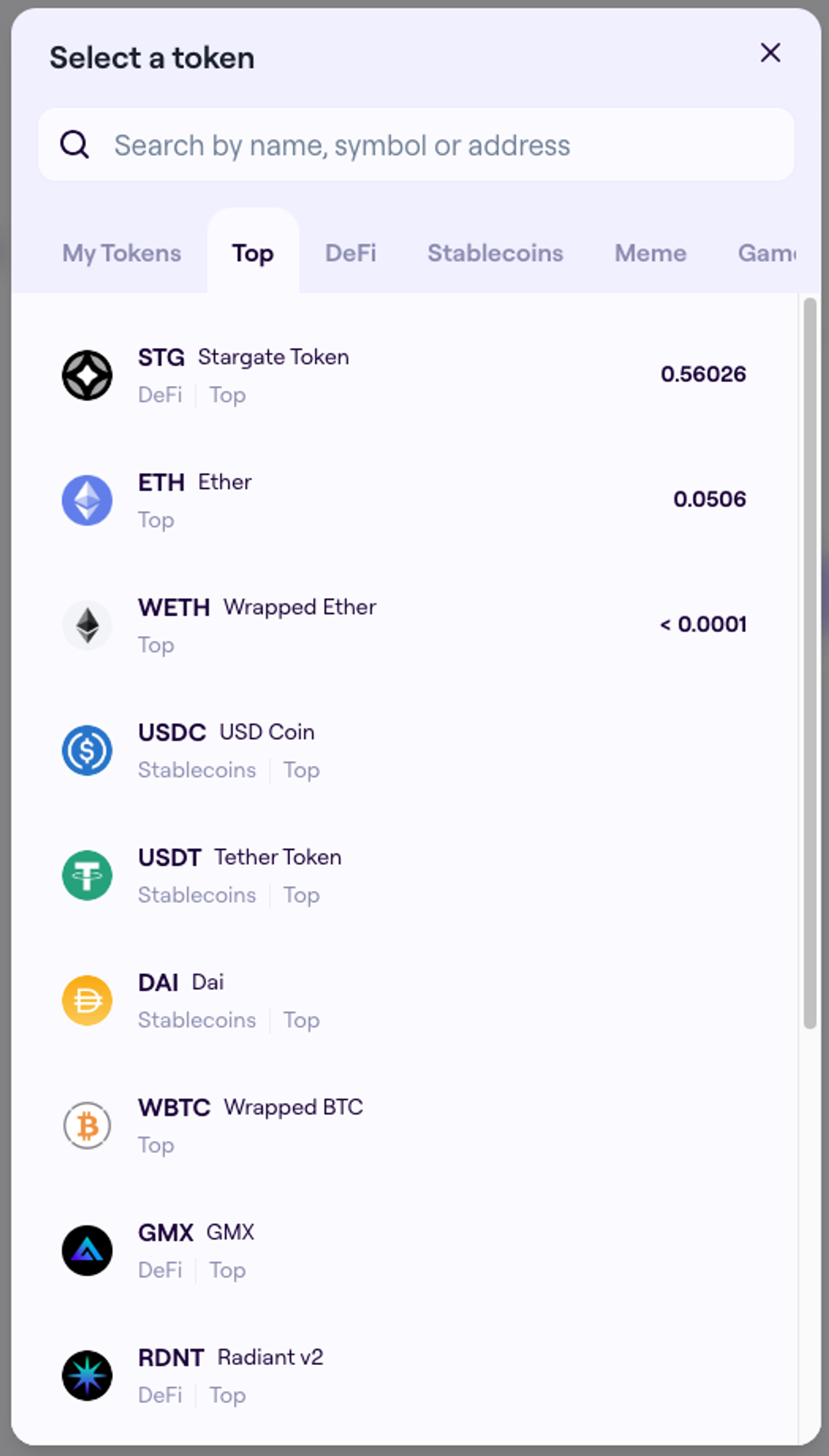
Categorize tokens
TraderJoe pioneered this feature, which groups tokens in their “Select token” menu into key categories. As the the number of crypto tokens grows ever larger, this helps users find what they’re after.