If you have a loan on a DeFi platform, the safety of that loan depends on two things:
- Your current Loan to Value ratio
- The protocol’s maximum Loan to Value ratio
In theory, this is quite simple to communicate, but in practice can become quite tricky.
How liquidation works in DeFi
The maximum amount you can borrow against the value of your collateral is known as the maximum loan to value ratio.
This ratio is determined by the protocol and will usually be somewhere around 65-90%. If you exceed this level, your collateral will start being sold to cover the debt.
This being crypto - and stomach-churning volatility being the norm - the value of your collateral can swing up and down.
This can put you at risk of exceeding the max LTV.
How to show risk
tldr; there is no standard way of showing this risk. This is annoying.
Basically, we need to show the difference between the user’s LTV and the max LTV.
The smaller that difference, the riskier their position is.
This apparently simple problem is surprisingly difficult in practice.
This is partly because of how we visualise numbers:
- We think of values “going up” and “going down”.
- We think of 1 as being “low” and 10 as being “high”.
- We think of progress bars “increasing” to the right and “decreasing” to the left.
You will see what I mean with the following examples.
Abracadabra
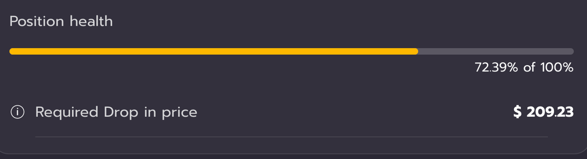
Scale
0% → 100%
100% = bad
When this bar is at 100%, this means there is no difference between my LTV and the max LTV. Therefore I will be liquidated.
In other words, when my position’s health is 100%, it will die. 🤣
Abracadabra also show a "required drop in price" which again points to the inconsistent match between language and visuals… this is useful info but we think of the price "dropping" and causing the health level to "fall", yet the health bar goes "up" to 100%, which is bad…
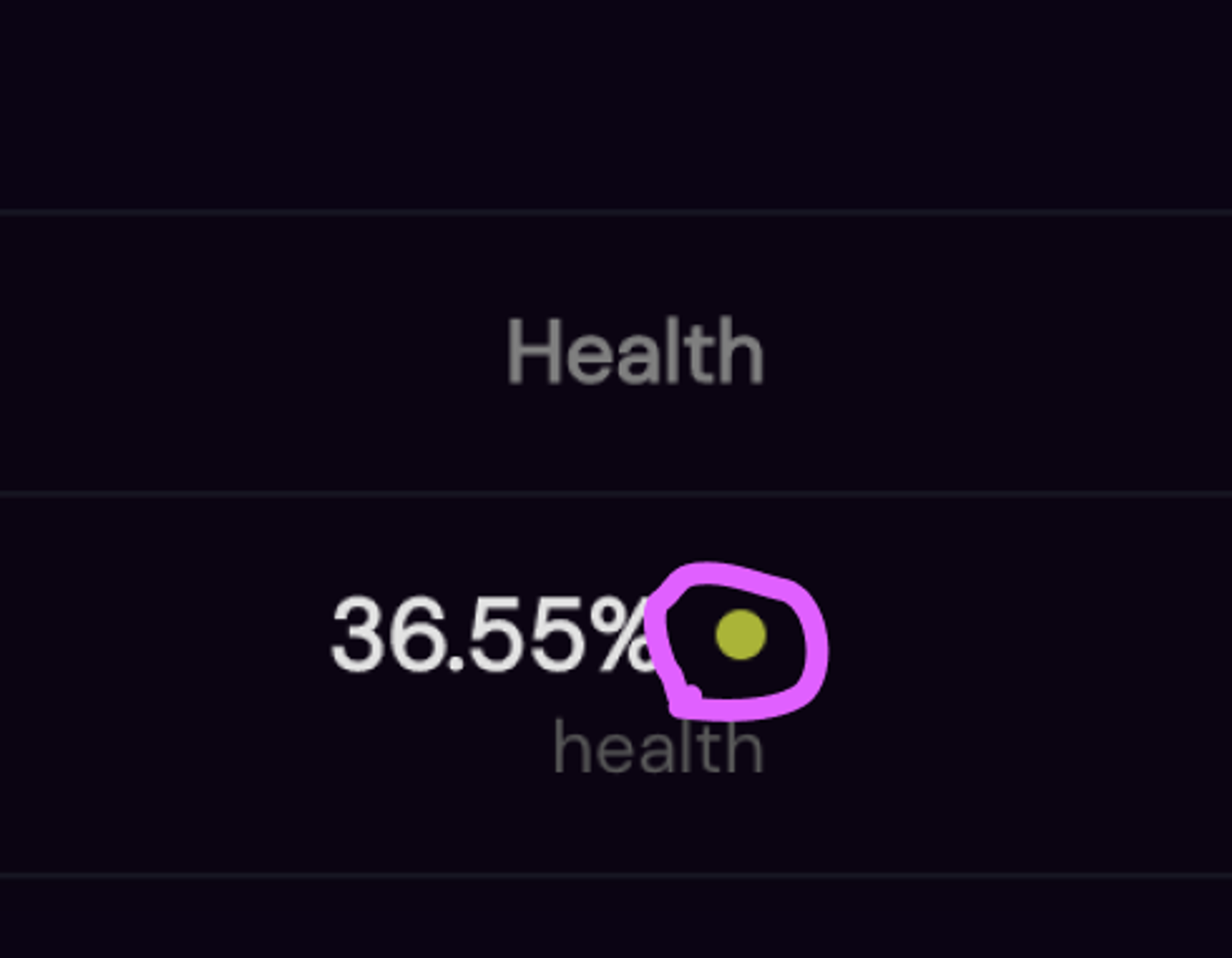
Sushi
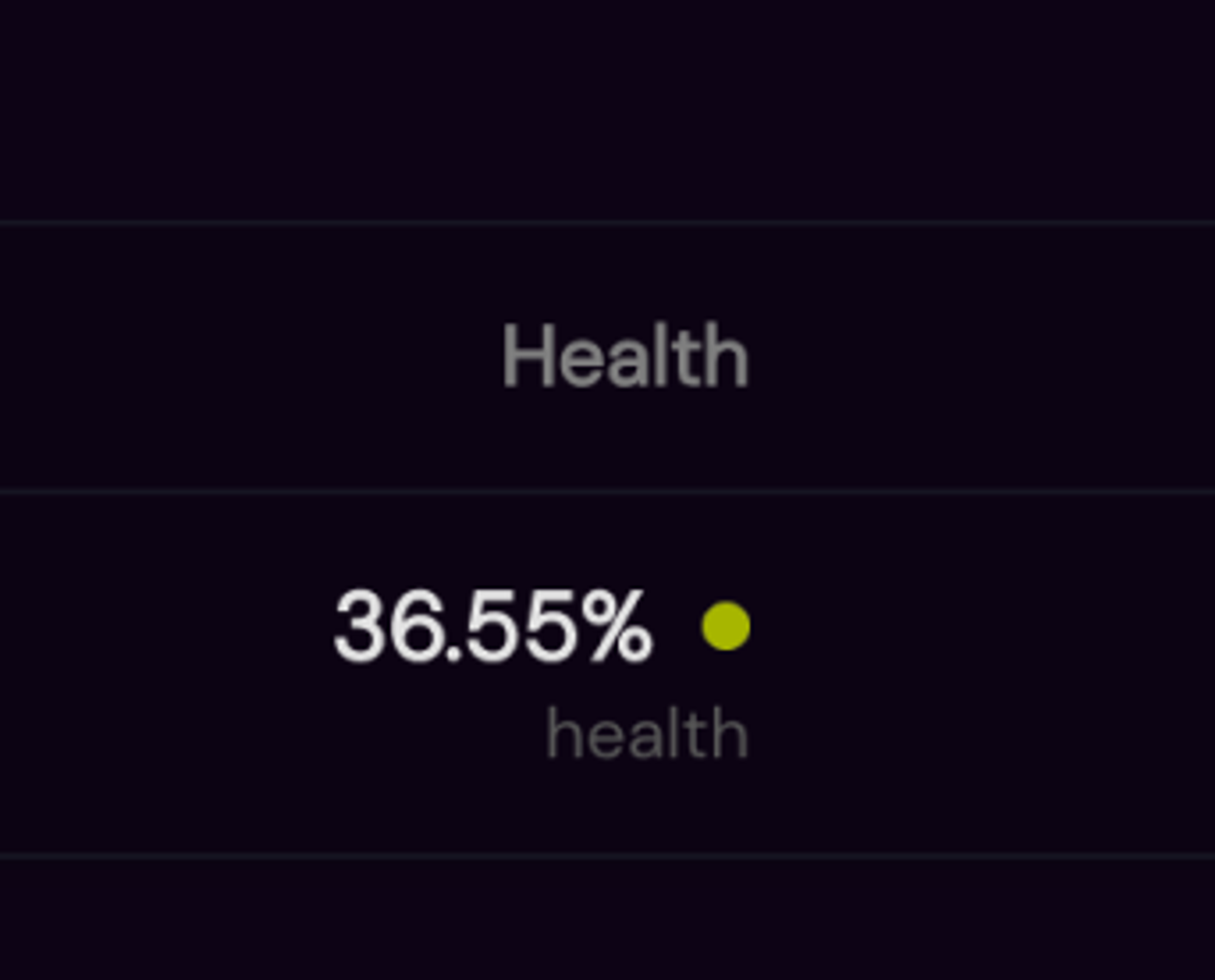
Scale
0% → 100%
100% = bad
Same as Abracadabra, but no progress bar. A traffic light dot instead.
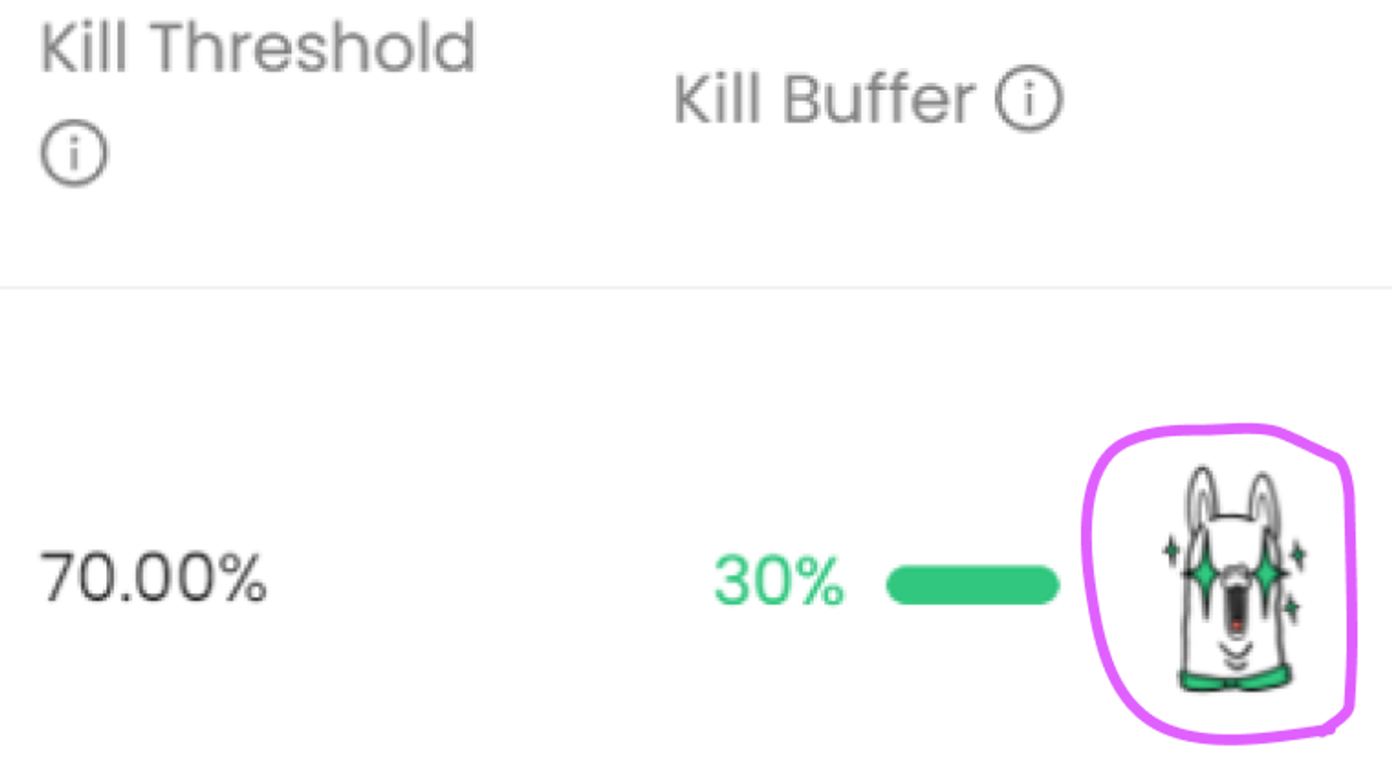
Alpaca Finance
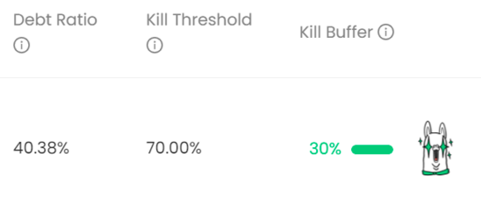
Scale
0% ← 100%
0% = bad
Alpaca show the BUFFER between LTV and max LTV instead. This inverts the usual data and as the difference between your debt ratio and the liquidation zone decreases, so does the bar. This seems more reasonable. Alpaca have a better grasp of visualisation and they call the difference the “Kill Buffer”. They also add a cool illustration.
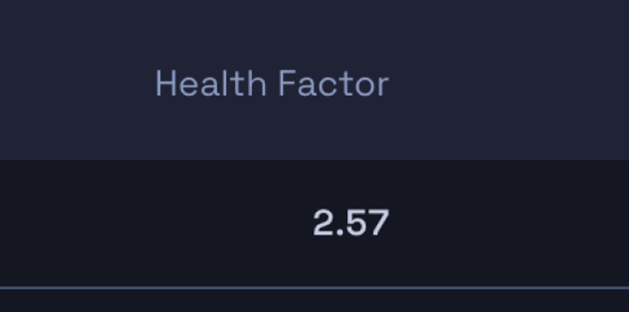
Aave
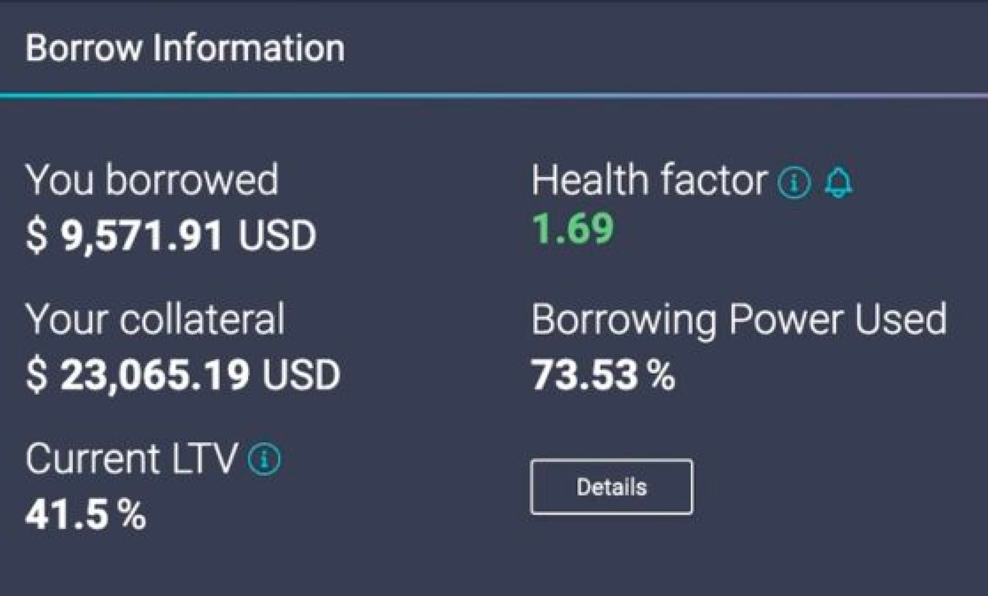
Scale
1 ← ???
1 = bad
Aave do their own thing here and introduce a “health factor”. When the number hits 1, you get liquidated. I don’t see how this is intuitive. Surely if you’re going to have a sliding scale that moves negatively, you would make it end at zero? Nor is it clear how this relates to the 41.5% current LTV.
Angle
Scale
1 ← ???
1 = bad
Same deal as Aave, but no traffic light colours.
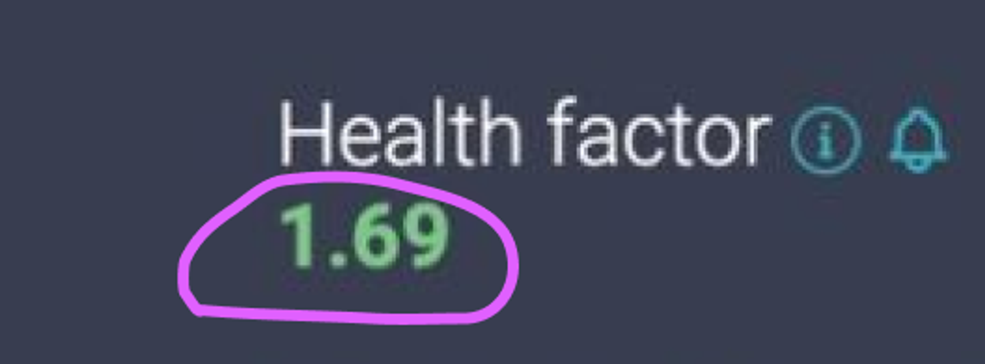
Health Factor?

I’ve actually done a small amount of user research around this. Not enough to take it to the bank, but I did speak to friends and colleagues who work in web3. Mostly pulled from a co-working space I go to, plus some telegram groups. So we’re looking at a crypto-savvy crowd but one that includes users who have never taken a loan, as well as users who use them all the time.
Admittedly, it wasn’t a huge sample size, but I quickly uncovered two things:
- Users who are already familiar with a health factor, quite like it.
- Users who who have not used a health factor, dislike it and find it confusing.
This suggests it is a sub-optimal method for explaining how safe a loan position is. If you’re a new user and you’re monitoring your loan position to make sure you don’t get liquidated, you want to quickly assess the situation and not have to make mental calculations. Some of the other tricks explained below tested much better, and were generally seen as clearer.
Other UI tricks to make it clearer
Traffic light colours on the numbers
Simple green, amber, red work very well as quick signifiers.
Illustrations
Emojis or custom illustrations like the Llama are easily recognized.
Traffic light dots
Same as putting the colour on the data, but a bit more subtle.
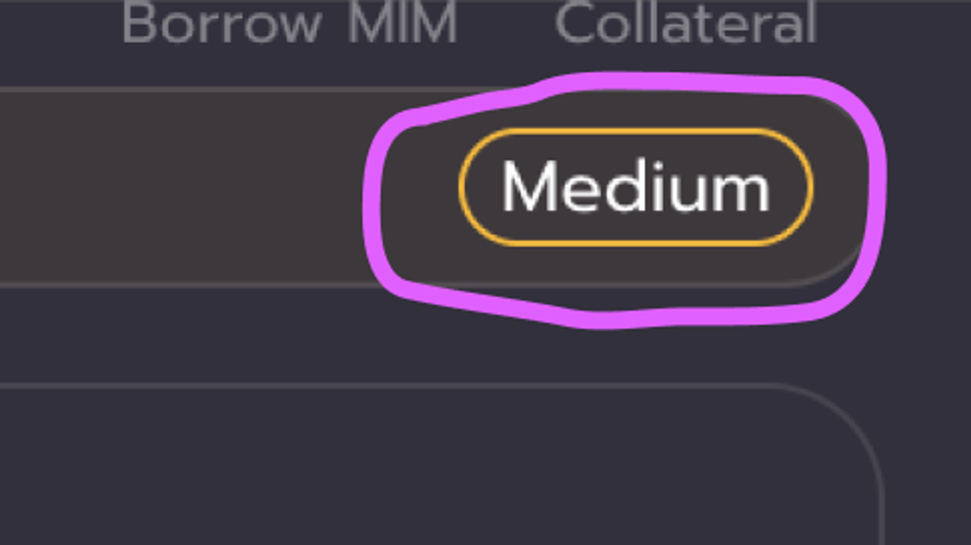
Descriptions e.g. Low, Medium, High.
The user doesn’t have to “translate” an abstract number into a status.
Conclusions
- 100% health suggests it is healthy. Do not represent a bad outcome with 100% health.
- Better to do a x → 0 scale. Or 0 ← x
- “Health factor” is very abstract and hard to understand
- Real data like “price at liquidation” or “required price drop until liquidation” are more useful
- Visual indicators like health bars, emojis, illustrations and traffic lights are helpful
- Stating risk as low, medium, high etc can make things clearer
- Too many numbers are confusing.
These can be combined together in a way that suits the project’s individual brand.