UX is BIG.
There are multiple levels to any process.
The UX can be good or bad on all of those levels.
Therefore it is not always so simple to say “The UX of this or that is bad”.
We need to break it down.
International Payments
There is the “UX” of sending any kind of money across borders, and there is the “UX” of the particular app you use to do it.
You could argue that sending stablecoins internationally is a much better experience than sending FIAT. It’s pretty much instant, and the fees are minimal. If you try to send FIAT it could take a couple of days and you’ll be charged fees at every step. On the other hand, some of the international payment apps are pretty good these days. It’s a more familiar and accessible process than the crypto equivalent. Most people have a smart phone and some fiat currency. Most people don’t have an exchange account, a wallet, and some crypto.
Parts of the user experience are better than the current standard. But a lot of the other steps are worse than the current standard.
ㅤ | Crypto | Fiat | Winner |
Speed | Fast | Slow | Crypto |
Cost | Low | Moderate | Crypto |
Accessibility | Low | High | Fiat |
Middlemen | Low | High | Crypto |
Awareness | Low | High | Fiat |
App UI | Moderate | Good | Fiat |
Integration | Low | High | Fiat |
This is also why there is such opportunity here.
If we really want to understand web3 UX, we need to look at the big picture, and see which levels need attention.
In Web2, there is the Nielsen-Norman model:
- Interaction level
- Journey level
- Relationship level
Infographic
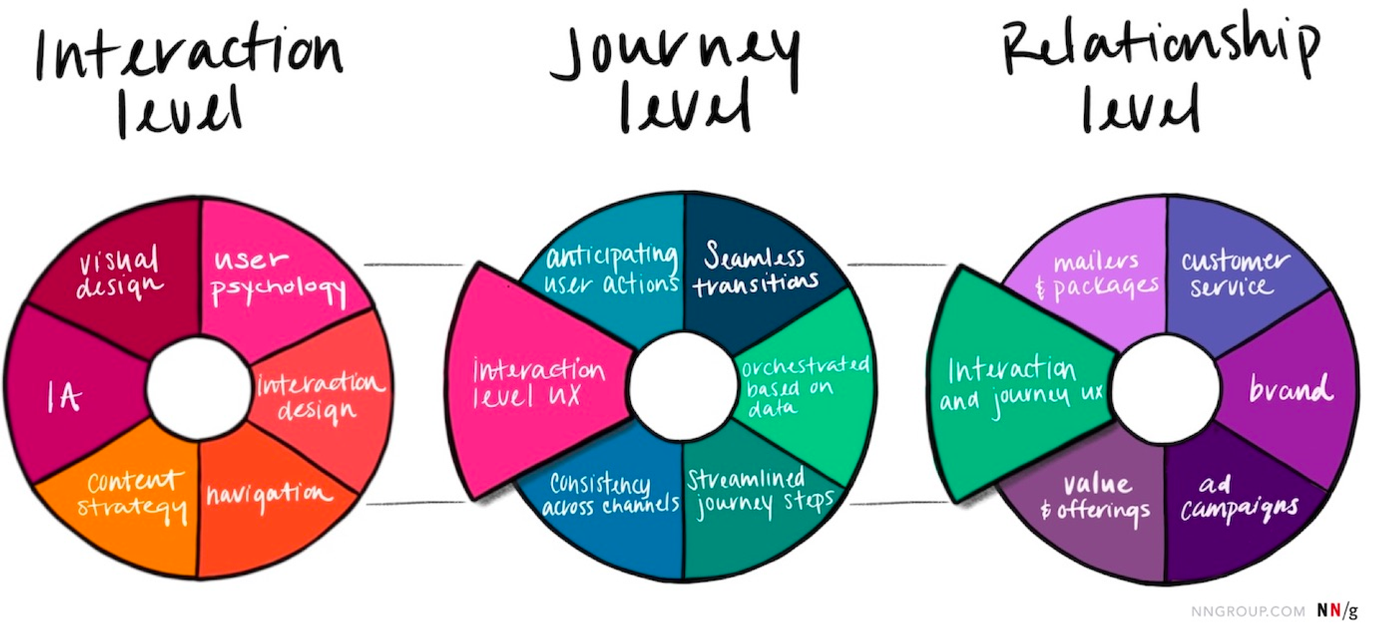
The three together cover the entire user experience from real world to digital. This framework is often used in CX Design (customer experience) and Service Design. In most cases, a person has made many decisions before they even get to your app or website.
If we zoom out even further, we see there is usually a core problem that your company is trying to solve. This is often an annoying issue in real life, and your product has innovated some way of improving this deep frustration.
graph TD
  Annoying_shit_irl --> thing/app_that_might_help --> the_actual_UI
Sometimes, we can make the biggest impact on people’s lives by dealing with that first bit. It’s just much harder to do, and usually requires major shifts in technology, policy or society.
The classic example here is the apocryphal Henry Ford quote:
“If I had asked people what they wanted, they would have said faster horses.”
What people actually wanted was “to get places faster”. This could be solved by a car. But that solution could only really take off after increasing awareness, plus an ecosystem-building effort of building better roads, overhauling the entire manufacturing industry, and passing appropriate laws.
Seeing the link here…?
If we look at something more modern like Netflix, we can again see multiple levels to the experience. The core user story is something like “people want high-quality entertainment”. The solution used to require DVDs, but now means a digital streaming platform. Which requires expert commissioning and curating. Users also want to see HD video, which requires good compression on the Netflix side and good internet connection on the user side. And they want to find the stuff they like, which requires a good UI, excellent information architecture, and clever recommendation algorithms.
In both cases the “User Experience” encompasses much more than you might think.
The Four Levels of Web3 User Experience
In the case of web3, we see four different layers. Each pose specific UX challenges.
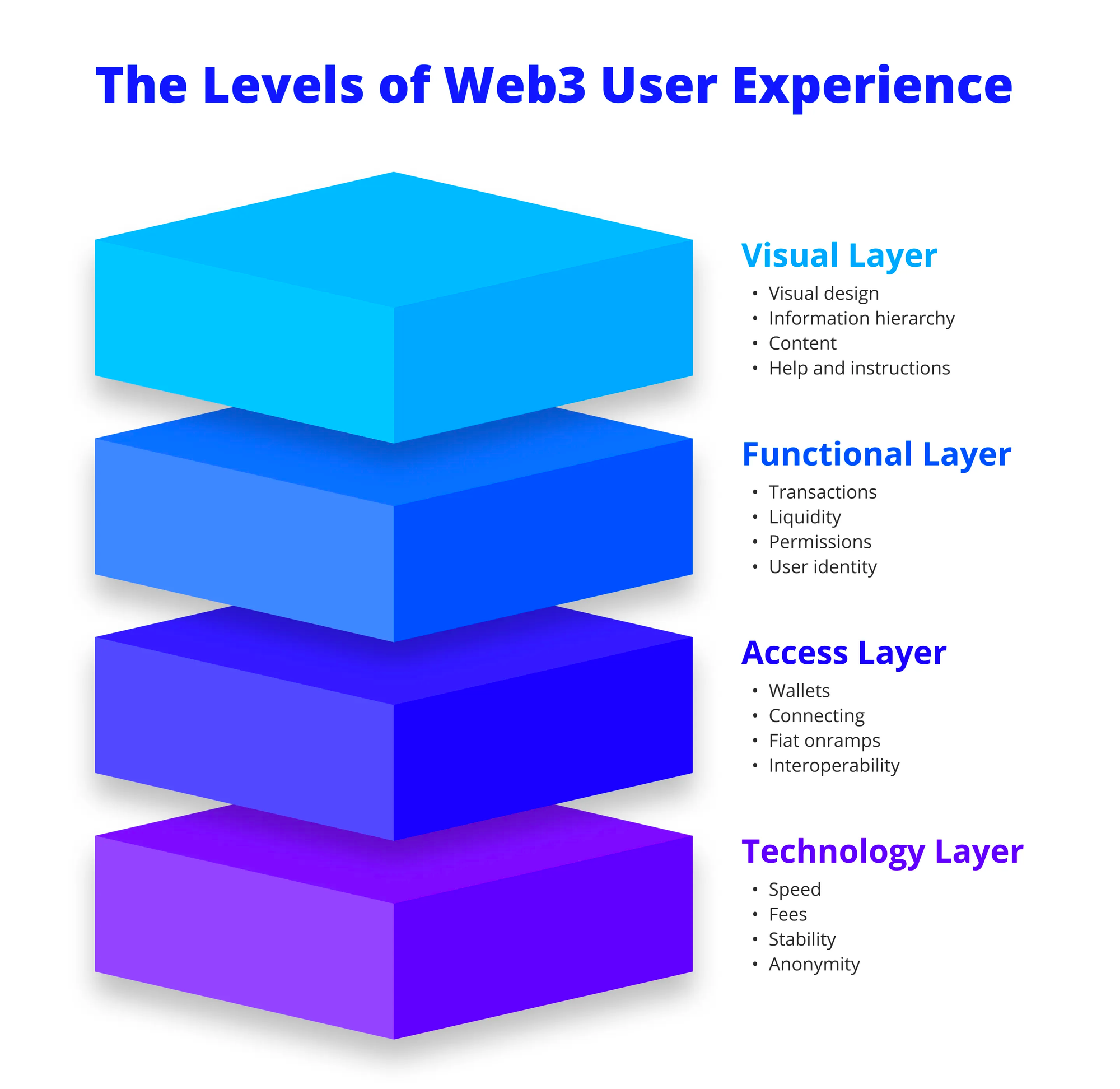
Technology Layer
- Speed
- Fees
- Stability
- Anonymity
Access Layer
- Wallets
- Connecting
- Seed phrases and security
- FIAT onramps
- Interoperability
- Web extensions
- Mobile experience
- Internet speed
Functional Layer
- Making transactions
- Liquidity
- Yield farming
- Smart contract interactions and permissions
- User identity
- Governance
- Token types
- Web3 sign-on
- Displaying NFTs
- Ownership of in-game assets
- Sending things cross-layer or cross-chain
Visual Layer
- Visual design
- Information hierarchy
- Navigation
- Content
- Help and instructions
It’s helpful to consider each layer of the experience to see where improvements can be made
Break it down

Technology Layer
When you look at the actual technology layer, I would argue the UX is already better on DeFi. Sending large payments internationally usually requires a waiting time, fees, and in some cases, security checks with intermediary banks. It’s also hard to track. On the blockchain it sends quickly, cheaply (tho not always 😟), and can be verified by anyone.
The UX challenges at this level are:
- increasing speed to rival or exceed the VISA network (tps)
- improving the stability and security of blockchains
- reducing fees to less than Western Union or Wise
- making transactions verifiable (and/or secret)
These are some of the biggest challenges to be solved. Yet they have nothing to do with an interface. In this light, layer 2 blockchains are direct attempts at improving overall UX.
This sort of thing becomes even more important when you consider non-defi stuff like onchain identity. If one day we are going to be using our self-custody wallets to login to services and keep our data out of the hands of web2 companies, then we really, really, need fast and secure networks.
Access Layer
Imagine the year is 1996 and you’re hearing about this wonderful new thing called the internet. First of all, you’re going to need a PC with a modem and you’ll need to connect it to the phone line. Once you “dial up” to “surf the web”, you won’t be able to answer calls. To actually do stuff, you’ll then have to set up an “email address”, which might be “pop3” or “imap”, use a “browser” and, if you want to be a pro, learn about “telnet” and “ftp”. Somehow you’ll manage it anyway and things will never be the same again.
The UX challenges at this level are:
- making a wallet that is as easy to use as a banking app and/or browser
- creating a web3 single sign-on
- frictionless FIAT onramps
- unifying chains or creating a “layer x”, so manual bridging is not required
- human-readable addresses (ENS is a step in this direction)
- educating people about self-custody and privacy
- putting crypto into the hands of many
- stepping beyond the current browser paradigm
Functional Layer
What we talk about when we talk about web3 UX. One thing to consider is that some of this stuff is necessarily strange because it’s also brand new. New functions will always seem hard to begin with. A few years ago, nobody had ever heard of NFTs or AMMs. Now we’ve got them, we need to figure out how best to use them.
The UX challenges at this level are:
- making transactions intuitive
- abstracting away complicated strategies (easy yield farming and auto-compounding)
- simplifying actions (e.g. using zappers, wrapping tokens automatically)
- creating flexibility and forgiveness in the system (sending tokens to the wrong network)
- making it easy and beneficial to participate in governance
- making NFTs meaningful and useful
- moving ownership of in-game assets to the user, not the manufacturer
- increasing the ways NFTs can be shared and displayed
- improving cross-chain and multilayer compatibility (most users probably don’t want ten different forms of USDC)
An important note at this level is that a lot of these problems have been partially solved by some of the crypto apps. The downside is that in most cases, you are trading some decentralisation for better UX. Crypto.com allows you to send tokens for free to other crypto.com users. Most exchanges will let you choose which network to withdraw on (mainnet or Polygon etc), Binance will farm your tokens for you and give you some interest, but you won’t have control over their strategy. Celsius did the same thing and it didn’t work out so well.
Visual Layer
What you see and try to understand. Are we using consistent design patterns, based on user research? Is the terminology too technical? Does everything look ok on mobile?
The UX challenges at this level are:
- following accessibility best practice
- reducing the use of technical terms
- making the important stuff stick out
- hiding away the irrelevant stuff
- creating easy to follow instructions
- driving inclusivity
- signalling “friendly” and “welcoming”, not “scary” and “exclusive”
- being A E S T H E T I C
- retaining personality, while building for the many
A User Story that will always need answering
“I want to deposit USD and earn the highest interest.”
Motivation: users want their money to work for them.
This problem appears at each layer in different forms:
Technology:
- Users want to do this quickly and cheaply. This means using a fast and cheap blockchain.
- Currently various layer 2 solutions and alternative layer 1s are competing to offer this.
- What will be the fastest, most secure, blockchain in the future? How will it solve the blockchain trilemma?
Access layer:
- users don’t understand the different types of stablecoins
- don’t know how to swap assets
- don’t have multiple wallets
- don’t have the ability to seamlessly use digital currency for purchases - they still have to swap back to fiat money to do things in the “real” world.
- don’t know where to find the best farming opportunities.
- Fiat onramps should be incorporated into simple mobile wallets installed by default on mobile phones. There are now a few crypto phones being released. Maybe one day, blockchains will be fully integrated and digital currency will be the mainstream.
Functional layer:
- Users don’t want to spend time and effort bridging USD into multiple different forms (USDC, usdc.e, axlUSDC, multiUSDC, sUSD etc etc)
- Manual yield farming is a pain.
- How can all of this process be abstracted away without the user knowing?
- How many steps will need to be approved?
- Users won’t want to claim different tokens or manually sell them.
- There should be a one-click deposit, which immediately gives the best apy.
Visual layer:
- users want the process to be as simple as possible with clear language and instructions.