These can get very tricky, very fast. One of the first things people notice when they start using web3 is that they have to click on a lot of stuff.
But by breaking transactions down into a basic flow, and extrapolating from the seven heuristics, we can define best practice guidelines.
Let’s say you want to perform a DeFi action, such as deposit tokens into a yield-bearing vault, borrow stablecoins against collateral, or withdraw tokens from a contract. It’s possible that each of these actions may involve multiple transactions, which will need confirming in your wallet.
In Web3, there are actions you can take in the UI, and actions you can take in the wallet.
Users can feel uncomfortable if these two strands are not integrated carefully.
Takeaways
- Combine “approval” and “make transaction” into one action
- Show the user how many steps there are
- Tell the user what is happening or what is required
- Design two action states:
- Action needed in UI
- Action needed in Wallet
- Design three process states:
- Pending
- Success
- Fail
- Use animations, artwork, and friendly language to humanize the journey
- On the error state, give the user the chance to “try again”
- On the success state, celebrate the moment with fun artwork or animation.
Why are transactions so complicated?
User needs
In general, users want:
- To control from the app, not the wallet
- To see feedback after each action.
Solutions
To meet these needs, we need to reduce the dissonance of switching between app and wallet popups by bundling actions together, so the next prompt appears as soon as the last one is completed.
Whenever the user does something (approves, confirms, or otherwise clicks), the system should assure them that this has been registered and stuff is happening on the backend.
Example flow: Add liquidity
This is what it typically looks like:
- Approve token 1
- click approve button in UI
- Metamask pops up, move mouse and click there
- Approve token 2
- click approve button in UI
- Metamask pops up, move mouse and click there
- Deposit tokens
- click deposit button in UI
- Metamask pops up, move mouse and click there
Some UIs have one or two buttons for “approve”, then another button for “deposit”. Do not do this. Instead have one button saying “deposit” (or whatever the action is) and make each wallet confirmation pop up automatically. The user just clicks through metamask, saving them a considerable few milliseconds of moving the mouse and clicking buttons.
This deserves repeating in a bigger font:
Make each step follow on automatically from the last
Even if you bundle the steps, however, the user flow can still involve a surprising number of steps. This is made more confusing because the process is split across two different UIs: the wallet and the app. In the example below, a second step is initiated automatically. The user does not have to click another button, but the UI gives them feedback after each step.
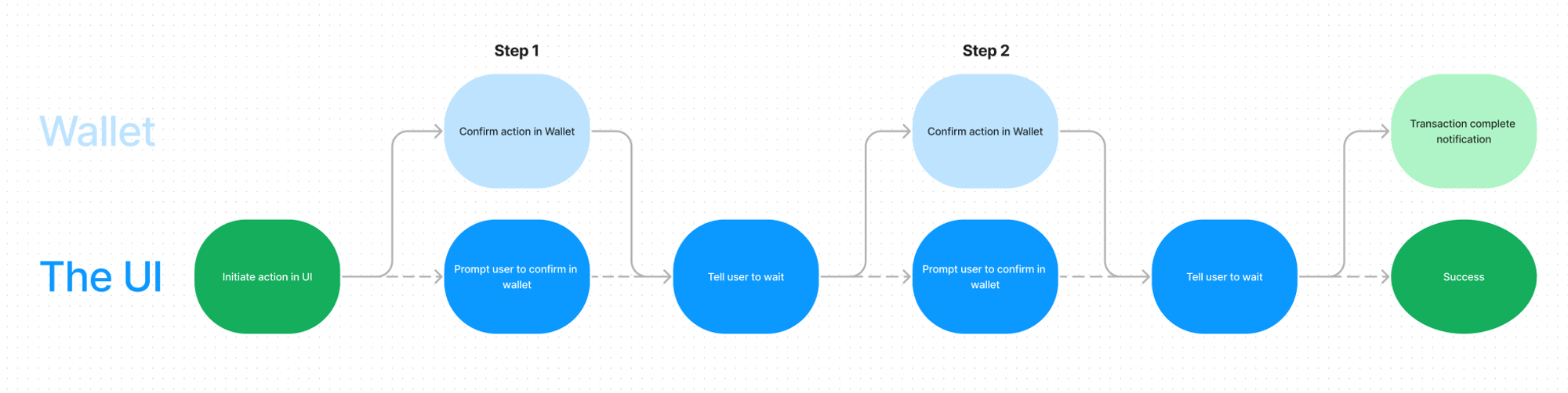
This is with only two steps. Imagine if there were many more!
This also does not show exactly how the feedback is given. Most web3 protocols utilise snackbars to show a blockchain transaction. These can be combined with alerts, messages in the main CTA, steppers, and other design patterns.
More feedback is generally better than none, but aim for consistency and simplification where possible.
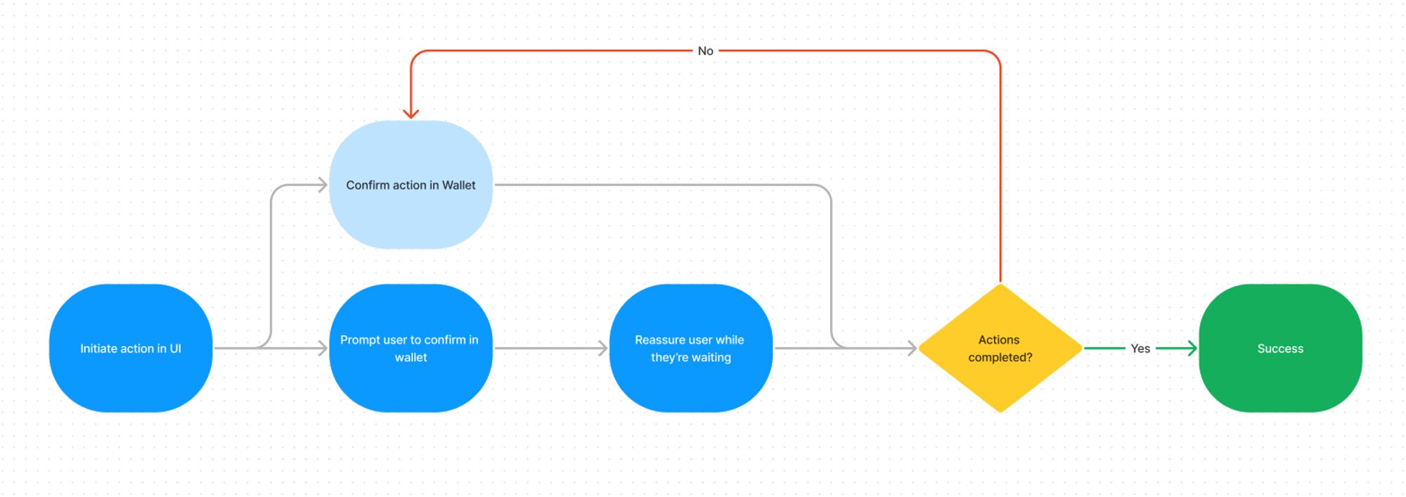
There are six states to communicate
- Action needed in UI
- Action needed in Wallet
- Waiting on transaction to be confirmed on the blockchain
- Success
- Fail
- (Cancelled)
Arguably “cancelled by user” could be combined with “failed”, as both result in the flow ending. Technically, the errors have very different causes.
Because Feedback follows action in the best UX, each state should be made clear.
The user should not be guessing what is happening.
The system status should always be visible. So if the transaction has been initiated and the user is waiting for it to be confirmed, they should be told that. If they need to click something in the wallet, the UI should tell them that. If they have clicked one thing but need to click another thing, thy should be told that too.
We can split these states up further:
Two actions required
- Action needed in UI
- Action needed in Wallet
Three process states
- Pending
- Success
- Fail
Design a screen for each.
If the user flow is turned into a loop, it would be something like this:
Show the user how many steps there will be
These states can be communicated in a number of ways. The most important thing is that the app holds the user’s hand as they walk through the process. Tell them how many there will be, tell them exactly what is happening, and use a bit of style throughout.
Here are two different approaches:
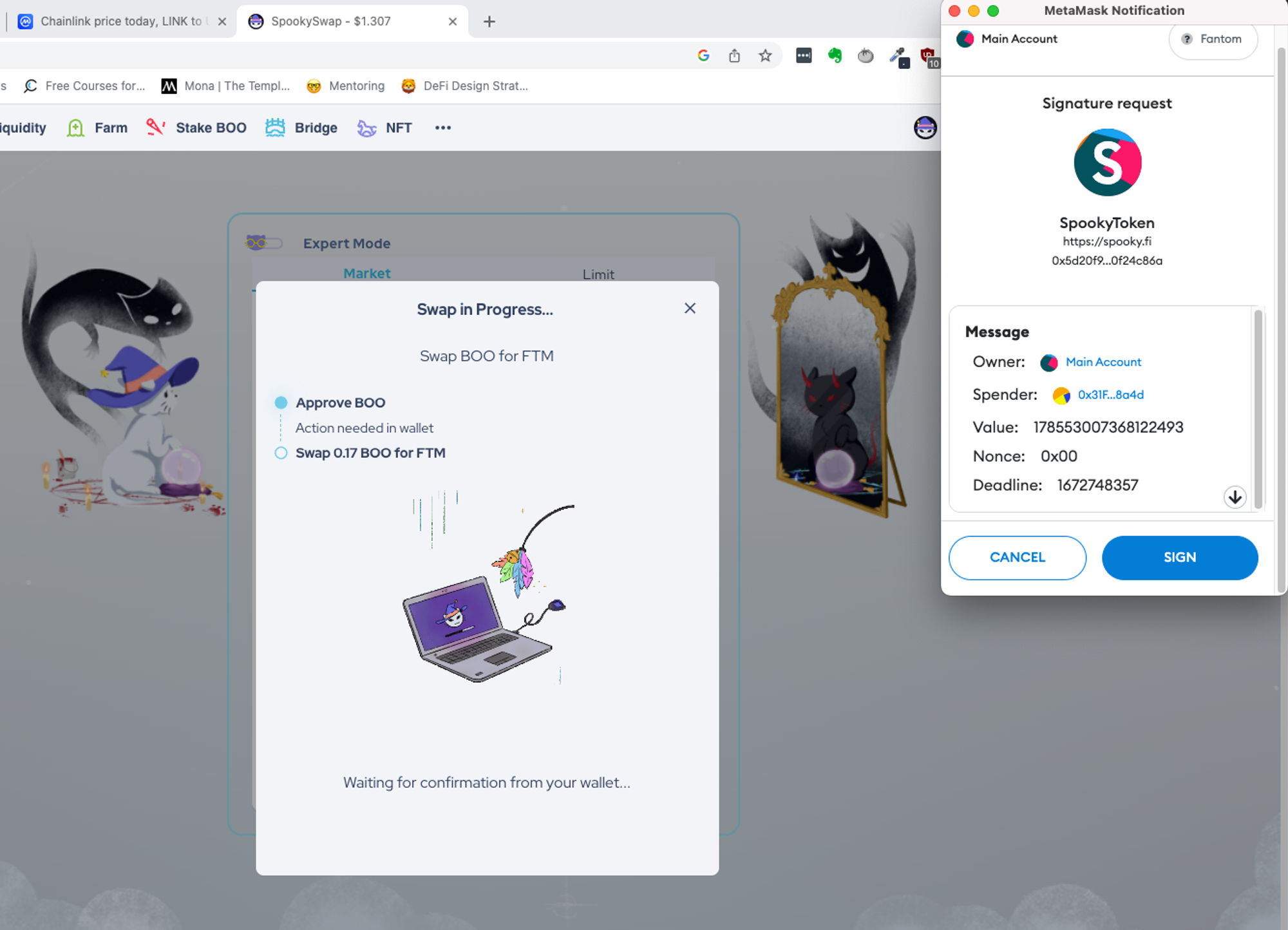
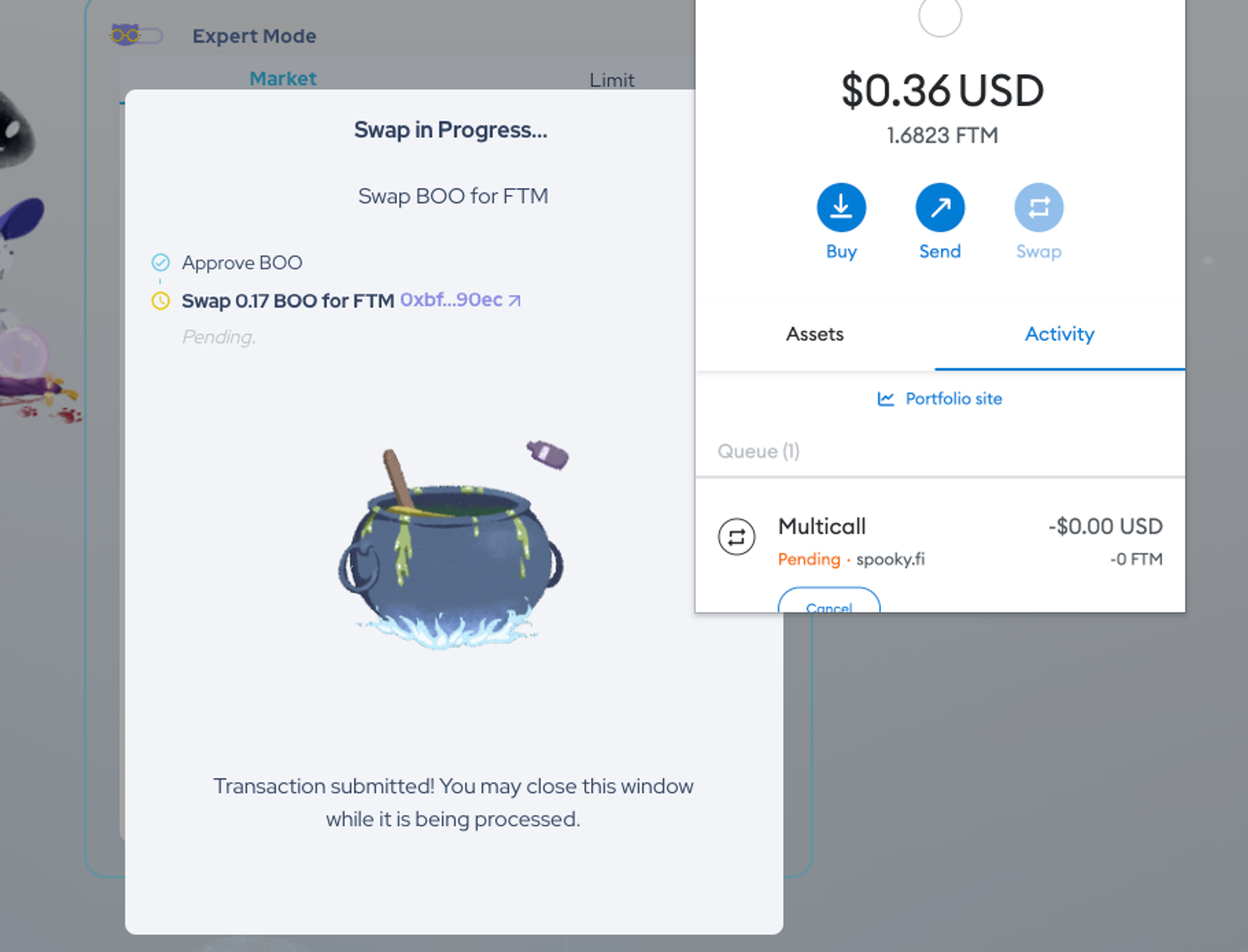
Example 1: SpookySwap
Action needed in wallet
Waiting on blockchain
Fail
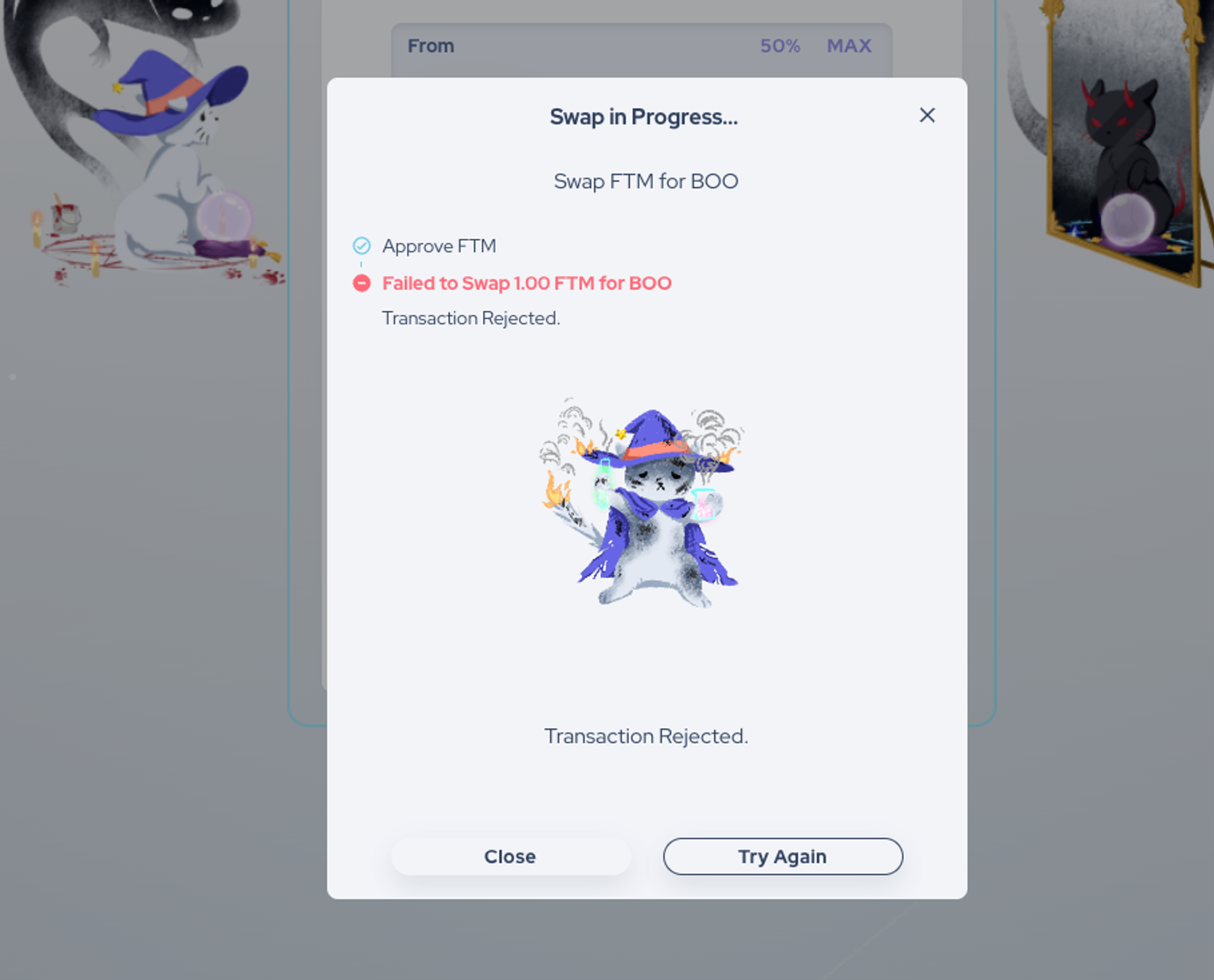
Success
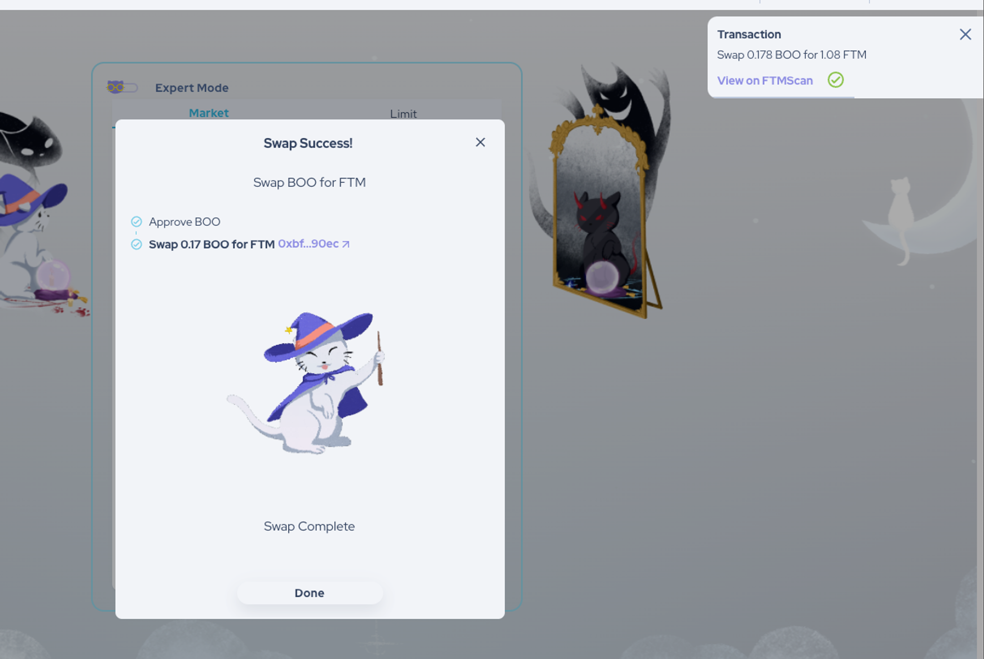
Spookyswap uses animations and custom artwork to make the process friendly and even a little bit fun. The success state has a great animation, and the fail state is made less alarming by the use of a cute cat.
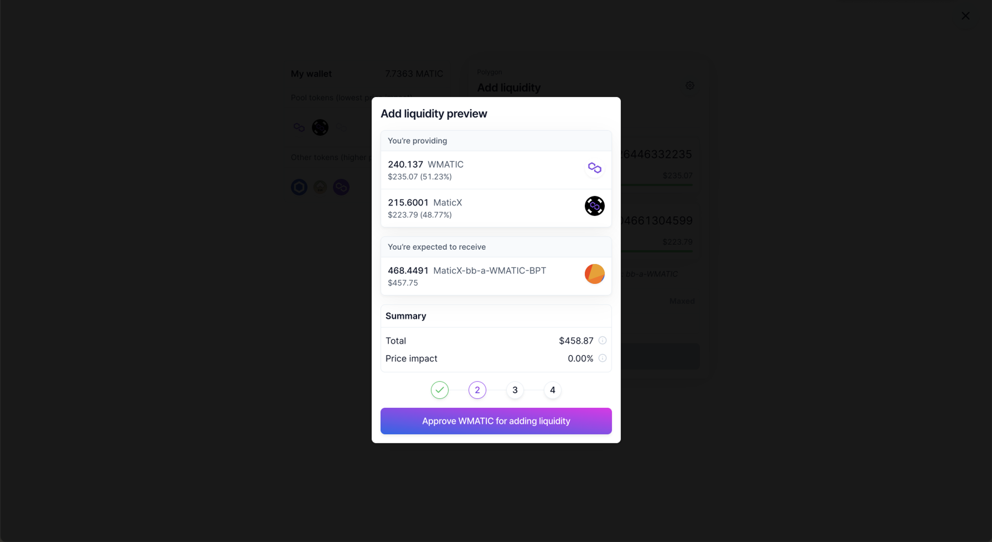
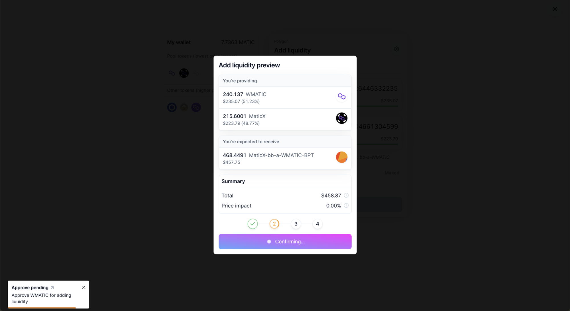
Example 2: Balancer
Action needed in Wallet
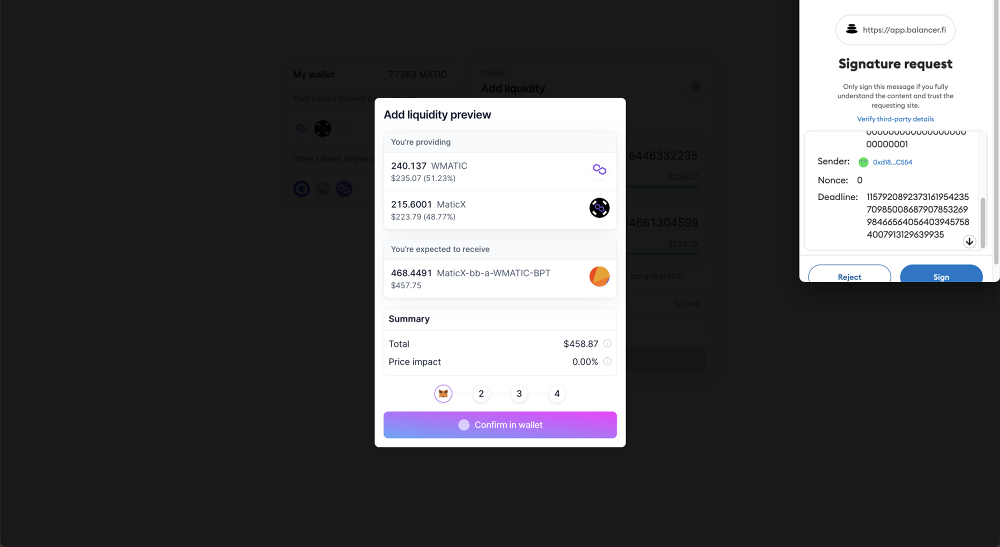
Action needed in UI
The steps are not automatic and the user has to initiate each step. However, the modal is extremely clear thanks to the opacity overlay, so at least the user is focussed fully on the steps.
Waiting on transaction to be confirmed on the blockchain
Success
There is an animated fireworks effect in the background upon completion
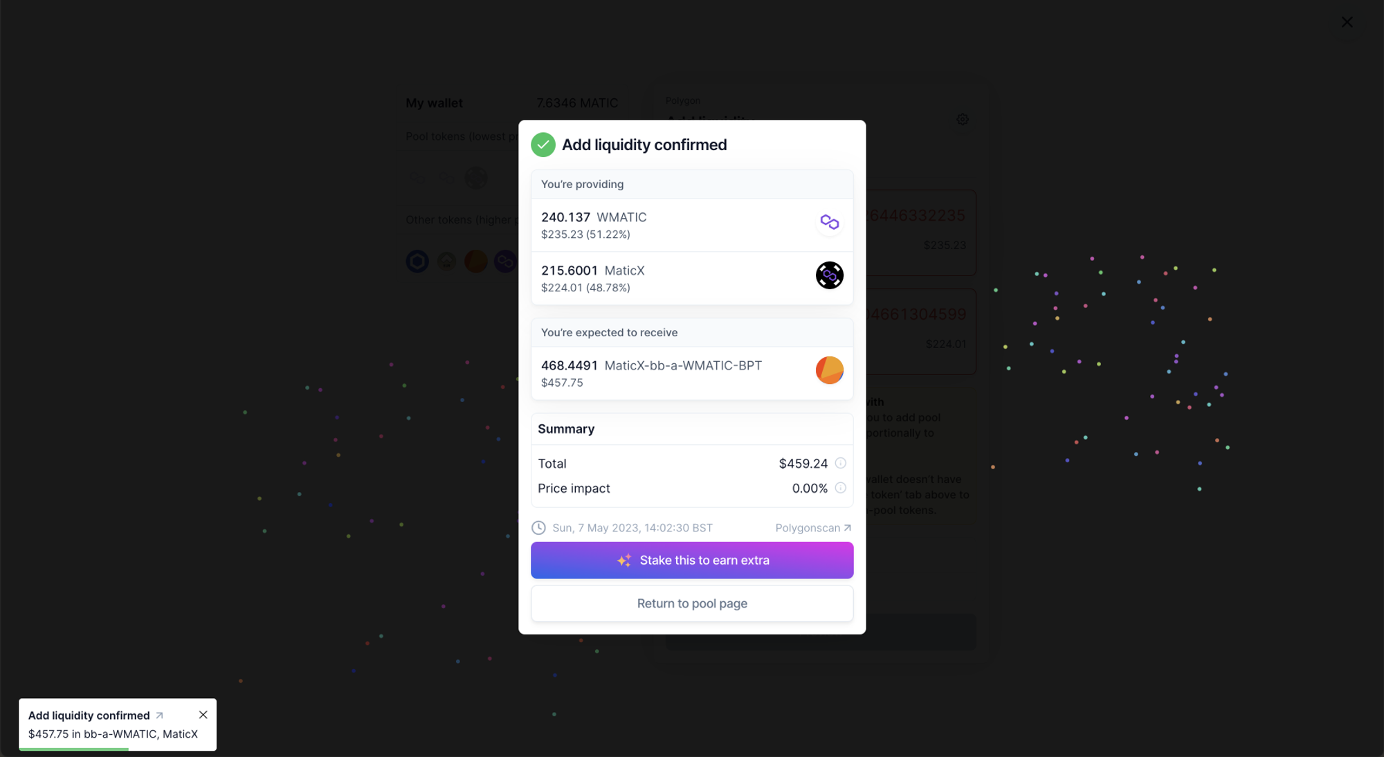
Balancer makes use of the main button and an animated stepper to communicate what is happening at each point. The result is a very consistent UI with clear feedback. There are no special images like Spookyswap, but the user is always aware of exactly where to look and click.