The first step into the big world of Web3.
Pretty important to get right.
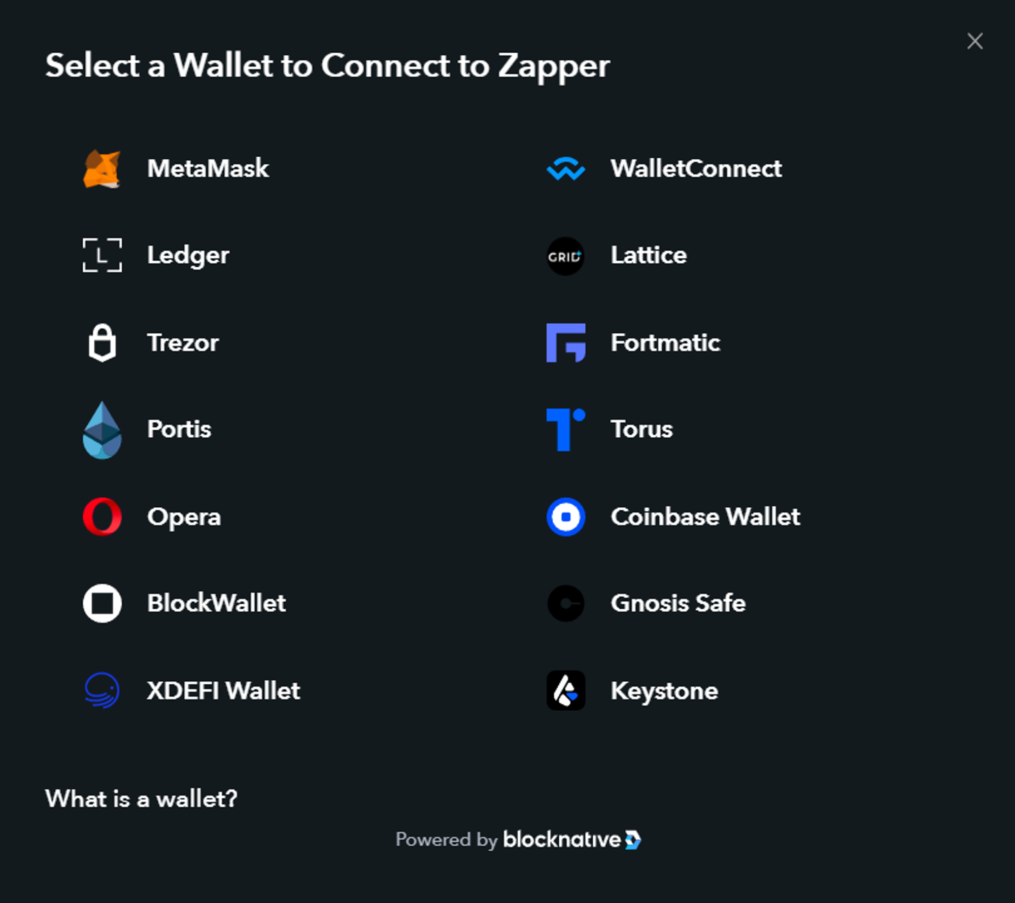
Yet here is an example from Zapper, with commentary from ChainLinkGod:

To be fair to Zapper, this is more of a technology problem than a DApp problem, and we’re stuck waiting until wallets are better integrated with browsers and web3 is just “the web”.
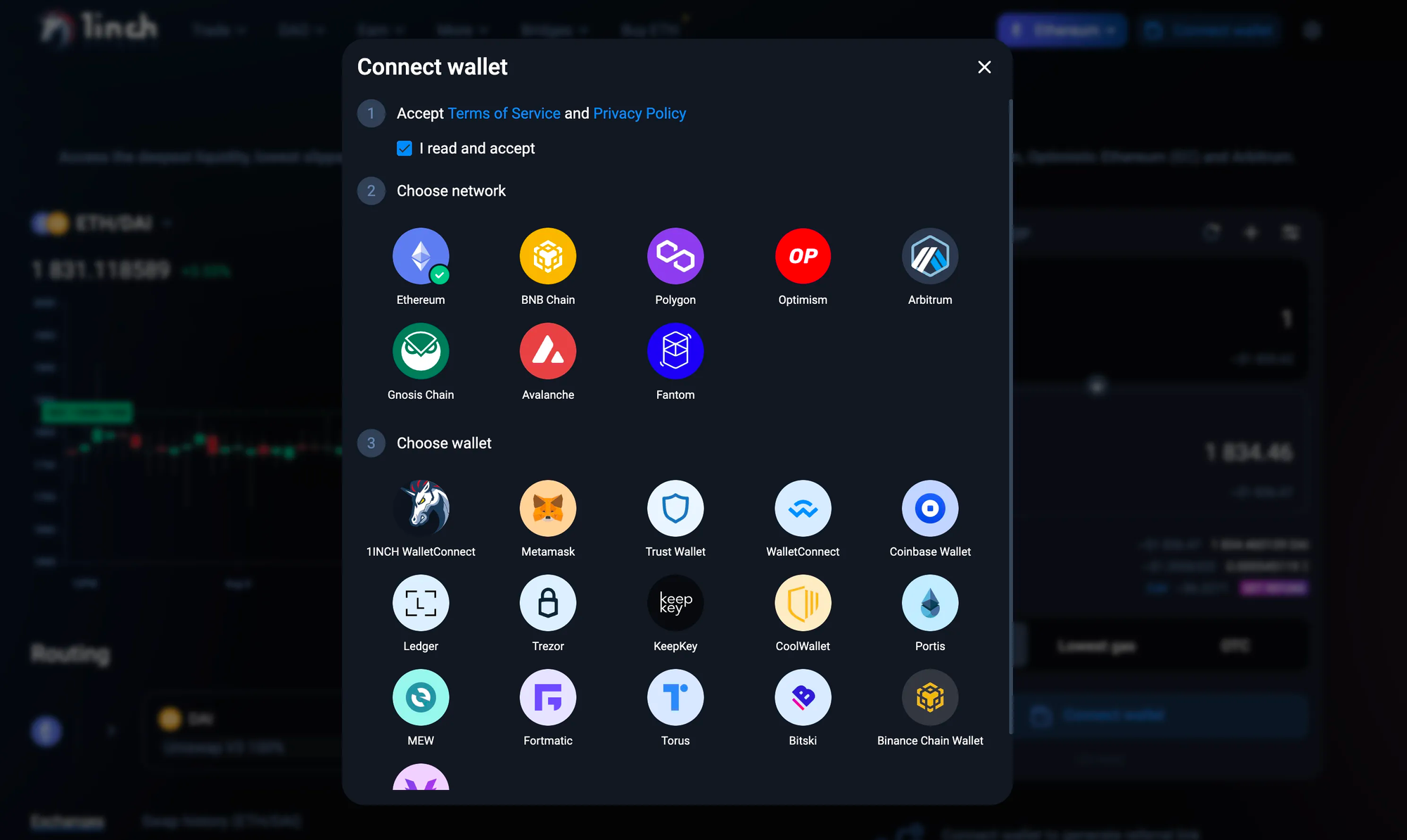
1inch is even worse, because they make you choose network first. They literally just add an extra step to confuse you:

The curse of too many options
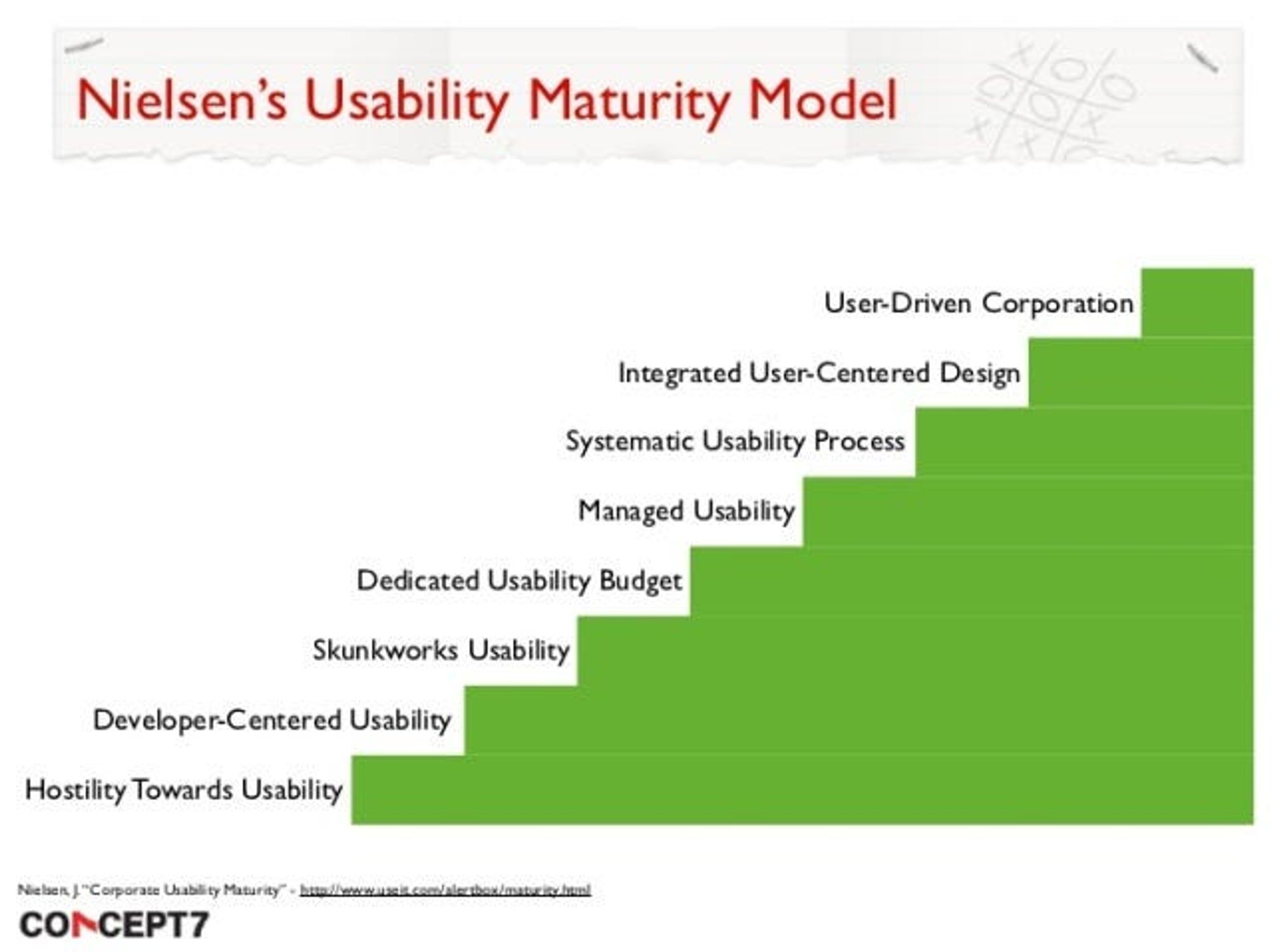
Nielsen’s Usability Maturity Model is a good way of judging your project’s overall approach to UX. A lot of web3 apps are somewhere around the “developer-centred usability” step. The tendency is to give as much control as possible, even if that creates information overload for the less experienced. There’s nothing wrong with catering for the experts, but as the industry progresses, this flexibility should be in the form of hidden shortcuts, not overwhelming customisability.

What this means in real terms is you should strive for fewer options, less overload, and simpler designs.
WalletConnect and Browser Default
WalletConnect can be used to connect to all mobile wallets.
Most desktop browsers identify the wallet that you are currently using as a default option. This can be detected by web3 apps.
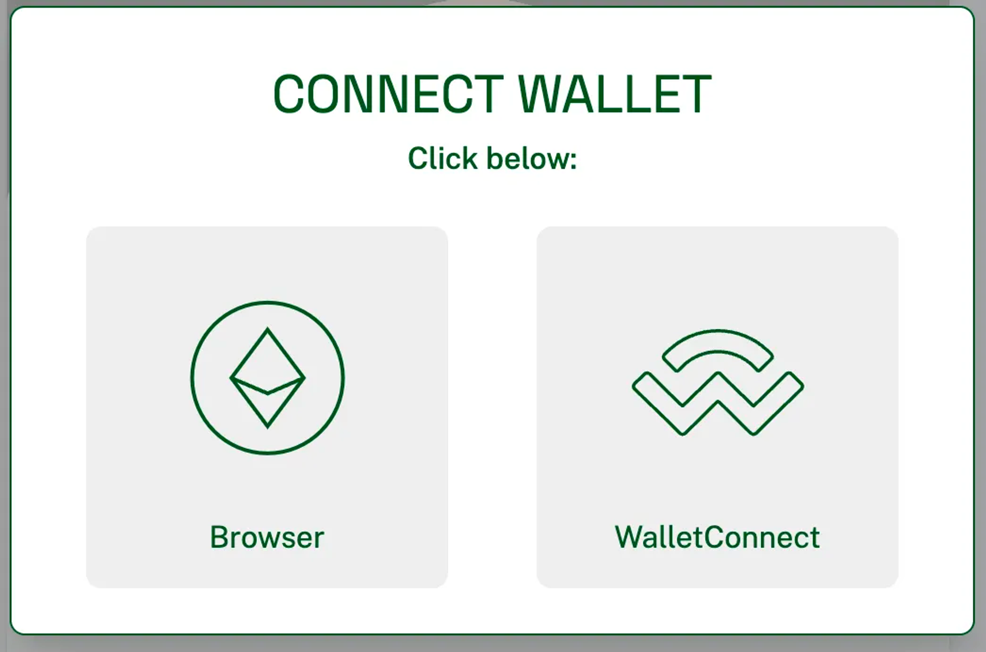
Knowing this, it is possible to simplify to the bare minimum of two options, like LensFrens did:

This is a great option, and unless you have good reason for doing otherwise (like you test with users and it doesn't work with their favourite wallets) this seems like a clear winner.
As written by design legend Alan Cooper: “No matter how beautiful, no matter how cool your interface, it would be better if there were less of it.”
Standard Solutions
There are two out of the box solutions for creating a connect wallet screen:
Both can be heavily customized and both are perfectly serviceable options, if you don't want to use the minimalist option above. These are good starting points, but you should still heed the following advice:
Tips
- Show the app while disconnected; allow users to click around and see what it can do
- Show the app even when on a different network (making it impossible to even see the app without being connected gives off unfriendly vibes)
- Give the option to add network when switching to a new network. Auto-adding the RPC for a new network is a nice touch, except that each network can have multiple RPCs and each app might prefer a different one. You can end up with multiple versions of the same network. Better to give the option before forcing it on users.
- Don’t overwhelm the users with too many wallet options.
- If you need to sign a signature to connect, make this clear and understandable. Do not ask users to sign something they don’t understand.
- Show the connected network prominently. Even if your app is multichain (especially if your app is multichain) the user should be aware of what network they are currently connected to.
- Include a switch network button in the appbar — don’t make them go to MetaMask to do it.