This is a long and rambling piece that involved a lot of research. If you just want the takeaways, skip to the end. I’ve categorised all the main errors, and tried writing some better messages for them. 😉
SECTION ONE: WHY THIS IS IMPORTANT
UX writing can have an outsize impact on your product
There’s an adage that ‘design is 90% text’ — I’ve seen it attributed to various people in various forms, so I’m not going to pretend to know who said it first.
It’s a bold statement, but it points to the fact that most of what your user sees, interprets, and acts on is going to be text. They scan for key words, they follow instructions, they find buttons, and they stare baffled at error messages.
If you get your copy right — and display it at the right size, in the right layout — you increase the usability of your product by a massive amount.
Error messages are particularly important because they’re literally the thin line(s of text) separating users from non-users. If the user can’t overcome the error, they can’t use your app.
The excellent book Microcopy: The Compete Guide explains:
An error message temporarily stops the process the users are trying to complete. As far as they are concerned, the message delays them and requires them to understand what went wrong and how they should continue. Since their motivation is already fragile, error messages could be the last straw, leading them to abandon the process, especially if messages are unclear, intimidating or make them feel bad.
– Kinneret Yifrah, Microcopy: The Complete Guide [emphasis my own]
The perfect error message
- Explain simply and clearly that there is a problem
and what that problem is.
- Provide a solution
so that users can return and complete the process immediately.
- Turn the delay into an experience that is as pleasant as possible
.
This is again cribbed from Microcopy: The Complete Guide. If you follow this simple, three-step, formula, your error messages will be easy to understand and get the user back into the correct flow as quickly and painlessly as possible.
Now let’s look at how web3 apps completely ignore this advice and consistently fuck it up.
SECTION TWO: ERRORS IN DEFI
What error messages in web3 usually look like, aka: how not to do it
Warning — this section is quite long, but I wanted to include as many examples as possible, and explain what some of these messages actually mean.
By understanding the common causes, and then looking at the common solutions, we can start grouping them together.
Uniswap
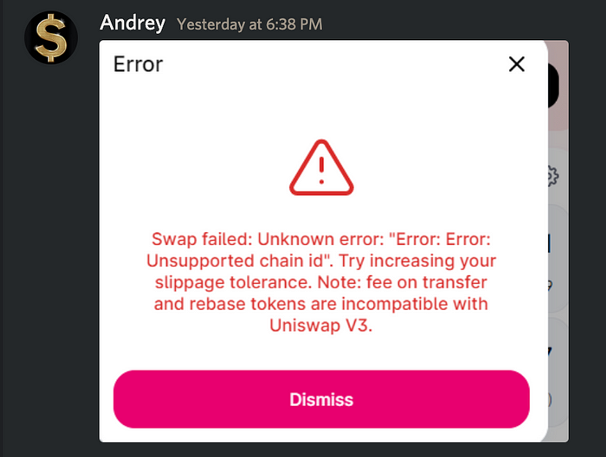
‘Unknown error: “Error: Error:”’ — well that doesn’t sound good. Error x3 ? oh my!
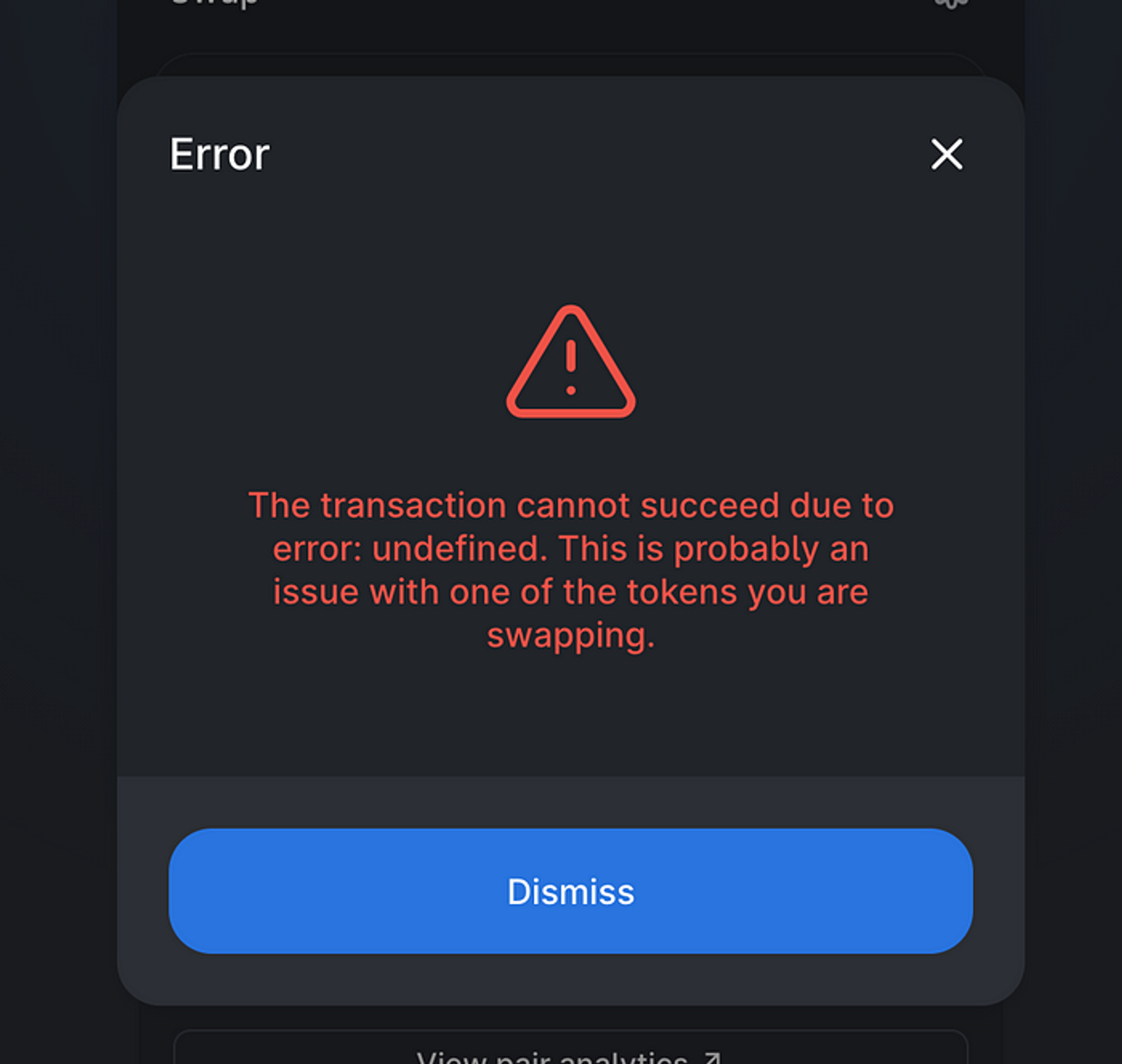
‘error: undefined’ — awesome, now I know exactly what to search for🙄
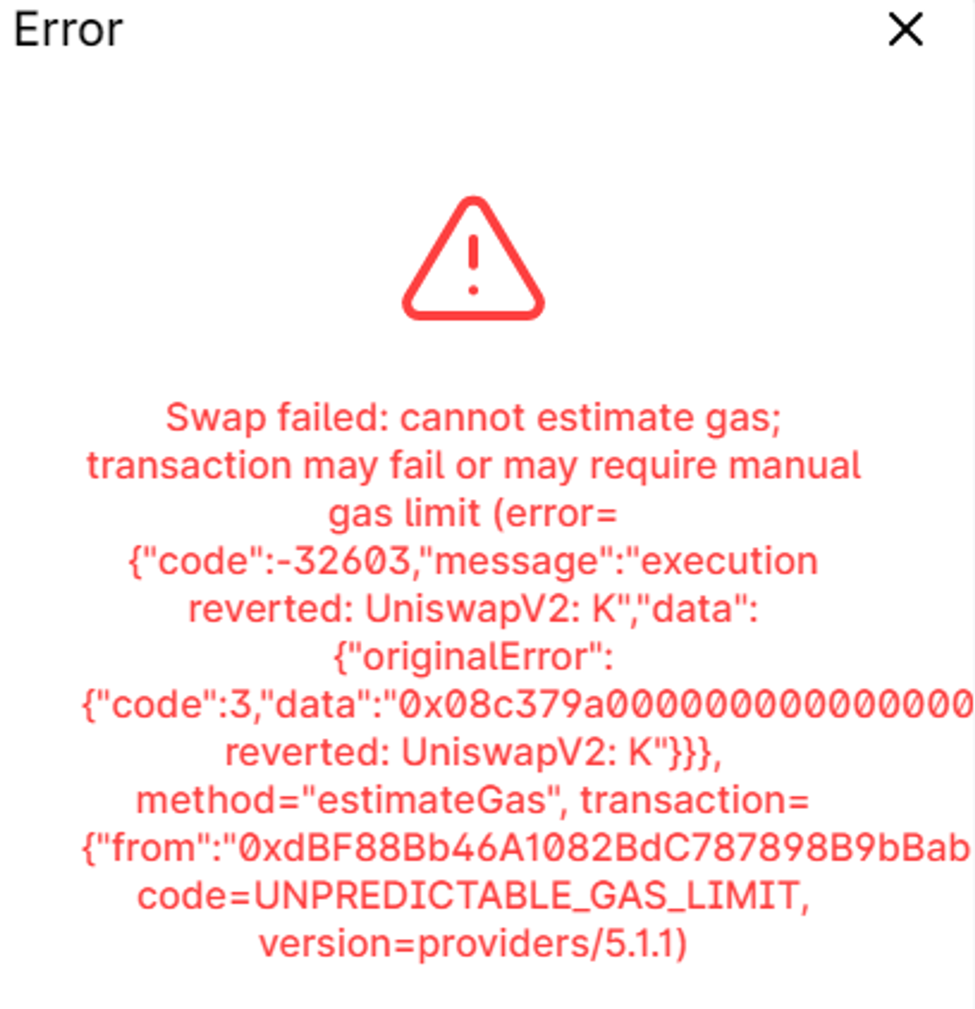
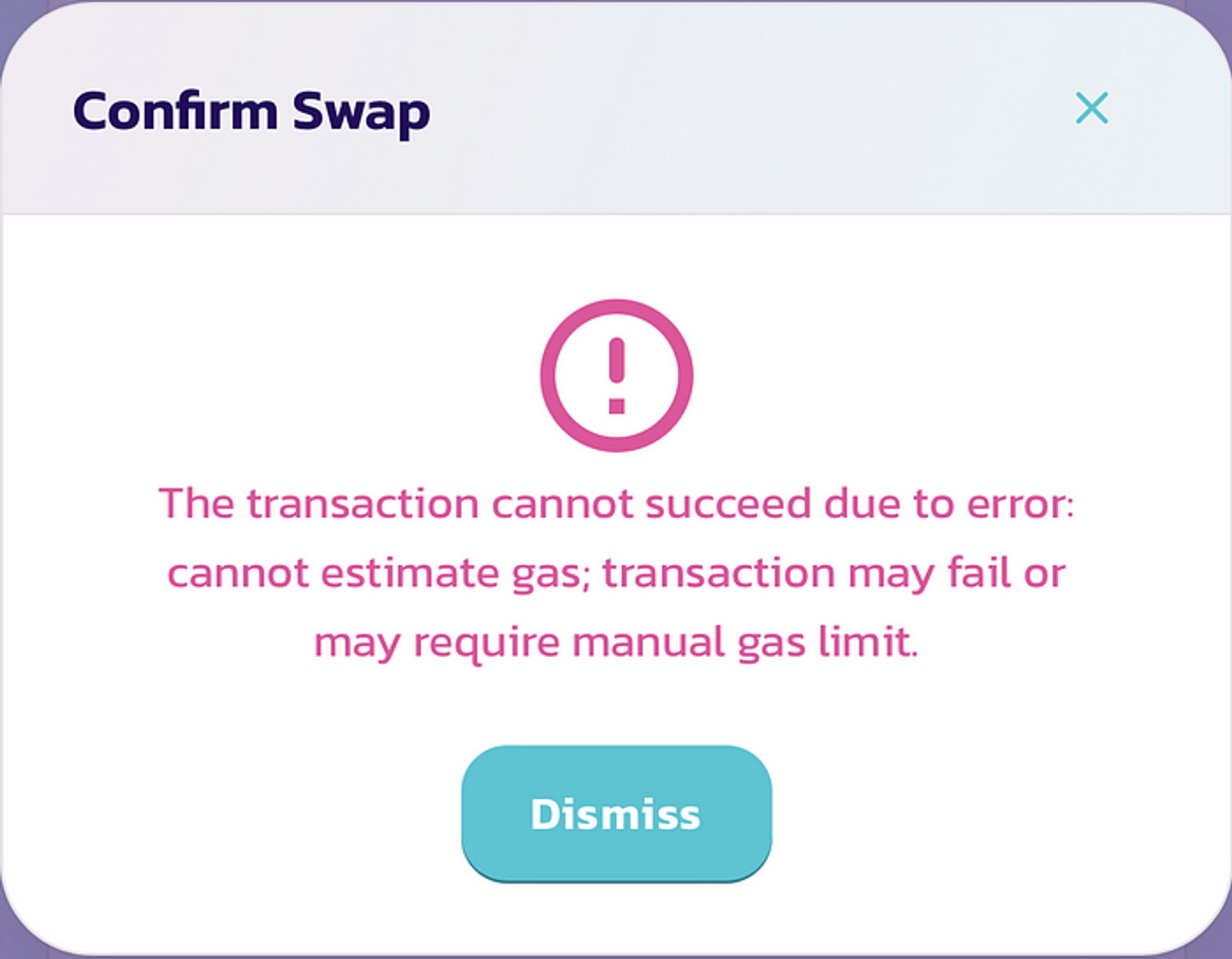
To be fair, ’cannot estimate gas; transaction may fail or may require manual gas limit’ is actually useful info. It at least gives a clue as to what’s up. The rest of it is total gibberish for most users.
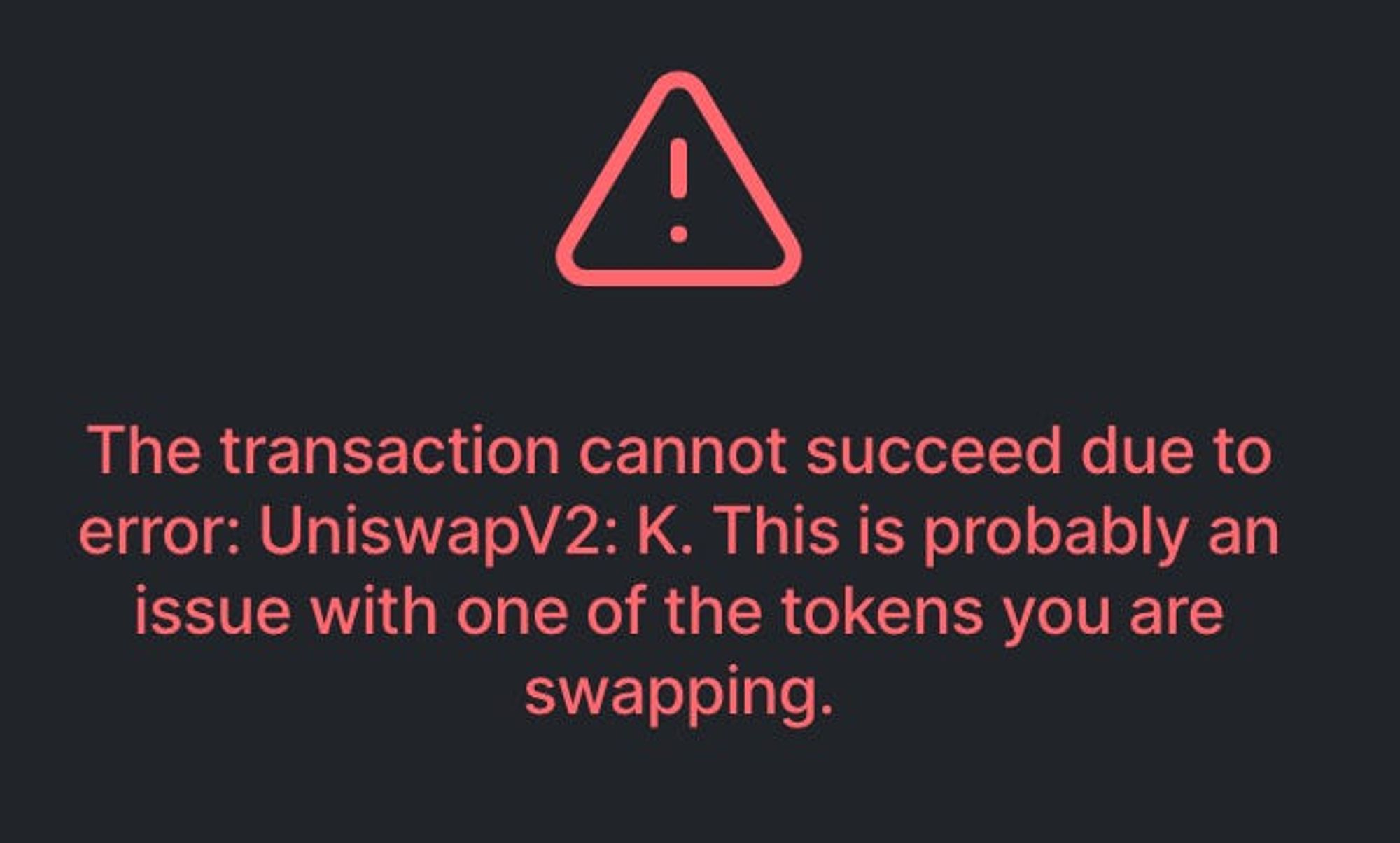
Again, a little bit useful because it gives you an error code that you can then look up. But it’s still opaque, and there is not much indication what error ‘K’ means.
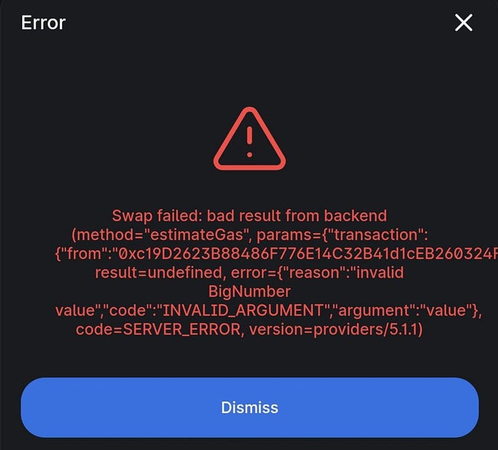
‘bad result from backend’ is about as vague as it gets. I know ‘invalid BigNumber’ is just referring to something in the code but it still makes me smile.
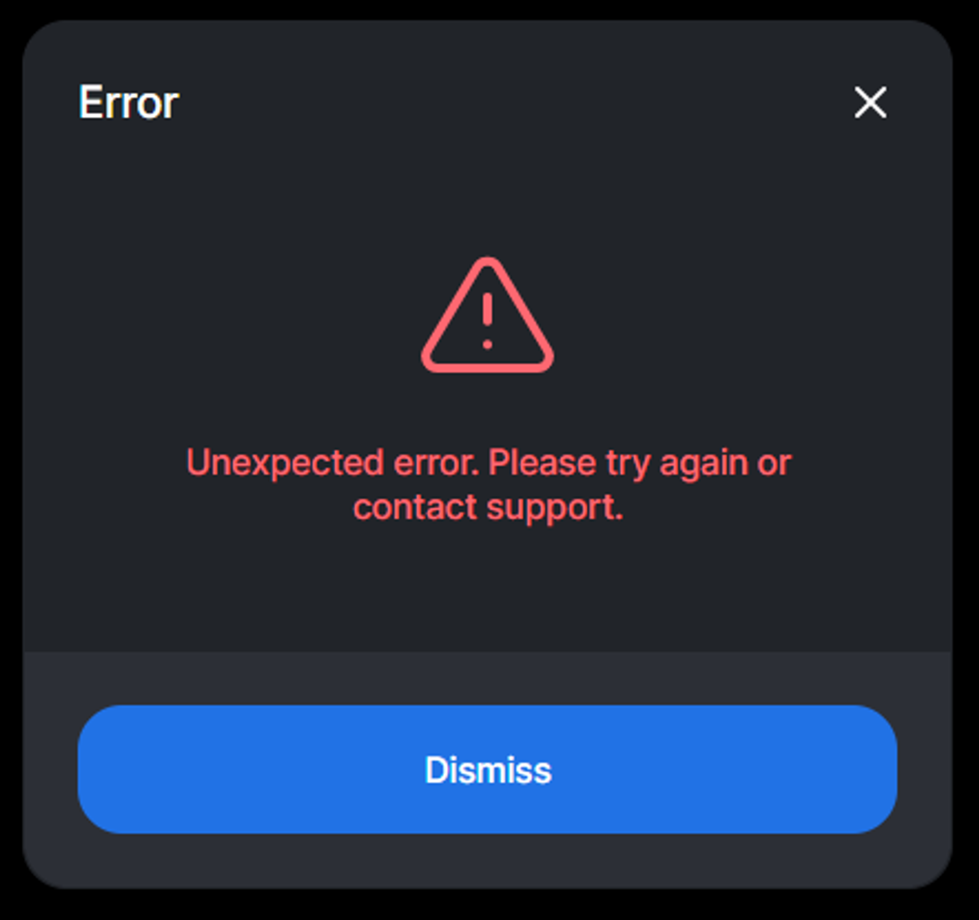
The reddit threads about this error are quite amusing. Because there is no support! After doing some digging, it looks like this refers to support for the token you are swapping, NOT uniswap. In other words, there is a problem with the token contract, and you should reach out to that team. This has to be one of the most frustrating error messages I’ve ever seen.
Pancakeswap
Pancakeswap is a fork of Uniswap on BSC, and has similar, though not identical, errors.
These are two different types of error, but both are ‘probably an issue with one of the tokens you are swapping’. It would be good to know how they differed.
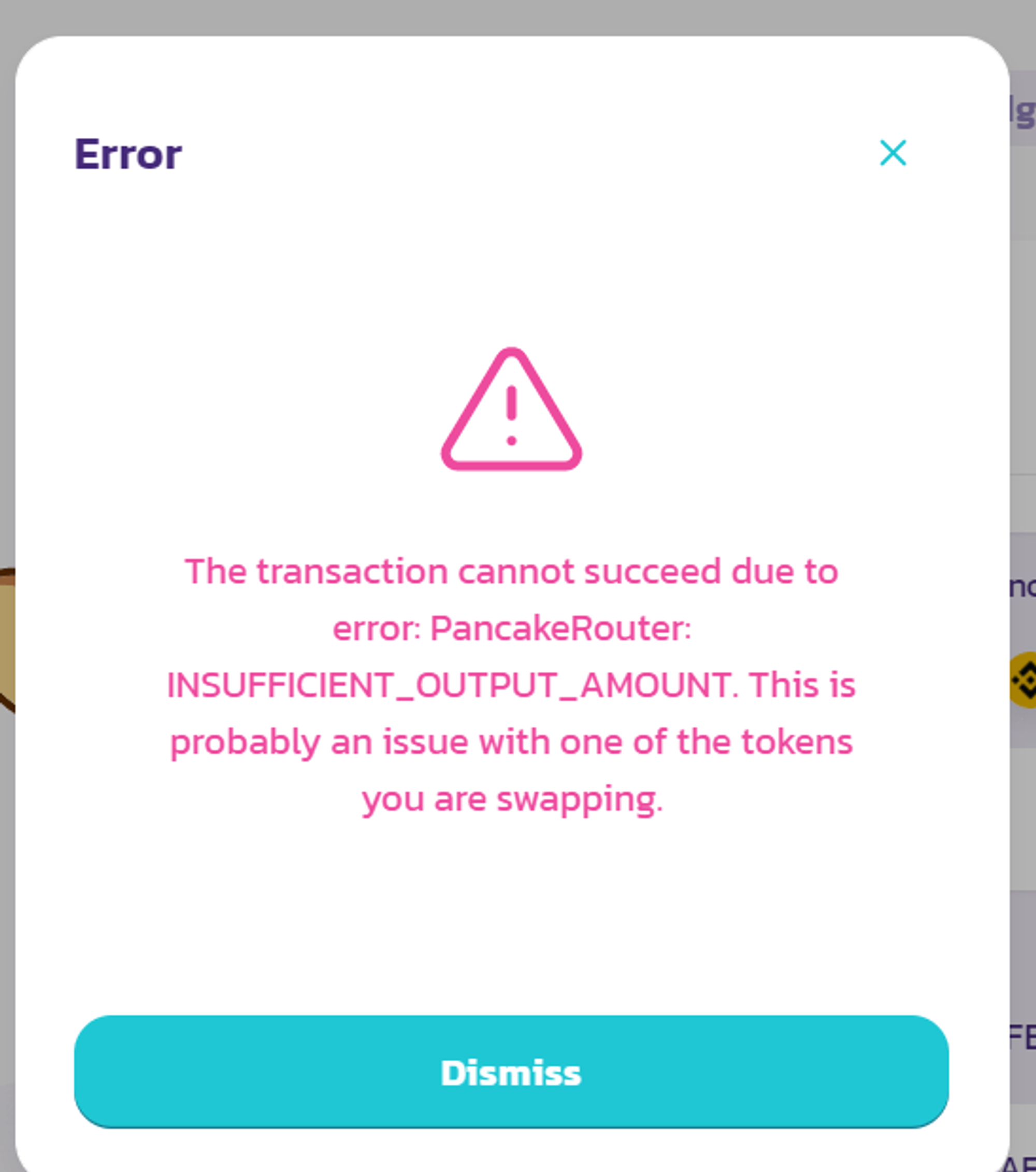
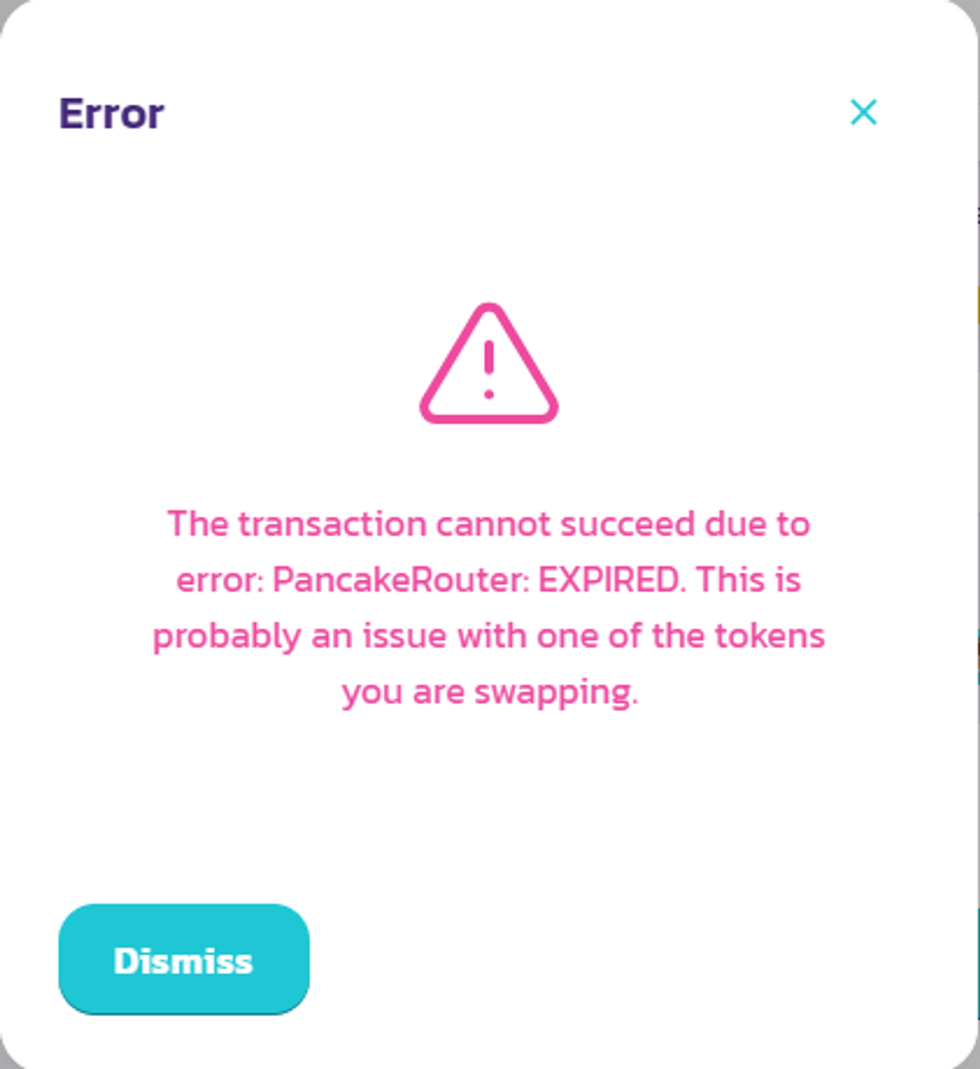
This is actually quite good. The formatting just needs to be improved for clarity.
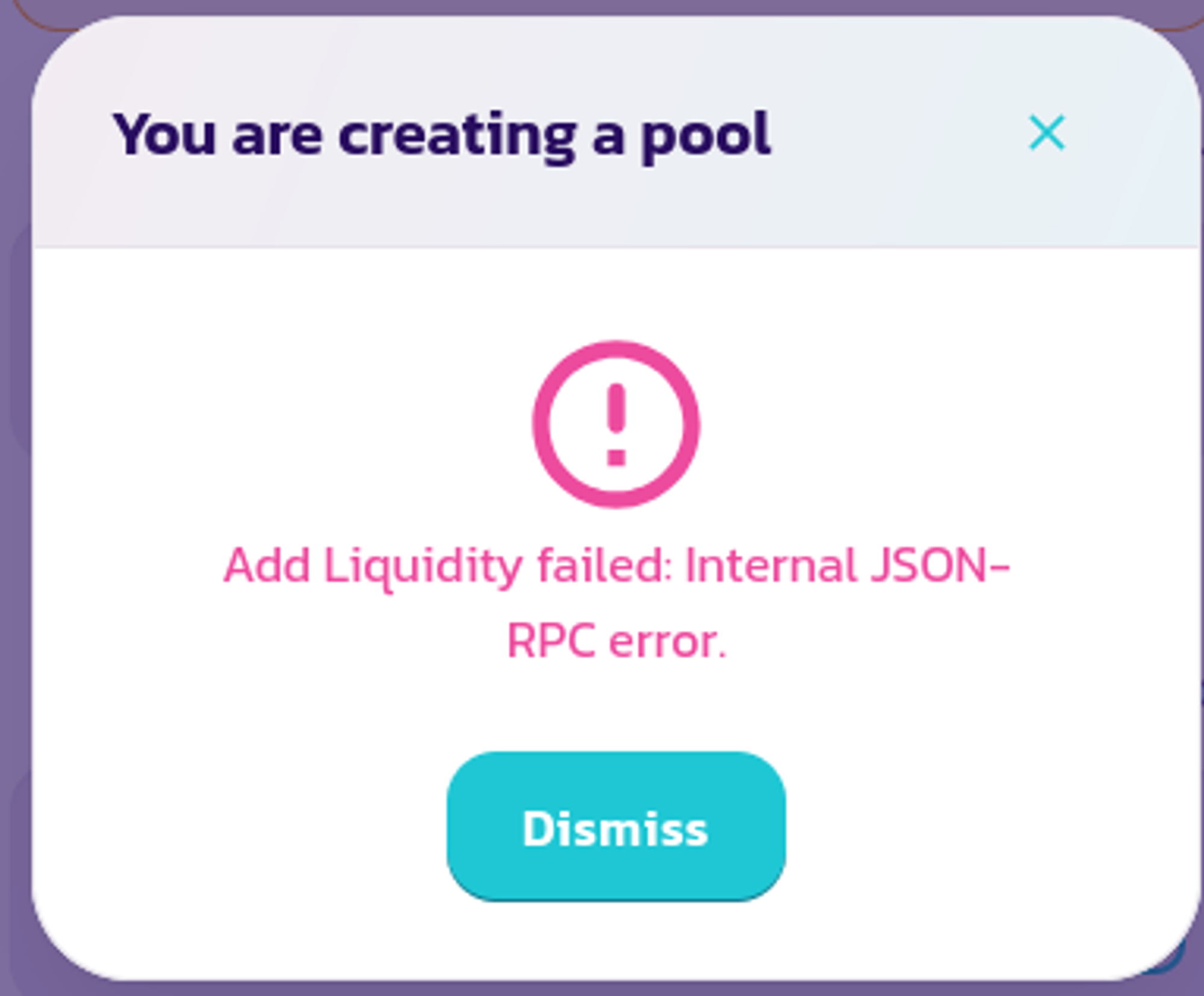
JSON-RPC error? If you know a little about metamask, you might know enough to try changing the RPC in network settings. But the suggested advice is to try increasing slippage… should you do one or the other, or both?

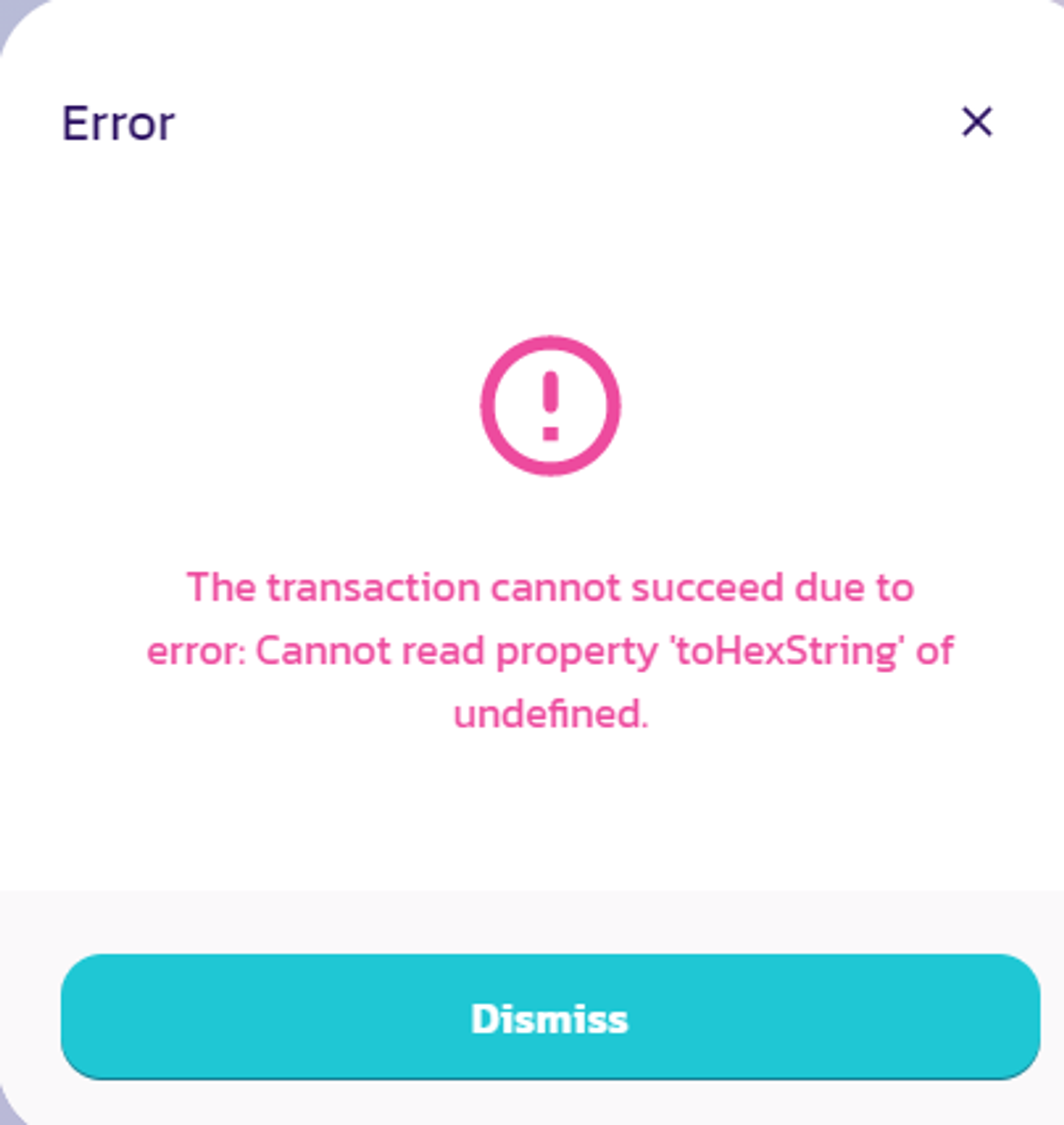
Nonsense to most people

Spookyswap
Spookyswap have upped the game here, because although they’ve copied existing errors, they have designed the modal in quite a nice way.
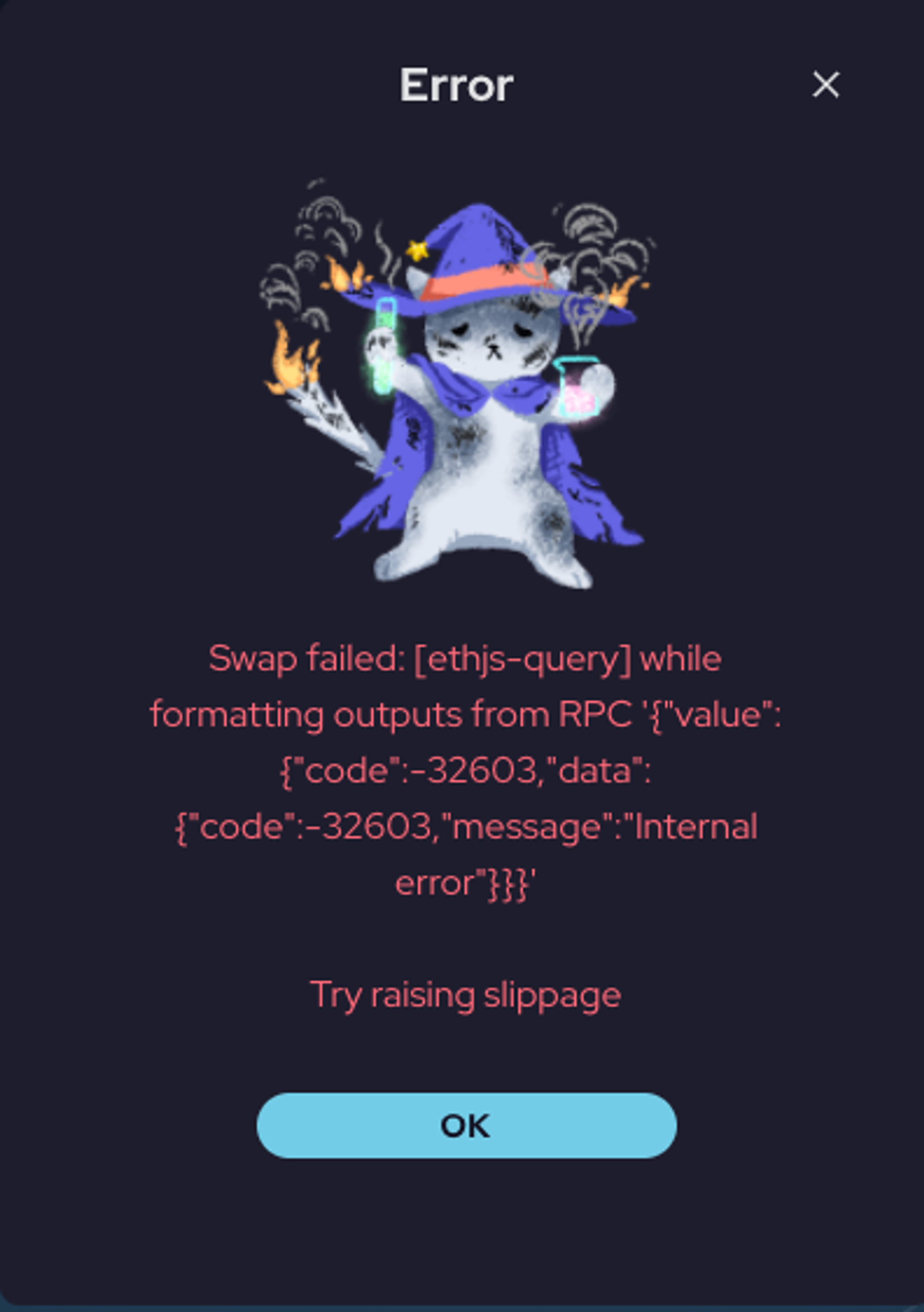
Far from perfect, but a step in the right direction.
If we compare against the three criteria I listed at the start:
Explain simply and clearly that there is a problem❌ Not really. It’s standard uniswap clone technical stuff
Provide a solution✅ Yes, and it is formatted on a separate line. Even this small change makes it more useful. It is much easier to scan and read than if it was all one big text block.
Turn the delay into an experience that is as pleasant as possible✅ Yes: I love the cat and genuinely smiled the first time I saw this. It’s on brand and shows someone thought about it.
They have also changed the button text from the technical-sounding ‘dismiss’ to the more friendly ‘OK’.
I’ve had my fun and mocked some well-known projects. Now I want to figure out what all these errors mean.
I actually have a google doc that is many pages long, full of examples. Stuff I’ve encountered myself, plus others culled from reddit and social media. From multiple dexes. I could go on and on here, but you get the gist.
Seeing as though almost every DeFi project is a clone of uniswap, pancakeswap or sushiswap, you quickly realise they actually all have the same errors. Or at least the same categories of errors.
What these errors actually mean, and how they are communicated currently
No definitive list exists anywhere, and the docs for the largest projects are less helpful than you’d imagine.
As an example, here is a small section pulled from the Uniswap v2 docs:
UniswapV2: KThis is an error that is frequently encountered, and requires a bit of context to understand it.The Uniswap constant product formula is “X * Y = K”. Where X and Y represent the respective reserve balances of two ERC-20 tokens, and “K” represents the product of the reserves. It is this “K” to which the “K” error refers.In essence, the “K” error means that a trade was attempted that somehow left the trading pair with less reserves than should be there, and as a result the transaction is reverted.This can have a few different causes.Fee On Transfer TokensThe most common examples are caused by “fee on transfer” tokens.
It then continues (at some length) to explain all the possible causes of this error. To a DeFi nerd like me, this is moderately interesting, but to the average user it achieves nothing — they want a solution!
In the way that DeFi usually works, each new project clones a previous project and makes a few small improvements, so let’s look at the Pancakeswap docs
Pancake: KThe transaction cannot succeed due to error: Pancake: K. This is probably an issue with one of the tokens you are swapping.Try modifying the amount on “To” field. Therefore putting “(estimated)” symbol on “From”. Then initiate the swap immediately.

Pancakeswap also include a helpful image telling you to only modify the ‘To’ field
They have the same ‘K’ problem, but also provide a solution. Modifying only the ‘To’ field ensures that even if you are trying to swap a token with its own fee, the system will take that into account and swap as much as it can, minus the fee that will be subtracted.
The Pancakeswap docs aren’t bad, but I think this is worded in a strange way and still a bit unclear. Their explanation above is trying to say ‘Only modify the “to” field and we’ll estimate how much we can swap. We can’t guarantee an exact amount on this trade’. If it then included a link to a longer explanation they’d have a pretty good error message.
This is also a good example of an error with multiple solutions. The problem — token has its own fee — can be overcome by:
- raising slippage
- only changing the ‘to’ field
- swapping a smaller amount than the max in your wallet
So a question is raised: which advice do you give the user?
SECTION THREE: HOW TO IMPROVE
Main types of error
Looking at all the codes, these are the main reasons a transaction may fail:
- You were too slow to confirm the transaction
- The token you are exchanging cannot be sold (it’s a scam token and it can only be sold from the creator’s address)
- You have too many digits after the decimal point (sounds weird, but usually related to low liquidity)
- Gas limit is too low (limit, not gas price)
- You don’t have enough tokens to pay for gas fees
- There is not enough liquidity and your slippage tolerance is too low
- Prices are updating very fast (the actual error is generally related to low liquidity, slippage, and being slow to confirm)
- The token has its own fee, and will tax you for each transaction (you need to set slippage higher than the percent they tax you)
- Some tokens do not allow you to sell everything (rebase tokens like tDoge will only let you sell 69% if price is below peg)
- Rare front end or browser issue
Here is this information again, along with an example error message or two, plus a solution:
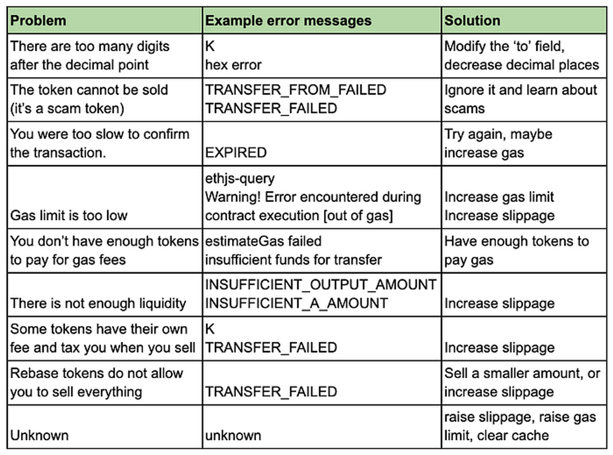
At this point, you’ve probably noticed that several of the problems are quite similar and a lot of errors have the same solution. When you really whittle it down, the main problems are:
- Liquidity is too low, probably because you’re trading microcaps
- You’re dealing with fee-paying tokens, rebase tokens, or scam tokens that have limits on how you trade them
- Gas limit is too low
In all of these cases, there are three things you can try:
- Increase slippage
- Increase gas limit
- Trade a smaller amount
If the error is particularly weird, then you might want to clear cache, refresh browser, and try again later. Maybe it’s a browser problem. You could also reduce the number of digits after the decimal point, but that’s a bit unusual. If you’re on mobile, you could also try a different wallet.
So if these are the only solutions a user actually needs, why give them a meaningless error code in the first place? We could prioritise the solution and then provide a link to more detailed information if the user wants it.
Some better messages (finally)
Tone and voice are crucial to your brand and should be reflected in all communication and feedback states, including errors. But I doubt many defi projects have done a tone and voice exercise for their brand or have a fulltime copywriter to enforce it. In any case, you want to prioritise clarity, not humour. I’ve offered a couple of messages with more character, but their appropriateness would depend entirely on the brand. Also, something might make you smile the first time you see it and smash your laptop the fiftieth time you see it.
Liquidity issues
Liquidity might be too low for this trade. Please try raising slippage.
— Simple. Clear.
Are you a whale? This trade was too big for the pool! Please try trading a smaller amount or raising slippage.
— I find this sort of thing annoyingly zany, but some people find it fun. I wanted to offer at least one example along these lines.
Fee-paying token issues
It looks like the token you’re trying to swap takes a fee. Please modify the amount in the “to” field and we’ll estimate how much we can swap. We can’t guarantee an exact trade.
— Reassures the user first. Gives a solution. Written in conversational speech. Perhaps a bit wordy.
It looks like the token you’re trying to swap takes a fee. Please specify a slippage tolerance higher than the fee. You might find this info by checking the project’s website.
— Unlike the technical, all-caps, TRANSFER_FAILED messages that just make the user feel bad, I hope my version is neutral, gives a solution, and points the user towards more info.
[name of actual token] takes [x %] as a fee on swap. Sorry about that — it’s nothing to do with us! Please specify a slippage tolerance higher than the fee and it should go through.
— Theoretically you could use dynamic messaging based on known fee-taking tokens and their fee structure. This would require the DEX keeping a database of all these tokens though, which could be time-consuming and irritating.
Speed issues
Your transfer has expired. This can happen when you take too long to press ‘confirm’ in your wallet. Try again?
— Try again could actually be a link (probably a tertiary-level button), and would actually initiate the trade again.
ZZZ… You snooze you lose. Trades have to be initiated within a short period of time. Try again and confirm a bit faster this time!
Miscellaneous issues
Hmmm, an error occurred while swapping. We’re not sure what happened. Please check your transaction details and contact support.
— Ideally, these would be actual links to the blockchain explorer transaction details, and the project telegram group (assuming they have support in the telegram chat).
I have no doubt some UX writers could come up with even better messages. These are not perfect, the point is just to provide a clear explanation plus a solution.
Do users understand the solution?
If you’ve used DeFi for a little while, you’ve probably realised that 90% of errors can be solved by raising slippage.
However, instead of just recommending that, we need to adequately explain slippage somewhere. I reckon a lot of defi users don’t really understand what slippage means.
The bigger issue is still DeFi education. Most projects are sorely lacking in contextual help, there is rarely an FAQ, and almost never an instructions page in the app itself. This is gradually changing, but it requires a lot more user research and testing to establish the right level of guidance. I’m actively working on this and keeping an eye on other projects doing the same thing.
I also think that while aiming to keep the error message as short as possible, we should also allow power users the opportunity to investigate further and figure out their own solutions. An oft-missed UX heuristic is ‘flexibility and efficiency’. A cutesy apology with no useful information is incredibly irritating.
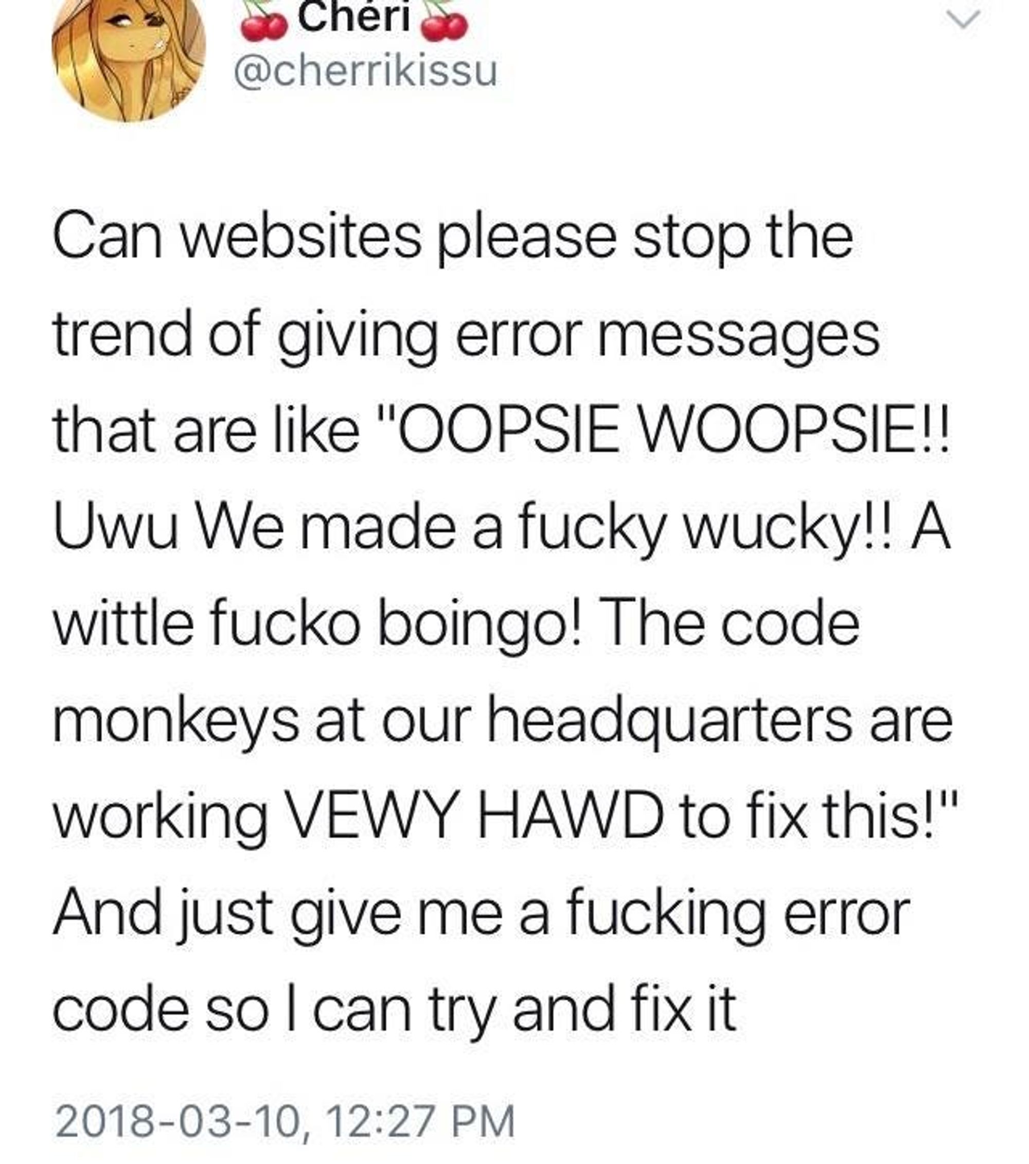
Don’t ever do this
SECTION FOUR: PUTTING THIS ALL TOGETHER
Conclusion
To recap, the perfect error message should:
- Explain simply and clearly what the problem is
- Provide a solution
- Turn the delay into an experience that is as pleasant as possible
I think we can also add a fourth: provide more info for power users.
On top of this, the message should be designed to optimise readability. This means following basic typesetting rules for digital products, such as:
- minimum of 16px font
- 45–70 characters per line (ref. Mary Dyson’s work on reading speed)
Option 1 — winner 🏆
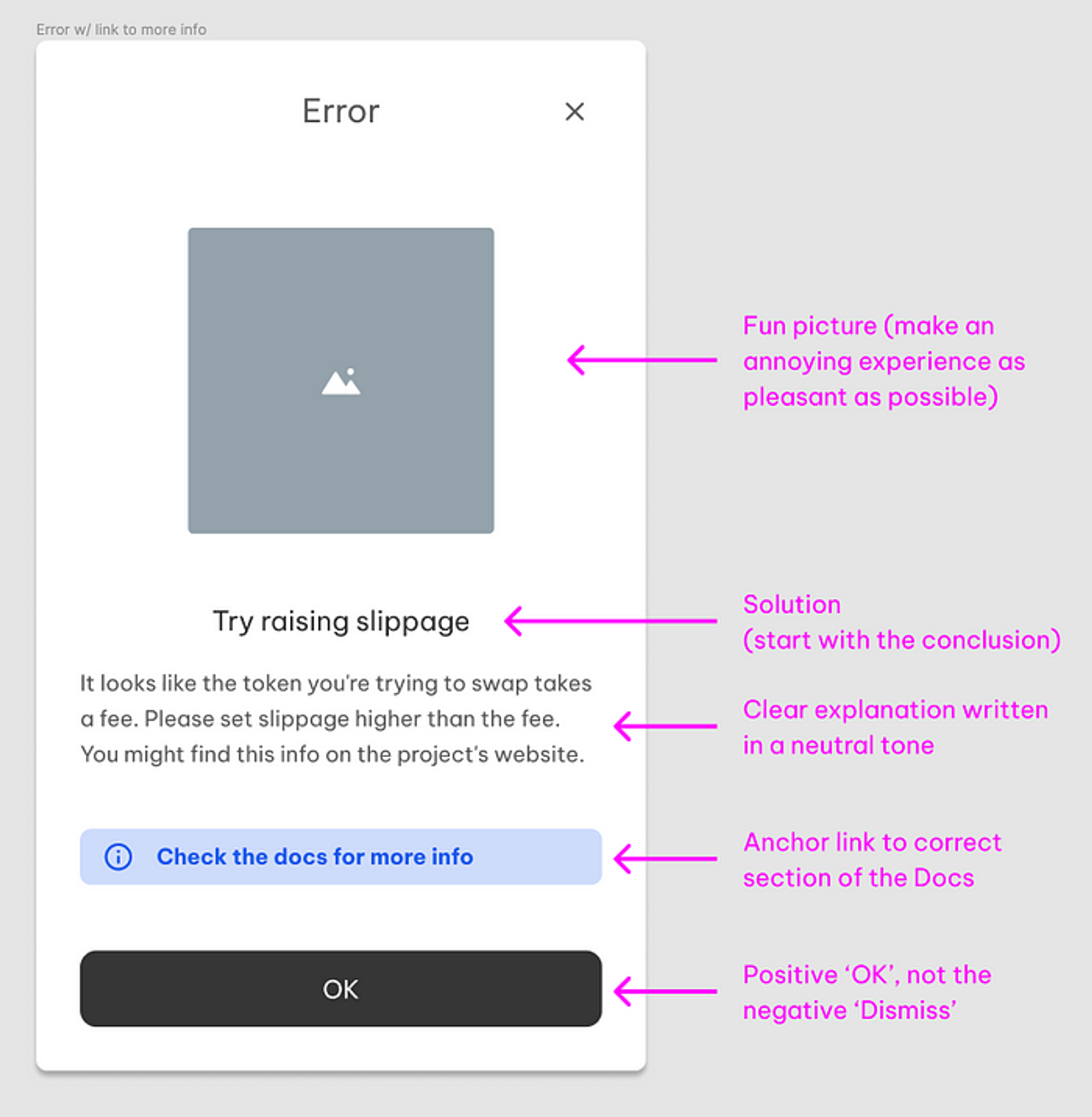
We iterated on this a couple of times within our team, and this was the ‘winner’. After a small amount of user testing it seems this provides just enough information — the link to the docs — without being overwhelming.
However, some users might like more info, so here are another couple of options.
Option 2 — more links
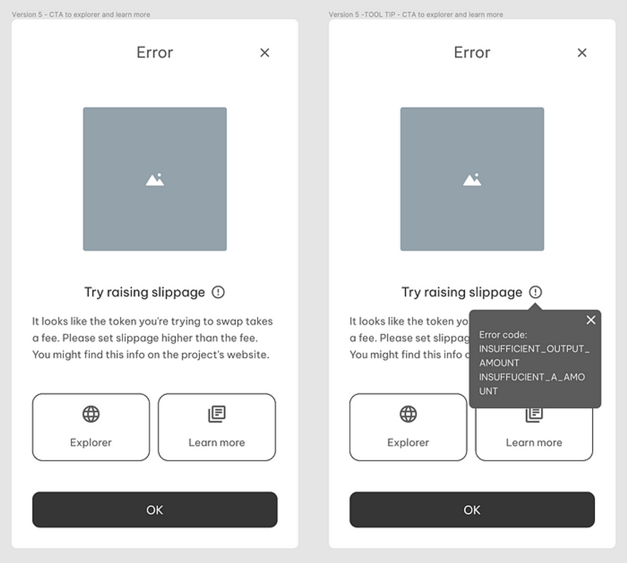
Some users particularly like to see the blockchain explorer, so for this version, we added a link and made the buttons bigger and more obvious. The error code can be found in the tooltip, which would stay visible until closed.
Option 3 — Learn more panel
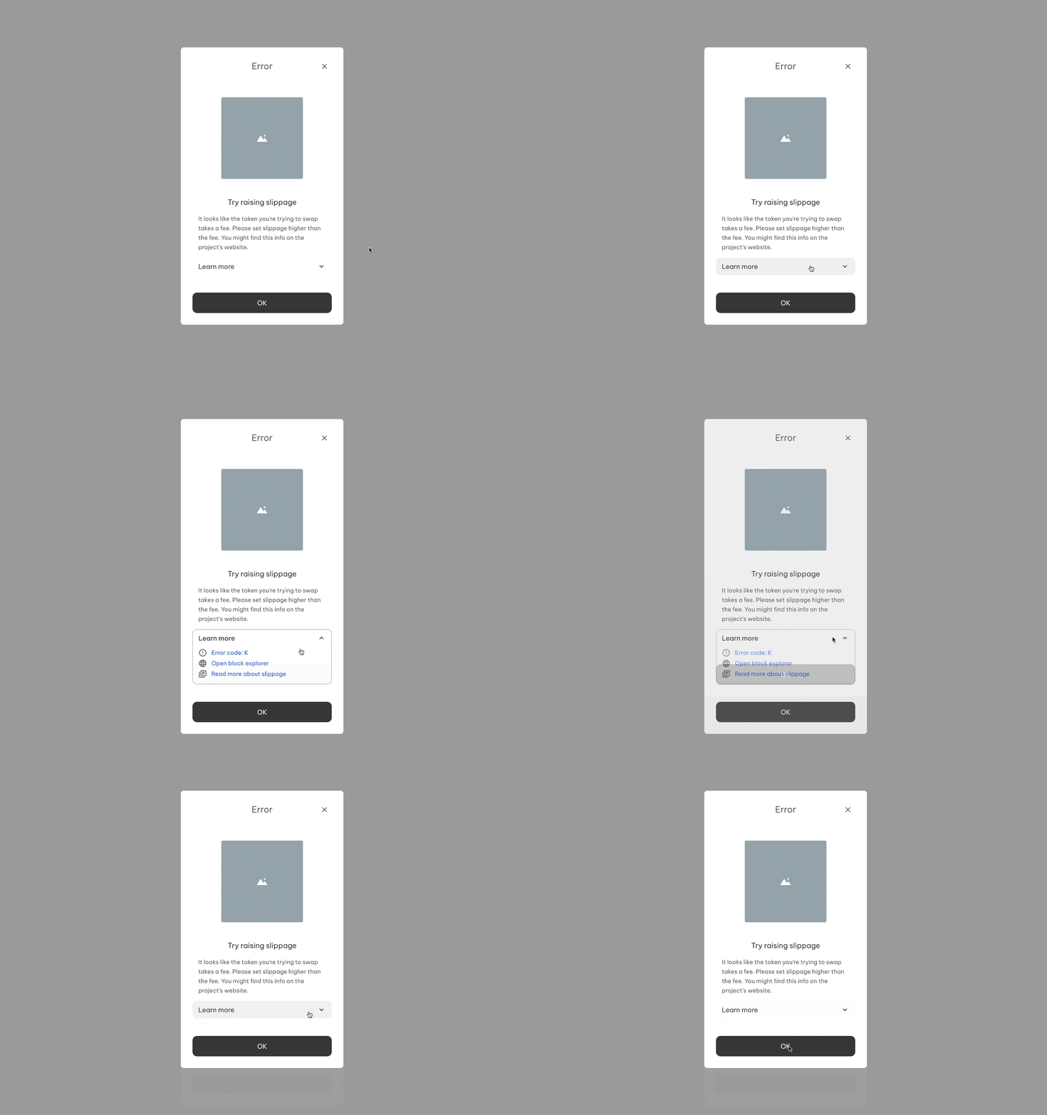
This has an expanding panel, with links to:
- The section of the docs for the right error code
- The blockchain explorer
- An FAQ with more info about slippage and other terms
Most users found this offered too much learning and too many options for the average user.