UX sits at the intersection of business goals and user needs.

A reasonable business goal might be to make a profit.
A reasonable user goal might be to save money.
You see the problem here…
So while fees are annoying to the user, they’re also necessary to keep this thing going. Sorry.
Therefore, the aim of good UX is to make fees:
- as painless as possible
- as clear as possible.
You can do this, if you:
- Show the fees up front
- Explain the fees in real terms
- Combine fees if the exact breakdown is confusing.
1. Show the fees up front
Better to just be honest about it. Nobody likes hidden fees. Be open and list the fees near the actual deposit box, and near the apy. You can always add a tooltip to soften the blow or explain what they’re for.
Tip: The proximity principle means we associate nearby things as being related.
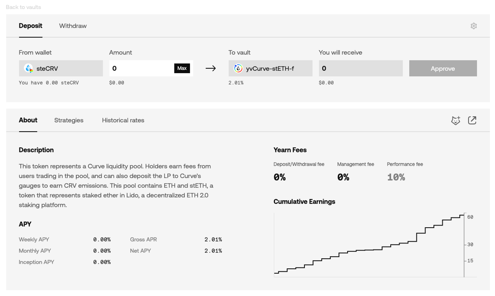
Yearn show fees underneath deposit. Don’t just bury them at the bottom of the page.

2. Explain the fees in real terms
I often find myself calculating what a percentage fee means in real terms.
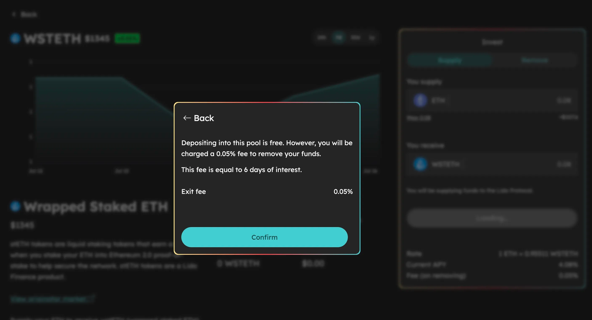
Rhino.fi does the hard work for you and shows and how long it will take for you to make it back!
The text reads ‘you will be charged a 0.05% fee to remove your funds. This fee is equal to 6 days of interest.’
In the crazy days of late 2020, it was not uncommon for farms to promise huge 4-figure apy, but have a ~4% withdrawal fee. Which in practical terms meant there was no point in depositing there — you would be tied up for an unreasonable amount of time and probably exit with less than you entered. They were banking on most people not bothering to work that out.
Be honest about your fee structure. And if it takes users a long time to become profitable? Maybe your fees are too high…

3. Combine fees if the exact breakdown is confusing
You want to be straight with your users, but you don’t want to overwhelm them with stuff they don’t care about. If there are multiple transactions taking place behind the scenes, you don’t need to give the breakdown for every single one. The users just want to know what number they are paying.
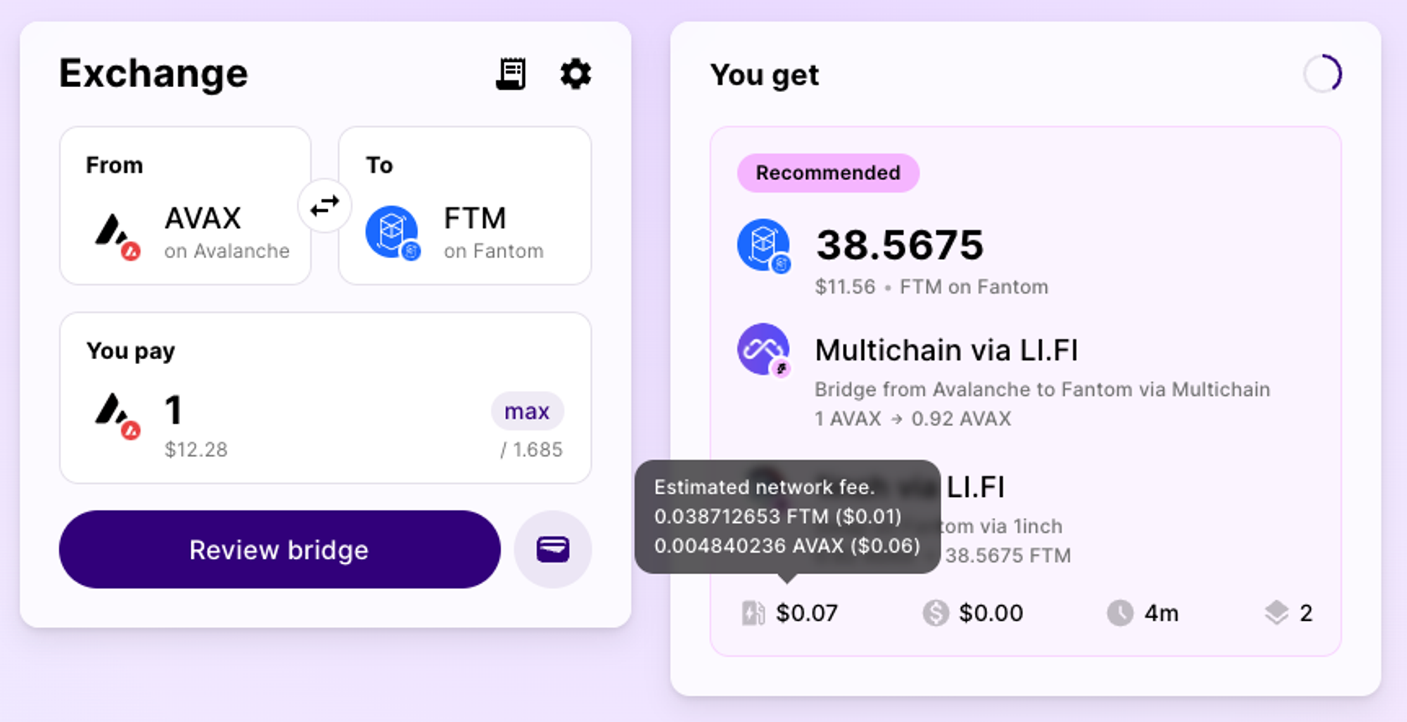
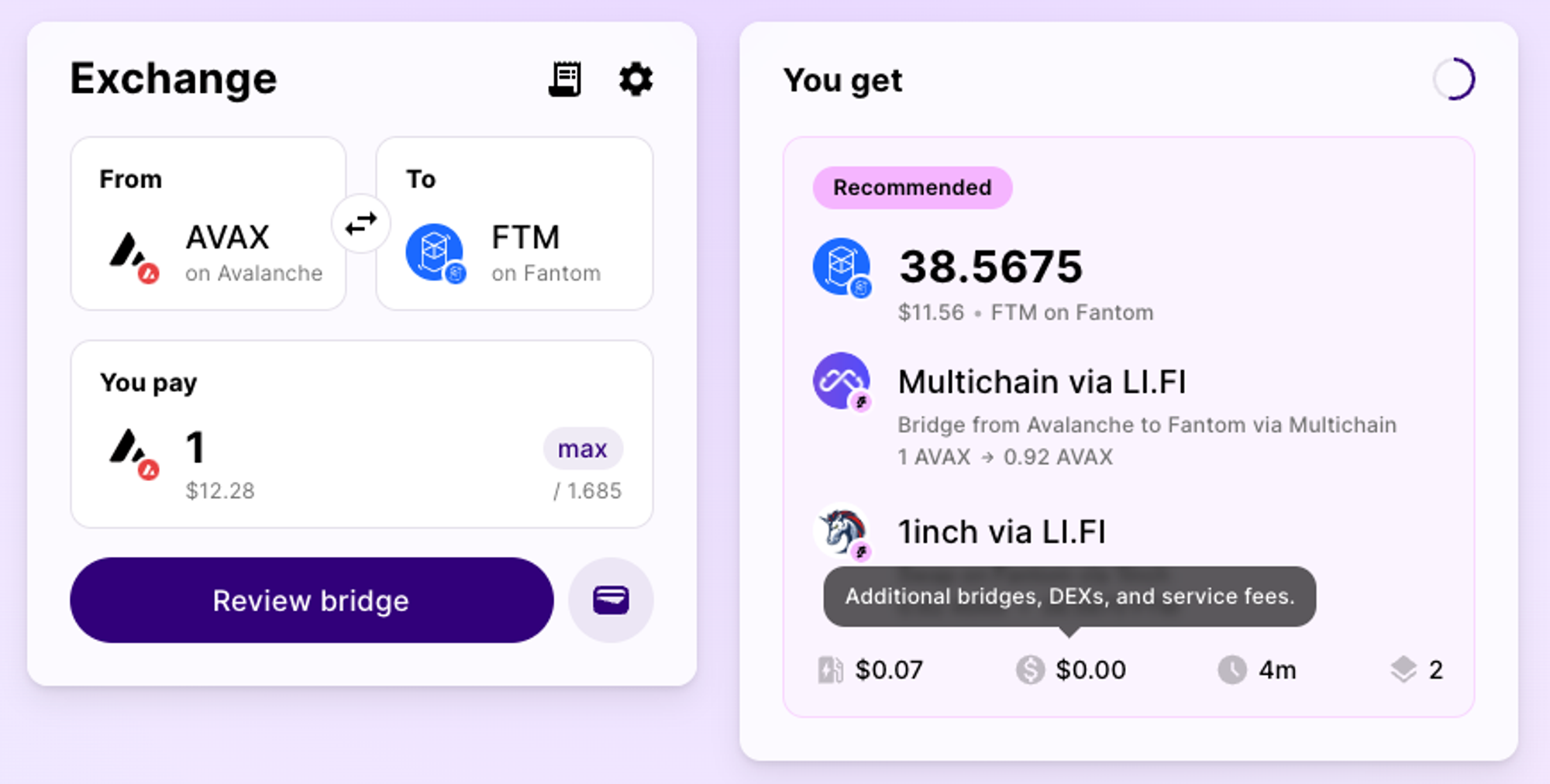
Jumper.exchange does this quite well. They give a combined gas fee, and a combined ‘additional’ fee, if any. The gas fee breakdown is revealed on hover, but the others aren’t, which is fine - nobody cares.

