This is a complicated topic. I do not assign strong confidence to my takeaways and believe the UX around menus and navigation has much room to improve.
👉 What to put in the navbar
- Links to main pages
- Connection status
- Anything extra, like settings, dark mode, history
1. Links - put on the left or the centre
- Have fewer than six
- And ideally four
- Use icons if possible
2. Connection Status - put on the right
- Show the connected network
- Even if you are only on one network (many apps are now multichain)
- Allow users to change the network from this button (don’t make them go to metamask)
- Show the wallet address as a button (make it look clickable)
- I believe dark/light mode toggle should go here too, simply for ease of access

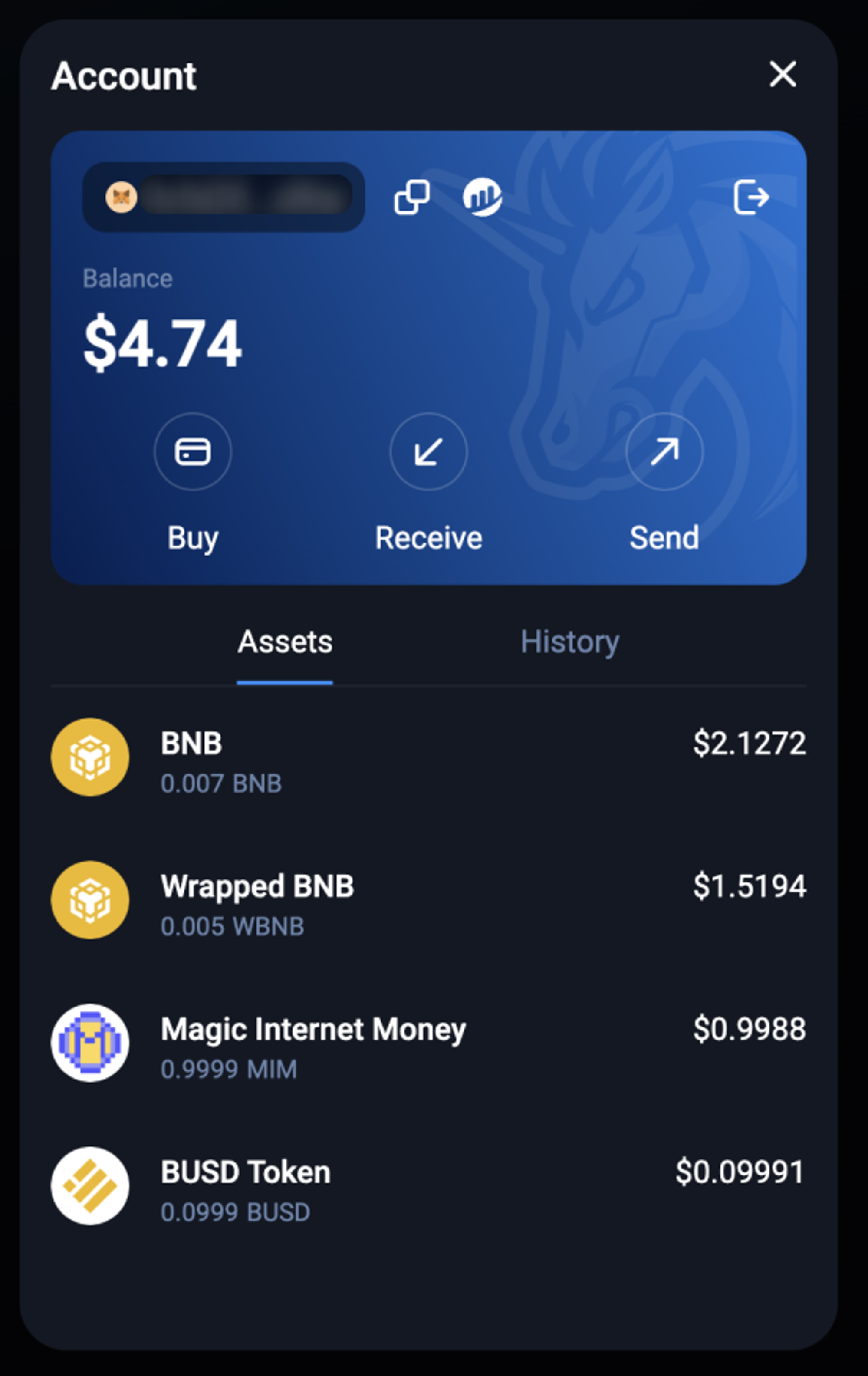
3. Everything else - put in a menu accessible by clicking on wallet address
- Have two tabs for:
- User’s assets (ideally across chains)
- Transaction history
- Show the balance of the network token (needed for gas)
Then there are many things you could include in here, such as
- token price
- links to exchanges
- links to block explorers
- links to onramps
- slippage
- global settings around languages and other accessibility concerns.
What is best will totally depend on the protocol and will need to be researched. The best way to do this is to speak to users. Then make educated decisions about what to include.
🎙️ Some discussion on the reasons why
Navbars
Generally speaking, the purpose of the navbar is to provide quick links to the main sections of your site.
This is as true for web3 as it is for web2.
However, on web3, we also have…
Some extra crypto stuff to show:
- Connected network
- Connected wallet
- Wallet type
- Transaction history
- Tokens in wallet
- Value of protocol tokens.
This is all the stuff related to the blockchain, and is generally not viewable until you are connected. As a result, this stuff is usually clustered around some kind of connection status.
Defi sites are web apps and not just static websites, so there are also usually some settings to put somewhere. And if there aren’t any settings, there’s often at least a dark mode switch.
These needs have caused DeFi navbars to evolve towards:
- links on the left
- blockchain stuff on the right
- settings in various places
Here’s a comparison of Compound, Convex and Sushi (picked largely at random tbh):
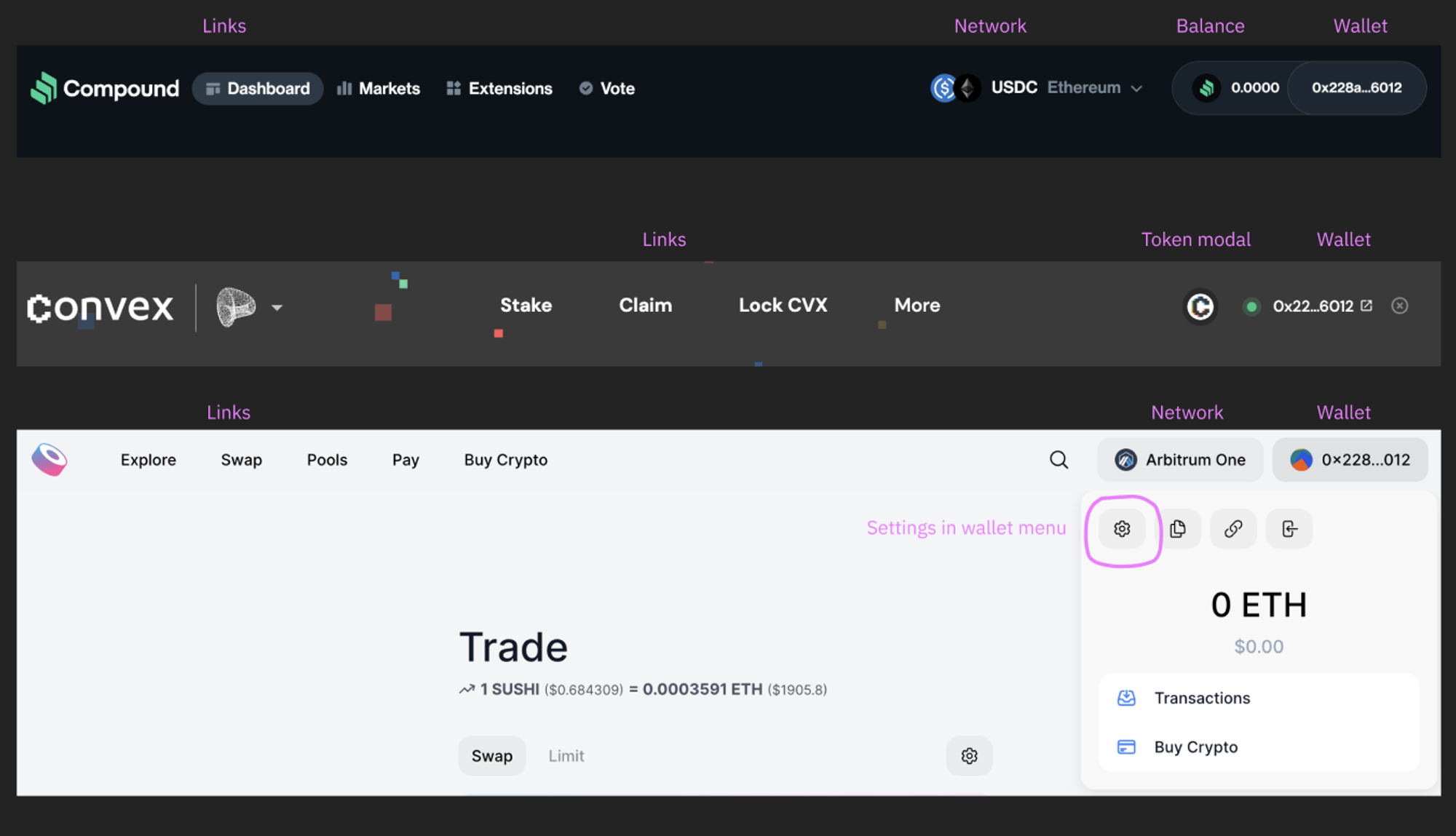
They all follow the same rough idea, but there are a few key differences.
Tokens and price
Compound shows your balance of comp tokens, but does not show the price.
Convex does not show the price of their token, only the icon. You can, however, click on the token icon and bring up a modal with the price and your balance.
Sushi does not show the price of Sushi anywhere.
Settings
There are no settings for Convex or Compound.
Sushi’s settings are found when you click the wallet address. Dark mode is found hidden in the settings button.
What should the wallet / address button do?
Three more examples to illustrate a point.
This is what happens when you click on the address in these projects:
- Beefy: disconnects your account without warning
- Convex: takes you to Etherscan
- Balancer: opens an Account menu


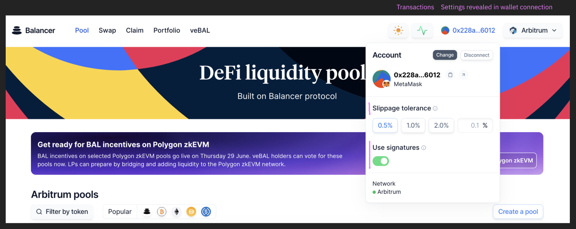
Also notice some little things like the fact that the network is furthest right on Balancer, but left of the account on Beefy. Both Convex and Beefy have a green traffic light to how the site is connected, but Balancer does not… etc etc.
It’s at times like this that you realise how young this industry still is - there are no standards yet. We’re still figuring out what best practice is.
The Account Menu
This is becoming more common, and it is a useful innovation.
Beefy’s decision to make the wallet address disconnect you is particularly annoying, because many sites are now conditioning you to expect a menu.
If you have an account menu, you now have a useful extra space to store things, instead of cramming them into the bar.
Some things you could put in a menu:
- Balance
- Assets
- History
- Settings
- Light/dark mode
- Wallet type (metamask/trust wallet ect)
- Links to fiat onramps
- Links to docs and support
1inch has a very stylized card UI:
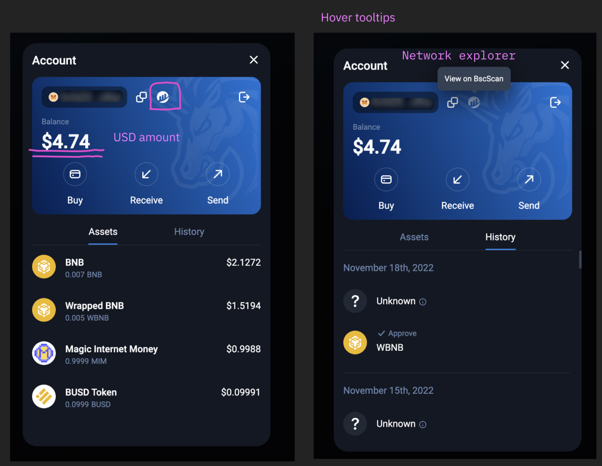
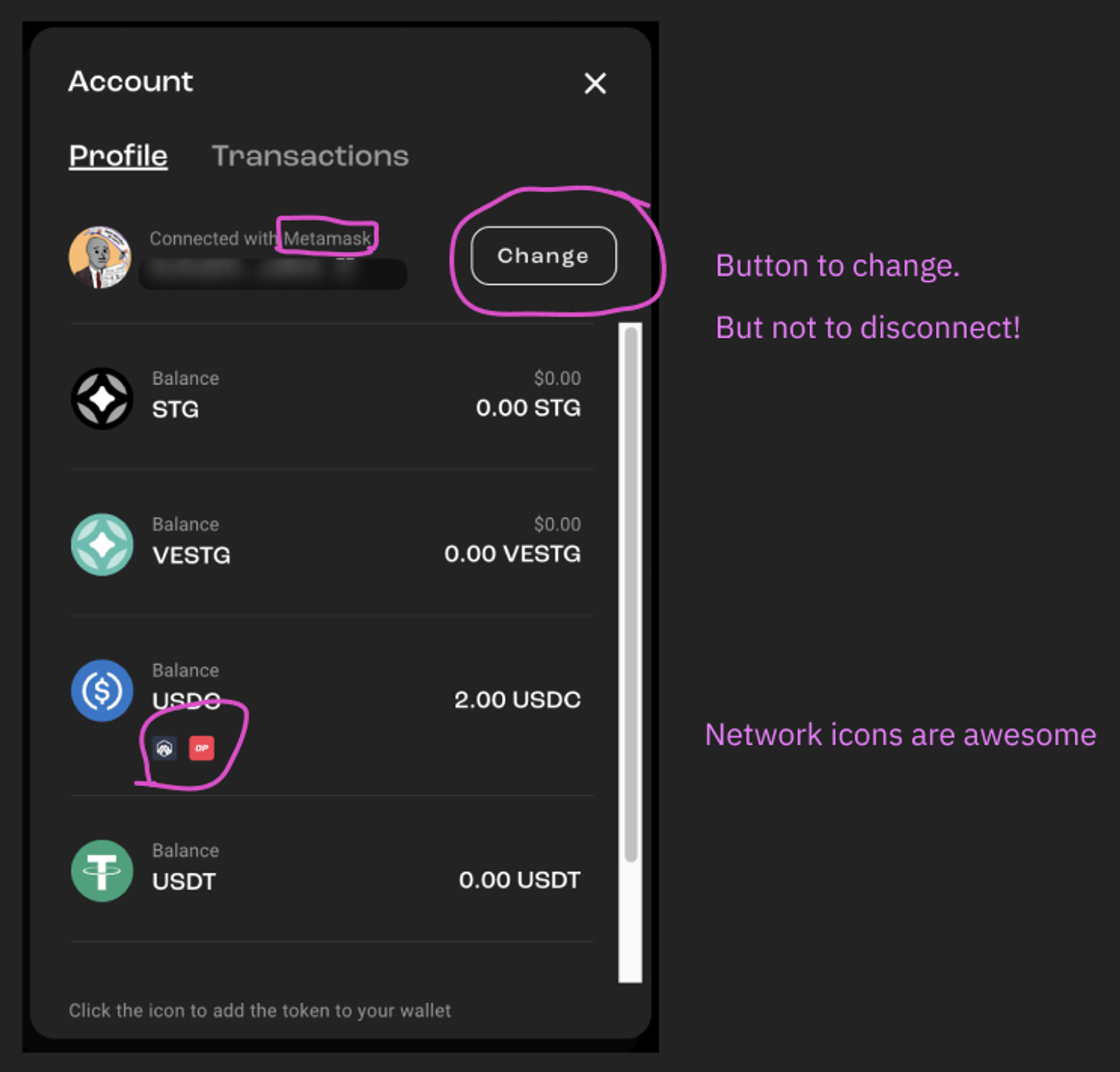
Stargate does a good job of showing assets across chains:
So what’s the best option?
It depends on the project.
In this situation, I think the best thing to do is make a list of everything that you could show.
Then do some classic card sorting and ranking exercises with your users.
If you get a bunch of your users to group and prioritise this info, some patterns should emerge and you’ll get an idea of what you need to show, and where it should be shown.