If you don’t know where to begin, try one of these six fonts:
- Roboto
- Helvetica / Helvetica Neue
- Open Sans
- Lato
- Inter
- IBM Plex
Font Size
- Body copy should be a minimum of 16
- 20 is often better - give it a go
- Try to use multiples of 4 for all your other styles
A simple size scheme
You should be designing to a 4pt grid.
Therefore, using multiples of 4 in your typography makes it easy to align objects with words.
This is easy with the type size, but involves a bit more thought with line height.
By default, Figma will set the line height to ”Auto”. This should be finetuned depending on how you’re using the text.
- For headings, it should be 1-1.2x
- For body copy, line height should be 1.3–1.6x the type size
This will give tighter, more impactful, headings, and looser, more breathable, body copy
If you adjust these numbers to the closest multiple of 4, this will create additional order and allow you to harmonize with the rest of your design system.
An example with a heading
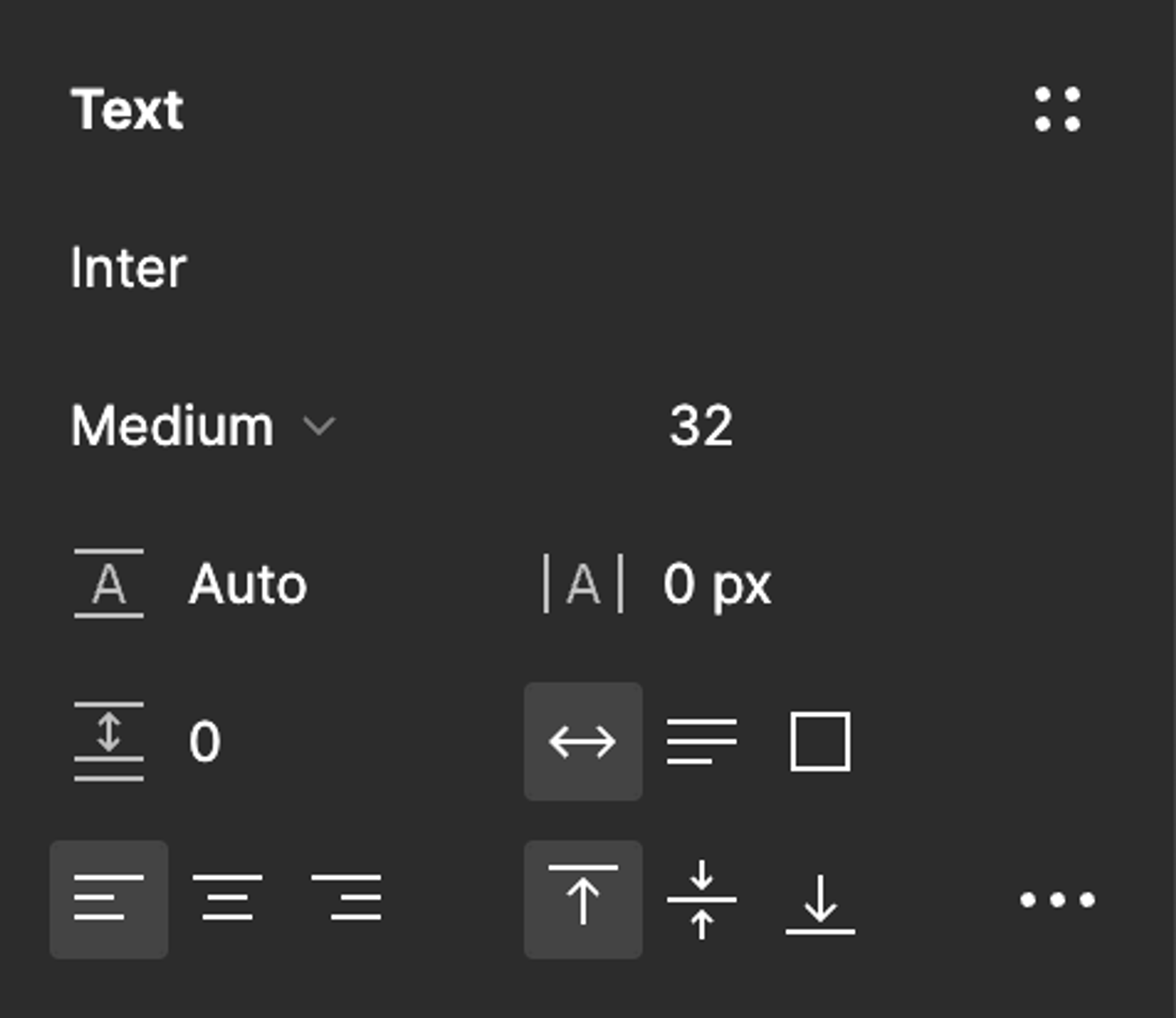
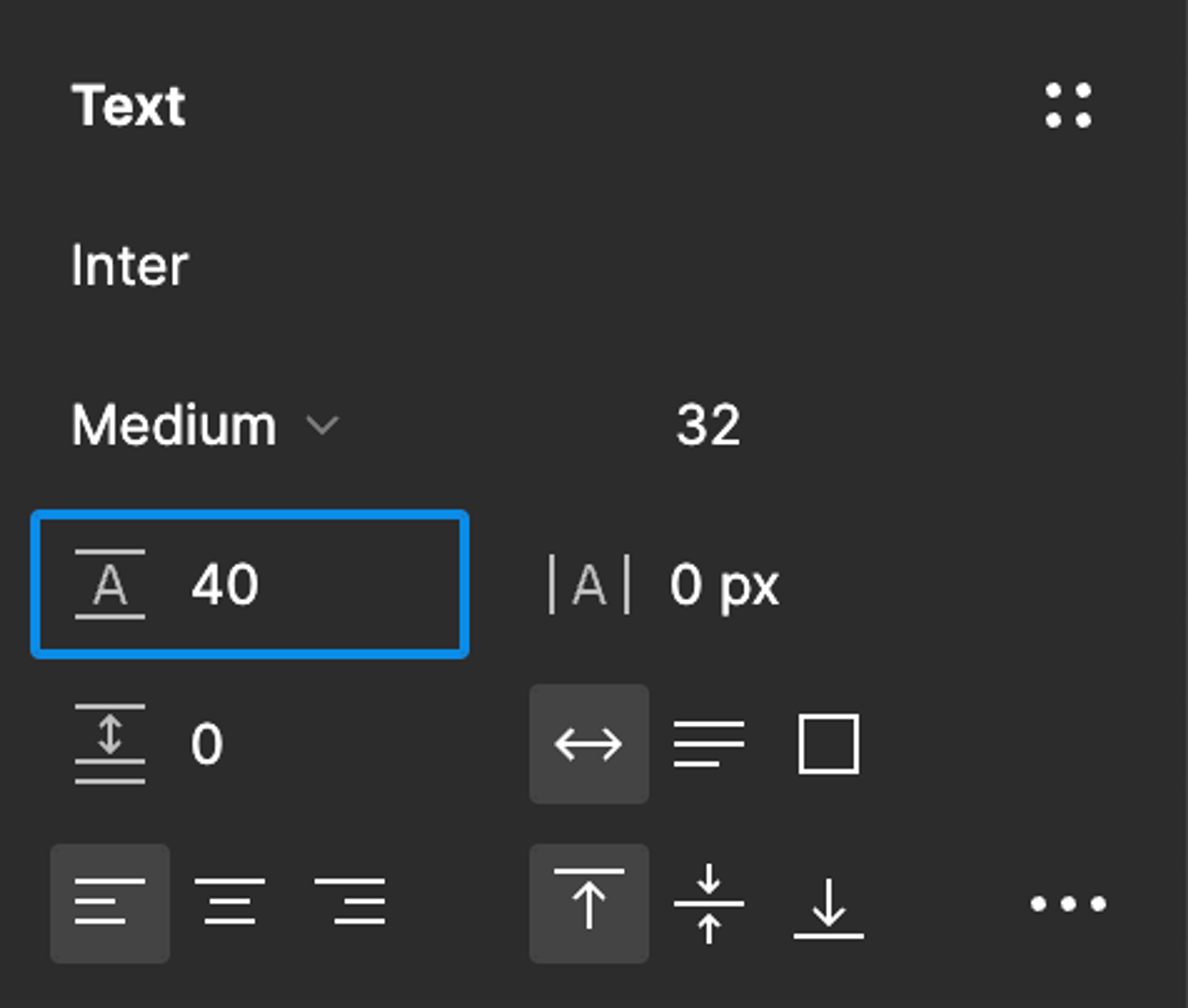
Here I have a heading with a size of 32.
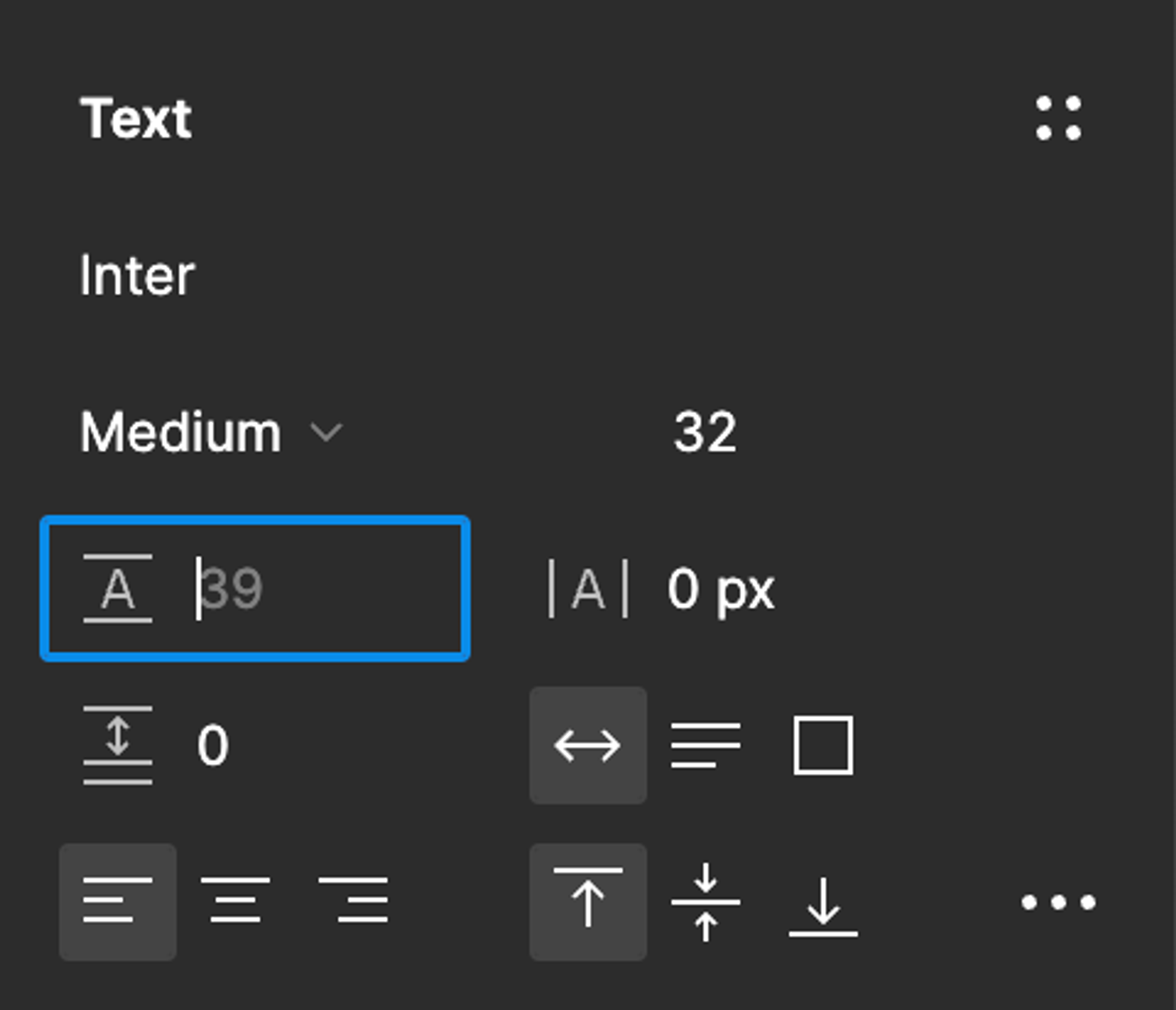
The Auto line height is 39.
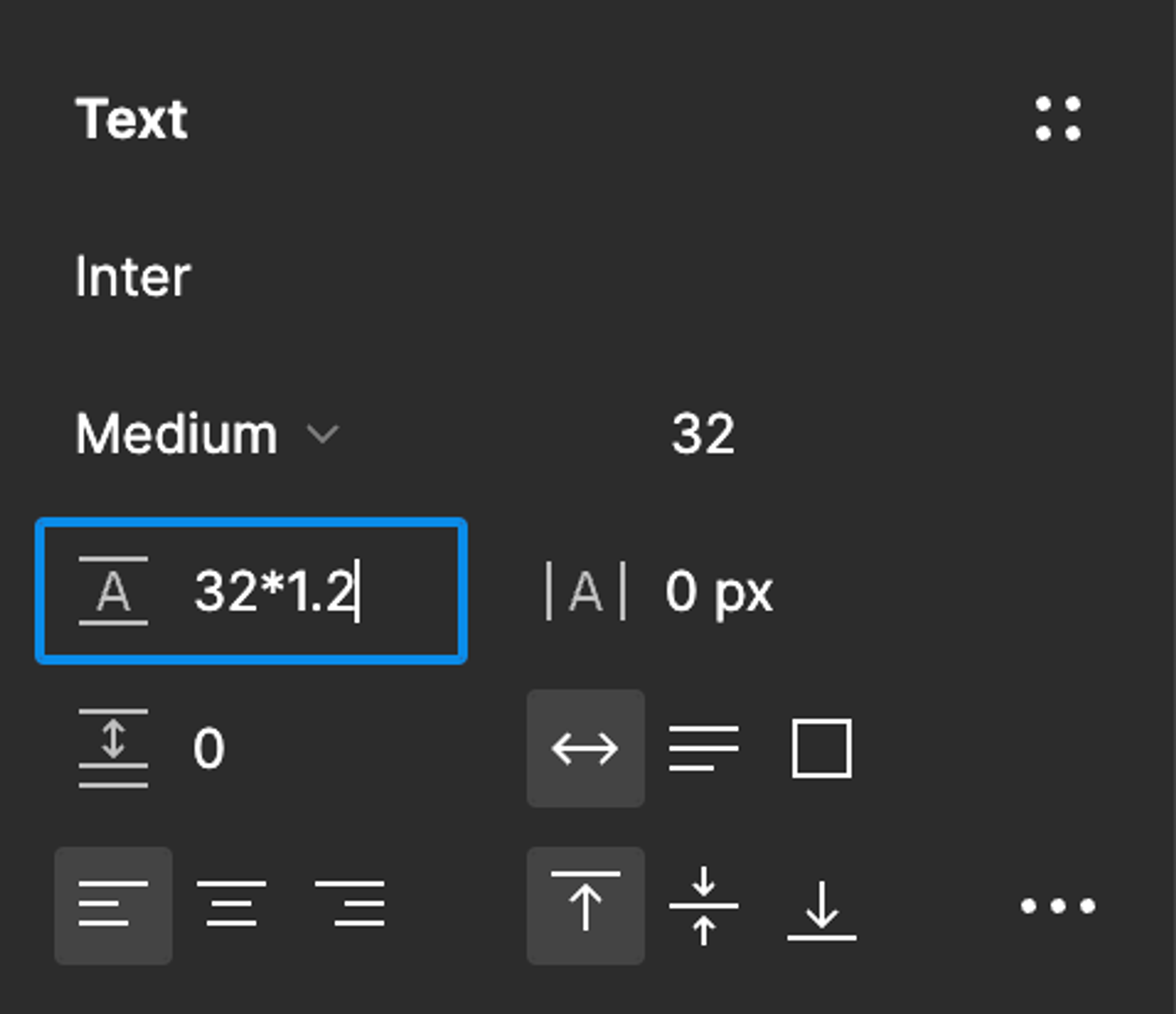
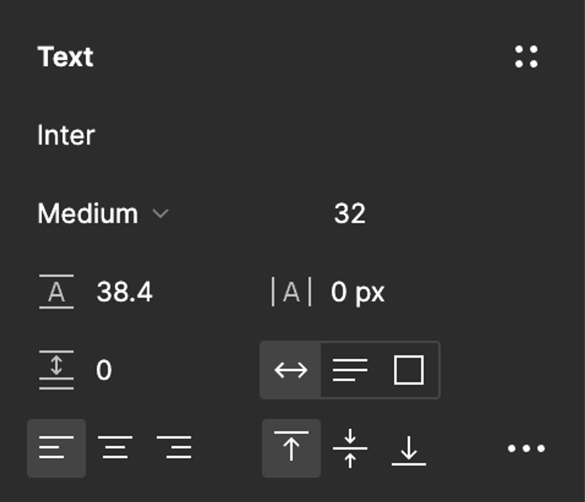
So I type 32*1.2, which = 38.4.
The closest multiple of 4 is 40.
So I change it to that, which is actually only 1 away from the default value anyway. OK, it’s slightly more than 1.2x, but close enough.
If it looks too loose to you, choose either 32 (1:1) or 36.
An example with a body copy
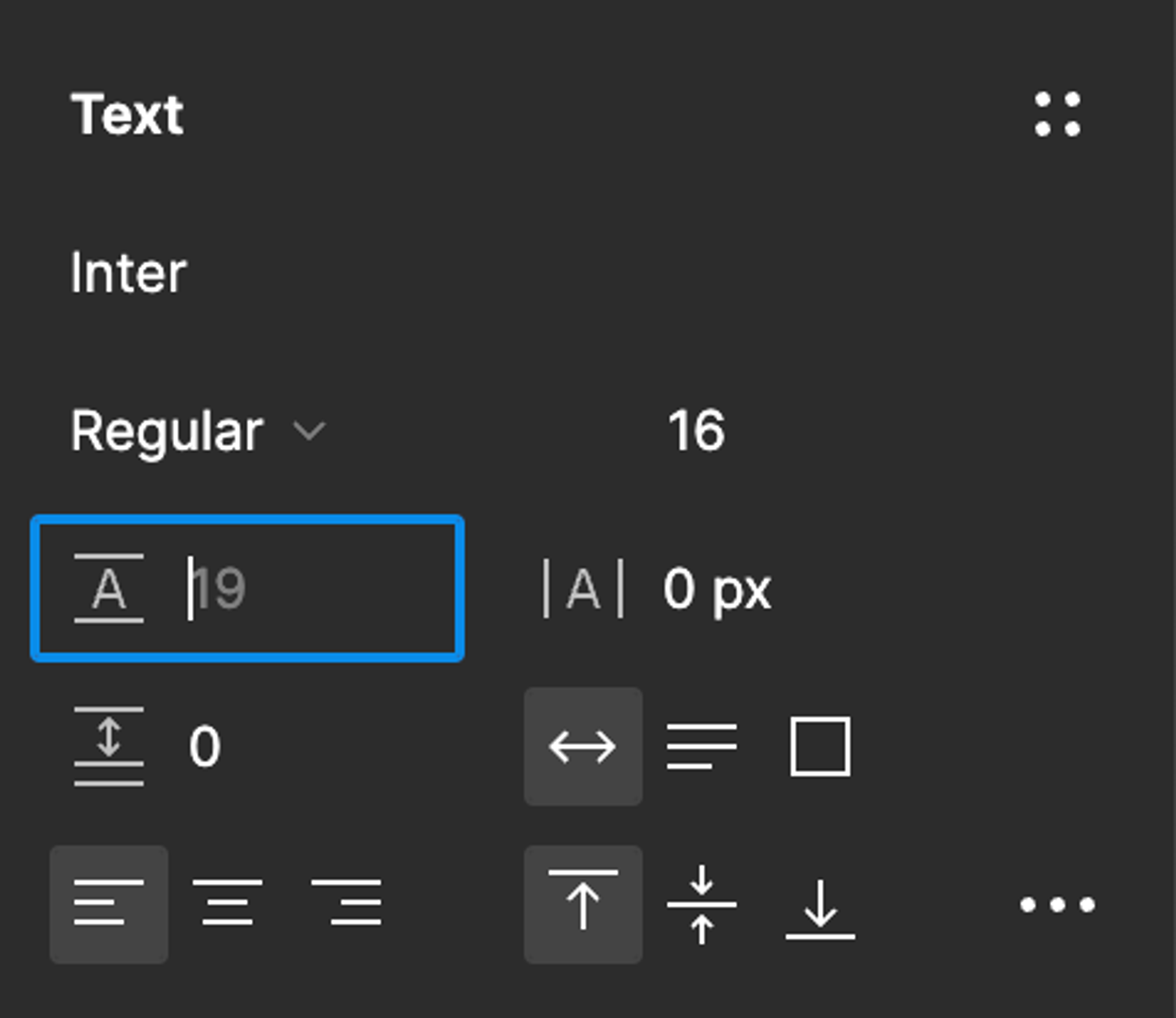
Here I have a body style with a size of 16.
The Auto line height is 19, which looks far too cramped.
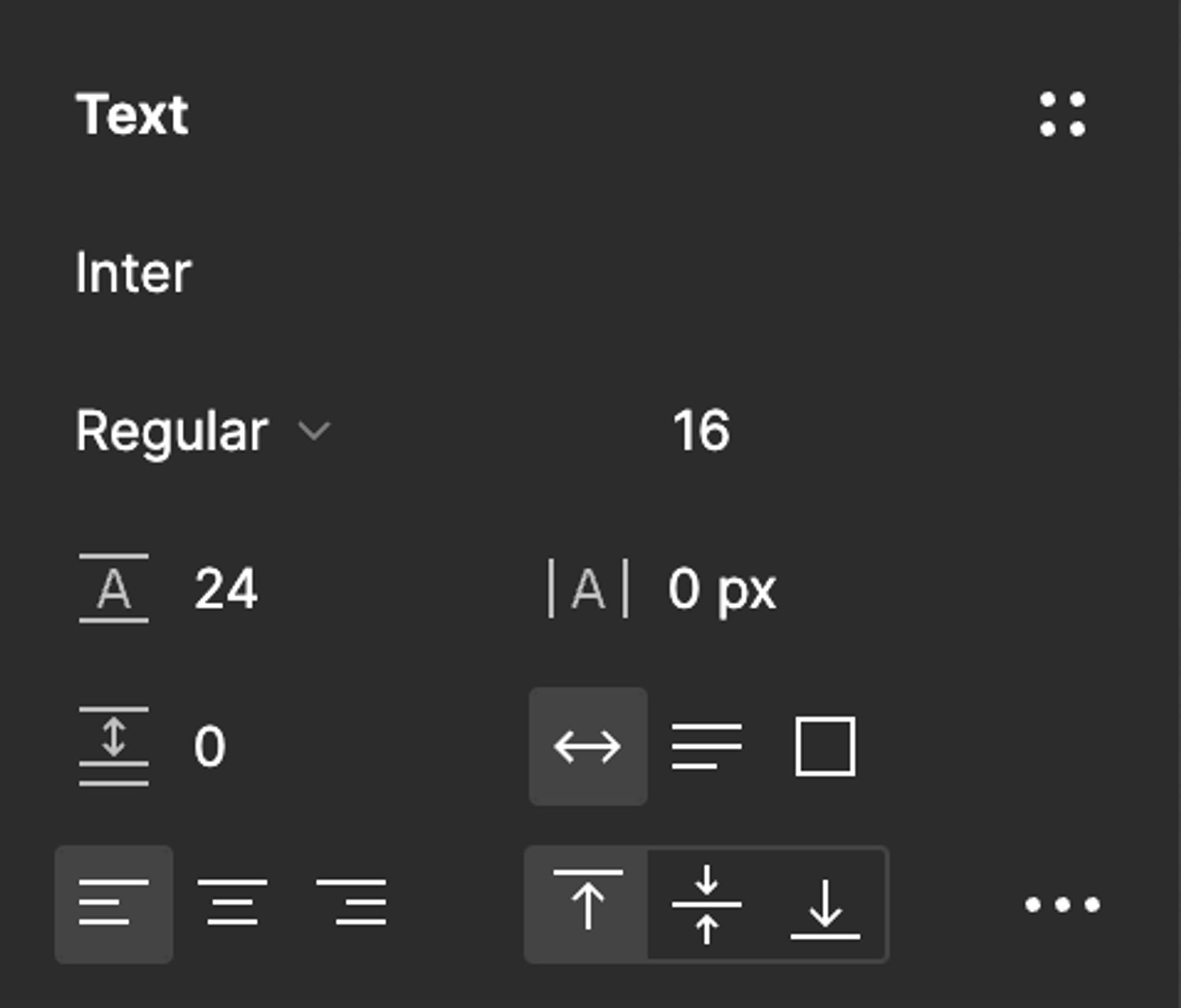
So I type 16*1.5, which = 24.
Perfect!
Takeaways
- Pick a highly readable font
- Pick some base sizes
- Set the line heights
- For headings, multiply font size by 1–1.2
- For body copy, multiply font size by 1.4–1.6
- Adjust the line heights to the nearest multiple of 4
- If your font has many weights (light, book, regular, medium, semi-bold, bold… etc), try not to use all of them, and in fact, use as few as possible.