If the user needs to sign a transaction to use the dAPP, do two things:
- Make the signature readable for humans
- Announce the signature with a popup in the browser first.
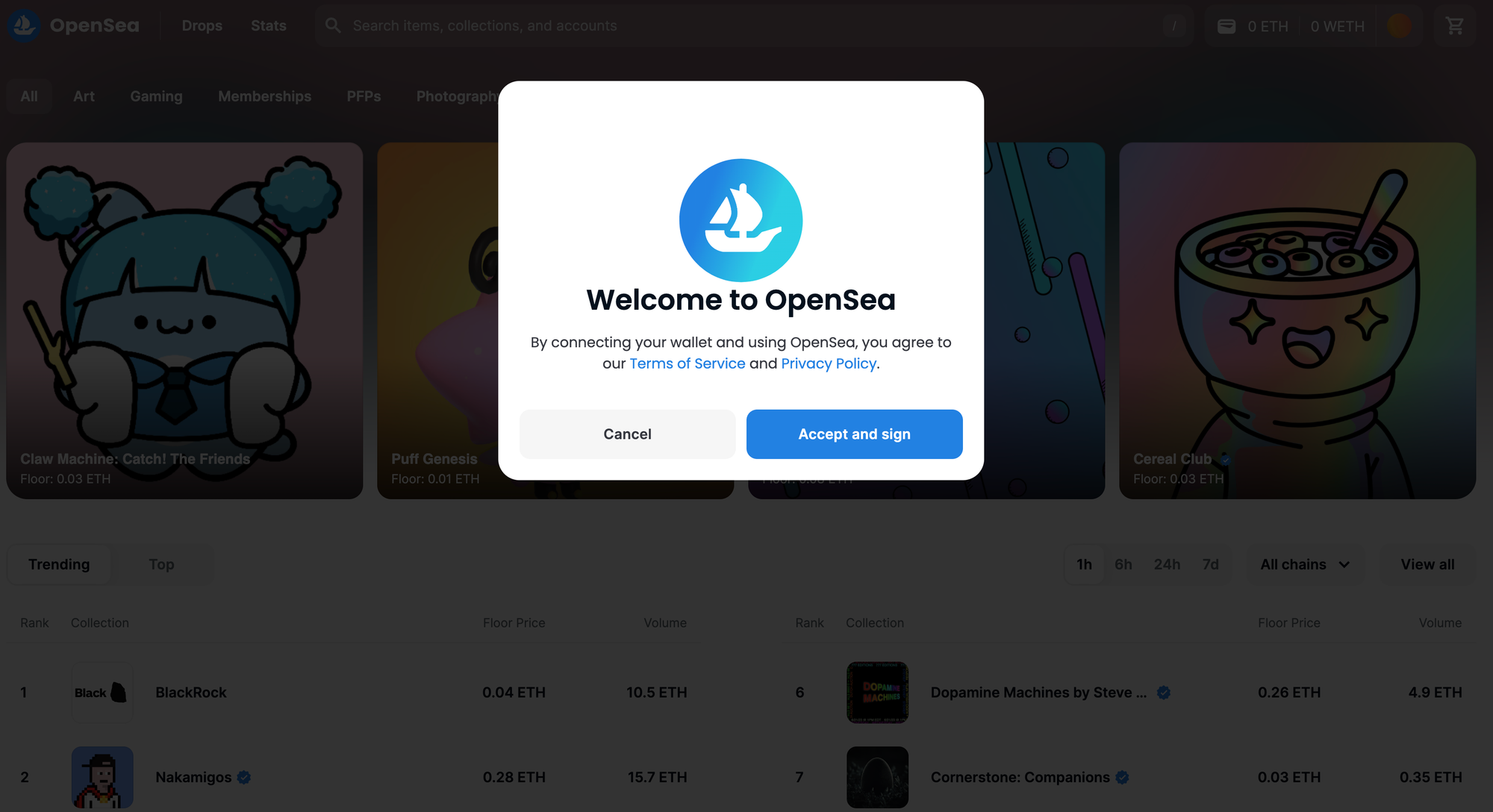
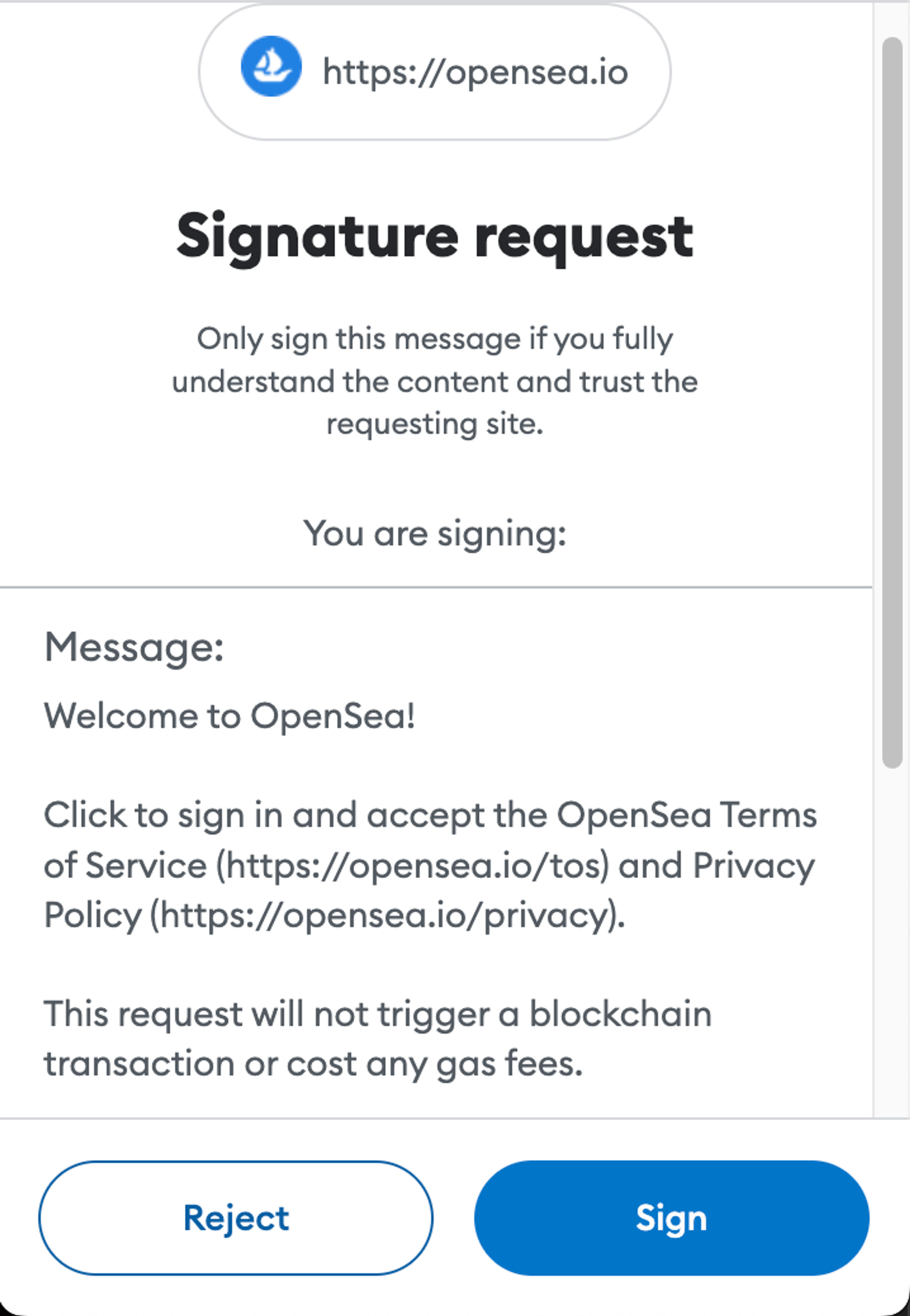
A wallet notification on its own is a bit jarring, especially if it’s just nonsense. So announce it first with a popup. You can also mention any terms of service here and get it over with. When the user agrees to those terms, they are primed to sign a message in the wallet - especially if you make the CTA read “accept and sign”.
OpenSea

Step 1: A modal pops up and gives you the option to “Accept and Sign” or “Cancel”.

Step 2: The signature request pops up, and clearly explains what it is asking of you.
The UI vs the Wallet
There are always two levels of interaction with a dApp: the Wallet and the project UI itself.
The section on transactions goes into more detail about this.
This way of interacting with a website will be unfamiliar to new users, and is honestly quite annoying for experienced users too.
Make sure the switch between the two levels is as seamless as possible.
If connecting for the first time requires a signature, then use it as an opportunity to get the terms and conditions away with at the same time, and then trigger the signature request.
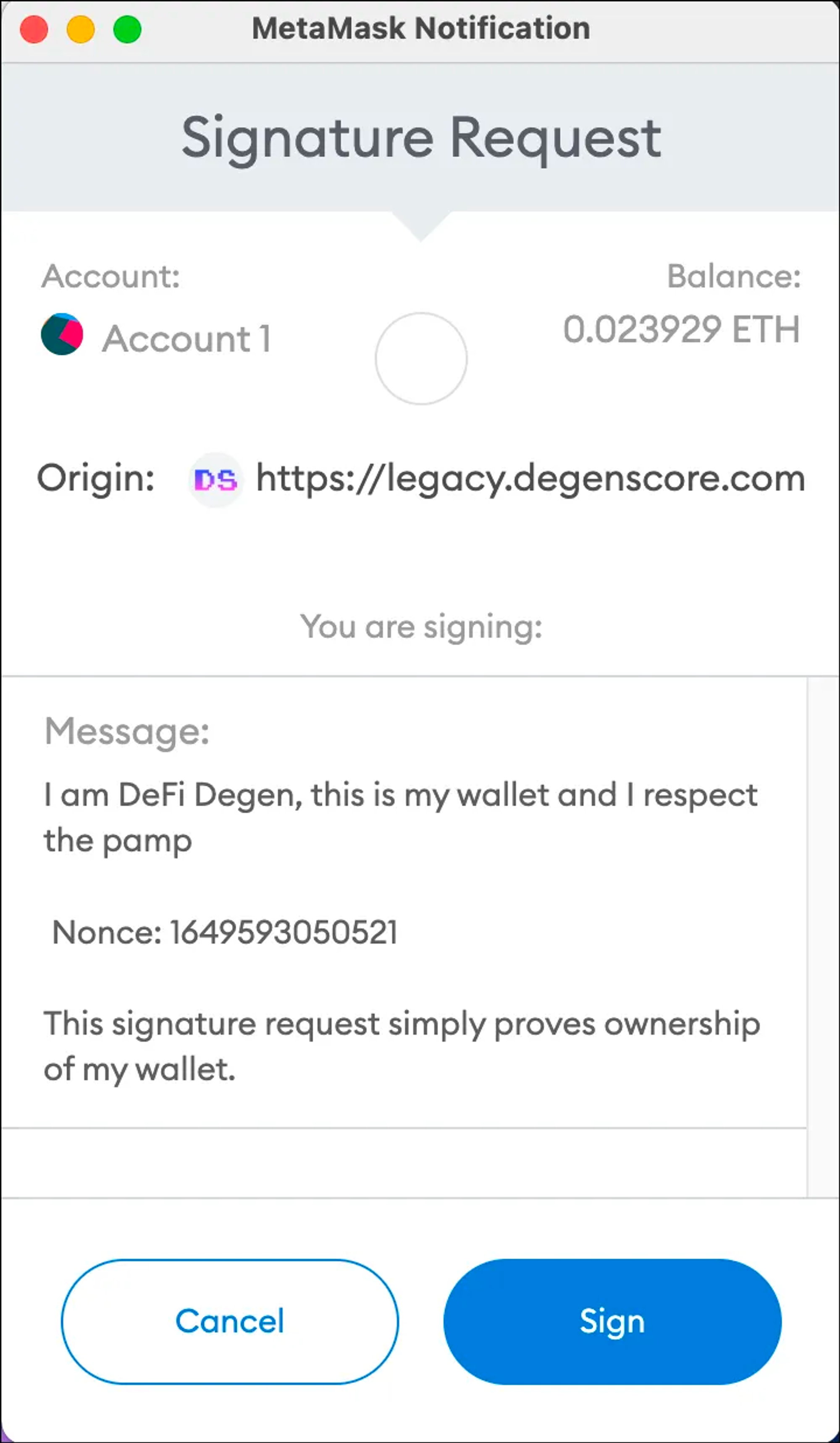
Make the messages readable, natural and on-brand.
The old DegenScore had a particularly good one.
DegenScore

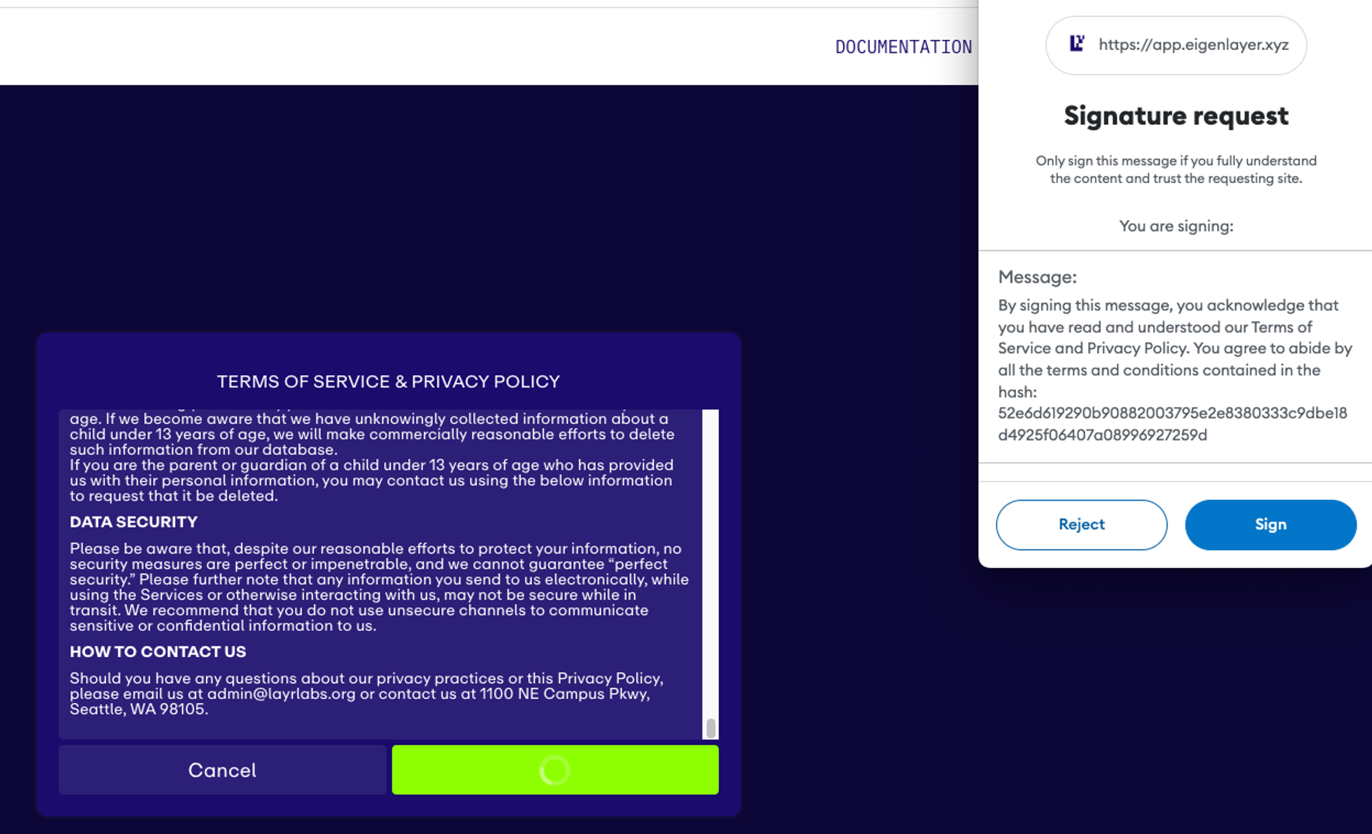
EigenLayer make you actually scroll through the whole terms of service, and then give you a very formal-sounding message to sign.
You could argue that as they’re aiming at larger wallets, this is onbrand with their more institutional userbase, but even so… it feels a bit stiff.
